A Comprehensive Website Planning Guide (Part 2)

Email Newsletter
Weekly tips on front-end & UX.
Trusted by 200,000+ folks.

 Register!
 Flexible CMS. Headless & API 1st

Planning is essential for most businesses and organizations. Unfortunately, when it comes to websites there is often a failure to plan properly or at all. This guide aims to change that.
In Part 1, I emphasized on the importance of recognizing the purpose of your website, and why planning for the web is just as important as planning for anything else associated with your business. Today, I'd like to go into more detail of evaluating a plan, choosing web professionals, and determining your site structure.
Writing The Plan (Or Proposal)
Note: The following section is for designers, but everyone ought to understand this part of the process.
If you're a designer hired to build a company's website, your plan is also a proposal that you'll need approved and signed off on in order to more forward with the project. Rules vary by country and type of business/organization, i.e., government agencies have a different process to follow than private businesses, but generally speaking you'll need a signature from a key decision maker — someone with the authority to approve the work and pay you.
If you're building the site internally with company resources, your plan is the working document for the project.
There are many ways to write a plan, but a good one will cover the following, incorporating some of the elements you've ironed out previously:
- Brief background on the company and the problems they face.
This is important as it helps remind everyone why they're doing the project in the first place. - A site map to show the organization of pages and their approximate number.
- An outline of the design process, including allowances for revisions, and what the design deliverables will be.
Are you presenting Photoshop mockups or functional design prototypes? How many are you allowing for? (See Design section for more on this distinction.) - A list of site features, including clear definitions for each, and notes on where they will appear.
The term "features" is understandably quite vague. A feature is simply a component of the site that provides some specific display or functionality. It may present a type of content from the Content Checklist (see below). Because websites vary so widely in scope, it's not possible to provide a complete list of all the features that ever will be. But here are a few common ones to get you started:- Slide show
- Staff directory
- Contact form
- Map
- Blog
The important thing is to provide a clear description of what the feature does, and if possible, link to an example of the feature in use. So instead of just saying "Slide show," try:
Slide Show
Javascript-driven image rotator. For each image display: panoramic image (16X9 ratio), title overlay and link. Provide next/previous buttons and current slide indicator. Maximum 6 images. See demo at someurl.com/slideshow.
Third Party Content
If you're integrating any third-party services like an email newsletter, Twitter feed, etc., it's important to define very clearly how they will work, and what degree of integration you'll provide. Some third party content, like a Facebook Friends Grid, might take 10 minutes to integrate, others could take a full day, or even more if building a custom component completely from scratch using a third party API.
Milestones
A list of key points in the project, and what the deliverables are for each. Again, depending on scope, this may be 30 days or 6 months. Here's a set of milestones for a project of 107 days, or about 3 1/2 months. This is a just an example — yours may look quite different.
- Day 1
Discovery meeting (designer and client) - Day 7
Content Strategy session (designer and client)D - Day 21
Initial designs presented to client - Day 28
Design feedback provided to designer - Day 35
Designs (with revisions) presented to client - Day 40
Designs approved by client - Day 42
Begin front end development (HTML, CSS, Javascript) - Day 63
Setup CMS and integrate front end assets - Day 84
CMS setup complete; CMS training; content entry begins - Day 100
Beta test - Day 107
Launch
Terms And Legal Language
Designers often skip this, and almost inevitably get burned when a project goes wrong. Take a moment and tell the client what all that tech-speak means! Telling the client in plain English will save a lot of trouble in the long run. The maxim: "Information is power" is absolutely true, and inviting clients to ask questions about technical terms can make them feel comfortable when they feel overwhelmed by tech speak and avoid confusion in the process.
What’s All This Going To Cost?
If you're developing your entire site internally, then cost consists of:
- Time spent by your employees.
- The software on which the site runs, including updates.
- Hardware, i.e., the server on which the site is hosted.
If you're contracting out the work, then the answer is "it depends."
Checking Credentials
Website design, including all its various components, is a professional service. But hiring a web designer or firm is nothing like choosing an accountant or attorney, because web design is not a credentialed field and is often collaborative in nature. That is, the person on the design team doing the design, the user interface elements, mockups, etc. may not be the same person doing the coding (the creation of front and back end markup). Even in small web teams, it's standard to see multiple people coming together to create the finished product, each with their own specialty, skill set and training.
You may come across web professionals with degrees or certifications in computer science, graphic art or related disciplines, even the occasional SEO guru or social media wizard. But due to the dynamic, ever evolving nature of the field, and its relative newness, it's unwise to rely on credentials to determine the skill or experience of the professionals you hire. Frankly, although they do prove that a given professional has invested in his or her craft (which is never a bad thing), they don't mean a whole lot in the real world. There isn't really a single regulated, unified body of experts handing out credentials to web professionals as proof that they know their stuff.
There are, however, very respected professional associations for designers in just about every country on earth. In the U.S., the AIGA and the Freelancer's Union offer memberships with benefits (including continuing education) to many professional designers.
While some individuals or firms may be quick to throw out numbers, experienced web professionals are wary of quoting prices until they have a clear understanding of your project's scope. You may be able to get a ballpark1 figure — your five-page restaurant site should not cost $20,000 (unless it includes a custom- built online ordering system), and a 100-page site for a 50-employee business will not cost $5,000, unless you want it to look like a small child designed it. One useful way to approximate cost is to find a project of similar scope to yours (an educated guess until you do a needs assessment) and inquire about what that project cost.
1 For readers unfamiliar with baseball, this is a metaphor which means "a general range or idea."
Let's not forget website maintenance
While the building of a site can vary enormously in size, scope and cost, the finished site isn't the end of the road. A site will need to be proactively maintained as long as it's online. A reasonable expectation of costs for yearly maintenance is 10 to 25 percent of the site's initial budget. So regular maintenance on a $20,000 site could run $2,000 - $5,000 per year. (Obviously, more complex revisions, updates, etc. will cost more than that, but this is a good ballpark for basic normal maintenance.)
If this figure is surprising, remember that successful sites are not built and forgotten, but maintained and improved. As your business grows and changes, your website should reflect this. Technology changes too, as does the ecosystem your site lives in — security holes will appear and need patching, updates will need to be made over time. Think of yourself as the steward of your website, facilitating its ongoing health and happiness over its lifetime.
How To Evaluate And Choose Web Professionals
As noted earlier, I am not a fan of the RFP (Request for Proposal). RFPs try (and usually fail) to reduce a creative, dynamic process to a series of numbers and milestones, without sufficient information for these benchmarks to be accurate. But without an RFP, how do you choose a team? Following these three steps will maximize the likelihood of choosing a good firm.
1. Ask For Referrals
When possible, getting referrals from business owners who have worked with the service provider in the past is a good start. The most valuable referrals come from people who have hired the individual or firm in question for a substantial project. Just because someone created a really great PowerPoint presentation for Leticia Gomez, president of Gomez Manufacturing, does not mean that this person is qualified to create a 200-page website for your science foundation or radio station.
2. Consider Substantial Projects
Smart designers always put their favorite, most successful, or most visually appealing work in their portfolio. But how a website looks is not necessarily an indication of its function. It can be very difficult for the layperson to tell just by looking at the site in a browser whether or not the site is well-structured and correctly built, let alone what went into building it. Having the designer take you through the needs assessment, design and development process of a substantial project they have completed will give you an idea of how they work. The process itself is just as important as ending up with a beautiful end result. Ask the designer:
- What were the initial assumptions going in to the project?
- How many people were involved?
- How long did it take? Were project milestones met, and if not, why?
- What was the client's feedback on the project?
- If you were to build it again, how would you work differently?
3. Meet Them
There's a maxim in business that people prefer to work with those they like, know and trust. The "like" part can be established by a nice old-fashioned face-to-face meeting. If the designer lives in another city or state, the phone is the next best thing, and there is always Skype, FaceTime, Google Hangout, etc. so that you can virtually "meet" and get a sense for the person.
Many designers are willing to sit down for an hour and talk about your needs. Get a sense of how this designer will address your project, but avoid fishing for ideas. You wouldn't ask an architect to "just have a quick go at a blueprint for us," for free, and you shouldn't ask designers for specific, in-depth solutions to your problem. Instead, take this opportunity to learn how they relate and what kinds of questions they ask. This is a good time to review one of their past projects, as noted above. Your goal is to learn about them, their people and process, and whether they're a good fit for your business.
Note: by no means are face-to-face meetings required for a successful project. While there are advantages to working with web professionals local to you, working virtually can provide great results too. If the people you're considering can't meet in person, consider a web conference instead.
Things Not To Rely On When Choosing Web Professionals
"My cousin's friend just started a web design certificate at Metropolis State College, and he says that UltraPowerCMS is the best, hottest new technology for building websites! So you should really get someone who works with that."
Ask a professional what the best tools for the job are. Don't make an important business decision based on hearsay. (You wouldn't tell your plumber which tool to use while fixing your toilet — you're not really qualified to make that call. Even if you're a plumber yourself, the professional you hired probably has a good reason for doing it her way — let her do her job.)
"I know this guy who will do your website for $500. You should call him!"
You get what you pay for. If it seems too good to be true budget-wise, it is. Period. (You've read this far, so you know your project cannot be done well for the cost of a smartphone.)
"The woman who manages our network administration says she can do it."
Get the right person for the right job. (Don't hire an airplane pilot when you need a ship's captain.)
But have you designed a site for a restaurant/car wash/toddler Parkour center?
Sometimes, when judging whether or not a design firm is a good fit, businesses will fixate on their own industry, wanting to see examples of work for a business just like theirs. While there are cases where specific industry knowledge and specialization is valuable, in most cases, a good design firm doesn't care what industry you're in. They'll follow the same needs assessment process regardless.
Everyone has a product, service, or benefit to communicate — frankly, it doesn’t matter if you’re selling baking supplies or cold fusion reactors. The designer’s job is to create a product that works specifically for the client’s business, in their industry. Good design is good design, and a skilled designer can design for just about any industry, whether they’ve done so before or not. Sometimes, not having specific knowledge about an industry can be an advantage, as it will be sen with a fresh perspective. See If Carpenters were hired like web designers for more on obsessing with designs for a particular industry.
Roles: Who’s Doing What?
Businesses are often surprised that it "takes so many people" to build a "simple website." There are certainly lots of designers out there who wear multiple hats, and do so brilliantly, but more often there are specific skill sets for specific roles — just like with any collaborative endeavor. You wouldn't expect the electrician to also be the carpenter, plumber and landscaper. It's the same in web design and development. Each role has specific skills, talents and responsibilities. Knowing what these are can help you to communicate during the building of your site, and keep information flowing smoothly for the life of the website.
In smaller firms, it's very common for the business to communicate with only one or two members of the team. Don't worry, the entire team's working on your project, you just can't see them. It's not really an effective use of anybody's time for the business to have a phone conversation about the finer points of JavaScript development for a particular module. The flow of communication works a little bit like a waterfall — the business will communicate with one or two people on the team, and they will, in turn, communicate with the rest of the team. Team members will interface with the business as needed, but the business should not expect to regularly speak to the entire team.
While each project is different, following are the typical participants and roles in a sizable web project. Your project may have people with slightly different job titles, but in all likelihood the ground will still need to be covered by someone on the team.
Internal Stakeholders (Representing All Primary Aspects Of The Business)
This may be one person, or a small group. Be sure to read below re: design by committee.
Project Manager
The project manager's role is much like in any other project, but it's important that he or she be familiar enough with the web project process to make informed decisions and recommendations about approach, timeline and roles.
Content Strategist/Information Architect
Helps plan, organize and prioritize the site's content and structure, including navigation. May also be responsible for editorial workflow, that is, the process an organization follows to move content from first draft through approval stages and finally to publishing. The larger the scope of a project, the more this role will be necessary. On smaller projects, these tasks are handled by the project manager and/or web designer.
Content Creators
One person from the business, at minimum, responsible for writing and providing other types of content. Splitting these duties among multiple people is strongly preferred.
Copywriter/Editor
Often overlooked in the process, a copywriter/editor can make your writing more appropriate to the audience, more relevant, more engaging. Writing for the web is different than writing for any other medium, and the quality of the writing on your site effects everything from your SEO to the engagement (or lack thereof) of the audience. Ideally, businesses should work with a writer who has experience working with web copy. Smaller companies do not typically have a skilled copywriter on staff, so you must bring in a third party.
The copywriter will either ask the business to provide a rough outline to build on, or will start by interviewing key staff at your company, creating finished copy based on their notes. Sometimes it's a combination of both methods, but a copywriter will engage with the company in a detailed way to create the best possible writing for a site. Professional copywriters can save you a lot of time and improve the quality of your website.
Web Designer
In addition to creating the visual look of the website, the creation of every single user interface element on the page, the style of the text, placement and layout of photos — the entire page top to bottom, the web designer may also provide graphic design, interaction design, illustration and animation, as part of the work. They may also have a role in managing user experience ("UX" — which is exactly what it sounds like — the experience of your website's users).
Front End Coder
The coder will translate visuals presented by the web designer into HTML, CSS, JavaScript and other technologies used to create the output of web pages. This code is generally called "markup" and it's the stuff you can see if you use the "View Source" feature in your browser — as well as the stuff that Google and other search engines interact with in order to index and rank your website in search engines.
The coder's work is done discreetly from other aspects of site creation. Typically, the coder will take the designs and guidelines supplied by the web designer and days or weeks later, produce piles of code and assets (graphics, videos, etc.) used to assemble the finished website.
Web/CMS Developer (“Back End” Coder)
A modern website of any size will be built in a content management system (CMS). The CMS developer will integrate the code and assets created by the front-end coder into the CMS, stitching the visible bits, called the markup, to the invisible bits and creating the site itself. The CMS developer also deals with the database that holds your content and the server on which the site lives. This person is ultimately be responsible for making sure all the assembled parts play nicely together.
Since all CMS are not the same, each with different programming languages and ways of doing things internally, you'll need a CMS developer who is skilled in using the CMS you're creating your site with. A CMS developer may be utterly fluent at creating sites with WordPress, but not have a clue what to do with Drupal.
TIP: This is by no means an exhaustive list of all the jobs in web development. Keep in mind that one person may play multiple roles, or you may divide roles or tasks further. The number of participants working on a project does not reflect the quality of the end result. In some cases, a series of one-on-one meetings between company principals and one experienced web professional can yield a great site.
You're using project management software, right?
This should almost go without saying, but your web project will greatly benefit from project management software. Keeping track of message threads, files, revisions and tasks among multiple project participants becomes very messy very quickly when run over email — don't do it. In my business, we became so frustrated with email-based project management, that using our preferred project management tool is a condition of working with us. Whether you prefer Basecamp, Trello, DaPulse, or another system, learn one and use it.
Where Will It All Run? Choosing A Content Management System (CMS)
A CMS is a software program that allows you to publish, edit, manage and display your website's content. Typically you will integrate your approved design into the CMS via some form of templates which ultimately display ("serve") functioning web pages to site visitors. These templates may be written in any number of web programming languages like PHP, Ruby or Python, or use a tag language like Smarty or Twig. Again, each CMS uses its own language.
When choosing a CMS, there are four key questions to answer:
- Is it widely used and supported?
- Is it relatively stable? Are there known security or other stability issues?
- Does the person or team developing in it have the necessary expertise?
- Will it support the layout, features and functionality the site requires?
“One Dude In A Basement Built This For Us” — Avoiding Proprietary Solutions
A CMS is software, and with any software there are products used by hundreds, thousands or ten of thousands of users to fulfill a specific need. There are many solutions to choosing from, and advising you on specific software is outside the scope of this guide. But there is one major pitfall to be aware of: some web design firms write their own CMS from scratch, making it a key part of the service they offer to clients. Some of these CMS are great, some decent, and some lousy. But this matters less than the core problem with a proprietary CMS: if that design firm goes out of business (and they often do), support for their CMS disappears. Now your website is tied to a complex piece of software which nobody supports. No improvements, no bug fixes, no security updates. And quite commonly, such software will have little or no documentation — no record of how it was built, how the pieces fit together.
In the best case scenario, you might (try to) hire someone to poke through the software and update the code, but this can be difficult, expensive, and you're throwing money at a piece of orphaned software that no one else will ever use. Many developers simply will not take this kind of work — it's not worth assuming responsibility for something they didn't have any control over the creation of.
When choosing a CMS, consider one that has a wide user base and options for paid support, whether from the vendor or third parties. When you choose a CMS that has 10,000 installations across 20 countries, there's likely to be a strong financial incentive for people to support and improve it. Here's a good resource for choosing a CMS.
WordPress, The 800 Kilo Gorilla Of CMS
WordPress is the most popular open source CMS in the world — there are more installations of WordPress running than any other CMS. It is free to download, open source, and was originally developed as a blogging platform. For some websites, it is an appropriate solution, but for many, it is not.
Due to several factors: its popularity with designers, its cost (free)2, its huge array of themes, and — very importantly — name recognition, WordPress is often chosen without even considering other solutions. It's not the purpose of this guide to tell you which CMS to use. But it's important to first complete your needs assessment and then choose your CMS. The needs of the organization should drive technology choices, not the other way around. Just because something is free and commonly used doesn't make it the right choice, and there are issues that come along with being the most popular kid in school — security being the most important (the most common usually also means the most hacked), but structure should be considered too. Think carefully and ask your designer before picking a CMS.
2 While free, WordPress, like all software, needs regular updating and attention to security, and these critical services are not free. WordPress' popularity also makes it a common target of black hat hackers (the malevolent kind).
Trusting the designer
Most designers have one or two CMS they specialize in, and if their honest assessment of your project is that it will work well in their CMS of choice, then the decision comes down to trusting the designer.
Dealing with your Information Technology (IT) person or department
In some companies, IT may put up resistance to the technologies you choose to power your website, especially if they are expected to support it. For example, you may choose a common CMS which runs on a Linux server, but your IT department is centered around Microsoft products.
Have sympathy for the embattled IT professional, as they rightly worry that someone will add to demands of their job without providing the resources or training they need to support new technologies.
While every business' need is different, in most cases, websites that don't require complex integration with other software can be hosted external to your company. If your IT department makes a fuss about supporting your chosen solution, you should strongly consider hosting it externally. However, if your project is especially complex, requires high security or intensive monitoring, you may need the support of your IT department or specialized external resources. Whatever you choose, make sure the people supporting your particular solution are versed in dealing with its unique challenges. And if there's no good in-house solution, don't hesitate to look elsewhere for people who can offer these services.
Determine Site Content
Who's responsible?
As you determine content for the site, you should also be thinking about who will contribute it. Remember, it's not the designer who will generate your content — that's up to you (or perhaps to the copywriter you've wisely hired). In a five-person business, it may be just two of you, and that's fine. In a larger organization, there may be five, ten or fifteen people contributing content. In this case it is wise to assign a project lead who will create an editorial calendar, assign writers, and establish deadlines.
Keep in mind that the time required for editing and proofing copy and visuals grows exponentially with the number of people contributing content.
"We had no idea it would take this long!"
If I had a dollar for every time a client admitted this, well, I'd have a few hundred dollars. Organizations consistently underestimate just how much time it will take to create, edit and organize their website content. Business owners often express concern about the designer's ability to meet deadlines. A common response to the question "When do you need this site completed?" is "As soon as possible". A designer may set aggressive timelines at a client's request, knowing that the business will rarely have content assembled and entered in to the CMS anywhere near as quickly as they expect.
There's no hard and fast rule for how long it takes to assemble content, but for written material, allowing for an average of 300 words per page, consider how long that will take to write and edit. Then multiply that by the number of pages. For example, if it takes one hour to write 300 words, and a half-hour to edit them, that's 1.5 hours X 40 pages = 60 hours. Good writing takes time, good photography takes planning and resources, and videos that people actually want to watch must be planned, scripted, shot and edited. Keep this in mind going in to your project, and schedule accordingly.
Especially when it comes to writing, consider having multiple people in your organization share the work. A dose of realism about how long content creation will take is key to setting — and meeting — deadlines.
Content is not just text
Unless you are creating the dullest, most technical site imaginable, your content should consist of more than just plain text. By using one or more of the following multi-media elements, you'll greatly enhance the appeal and usefulness of the site:
- Photography
- Documents (usually PDFs)
- Audio
- Podcasts
- Interviews
- Playlists
- Video (i.e., YouTube, Vimeo, or self-hosted).
- Content feeds from other websites, for example: Twitter, Facebook wall content or friends grid, Instagram photos, YouTube/Vimeo videos, RSS Feeds
- JavaScript, Java, Flash, Quicktime. These are powerful tools for video, animation, and interactive features, for example, a mortgage calculator. However, all but JavaScript do not work consistently across mobile devices. When considering one of these technologies, first ensure your audience can access them.
THE VALUE OF QUALITY PHOTOGRAPHY
As with other elements of the website, photos reflect the image of the organization. If you've just moved into a beautiful new building or storefront, you may have snapped some pictures of the building and staff on your $150 digital camera. In most instances, unless you have bona fide photography skills, you will not turn out quality photos. Don't make the mistake of thinking you can take good photos just because you have a good camera — it's not about the camera. Try to budget for professional photography. You don't necessarily need a lot of photos, just good ones. Twelve professional images are always better than fifty amateur snapshots.
There isn't an organization that won't benefit from good visuals, but it's especially important for industries that produce tangible visual results, like home remodeling, interior design or automobile restoration. It's incredibly silly to complete a $50,000 kitchen and not budget $500 for a photographer (1% of the total).


If your budget simply doesn't allow hiring a pro, you can always contact your local art school or community college and ask for a recommendation for a talented student. A budding photographer with a good eye will work cheap in order to build their portfolio.
If you truly have no budget at all, take photos yourself. Pay special attention to lighting, framing and focus, and hope for the best. Taking a large quantity of photos and sifting through them later can improve the chances of a quality shot, and simple fixes (adjusting levels, removing red eye) in Photoshop or other image editing tool can further enhance them. Keep in mind, however, that no amount of "fixing it in Photoshop" can rescue a really bad photo.
In some cases, stock photography may be used for more generic images. But there is no substitute for quality photos of your staff, storefront, products or services. If you want your website to feel uniquely like you, then you'll need to reflect this in your photos.
The value of quality writing
As with good photography, the ability to write well is not a skill possessed by all. As I mentioned, writing for the web is a different endeavor than crafting memos, policy papers or technical writing. You or your colleague may be great at writing operation manuals for precision machining tools, but that doesn't mean you can write well for the web. If you don't have someone in your organization who can write clear and concise marketing copy, hire an expert. If you can write reasonably well but need some guidance, consider hiring an editor to polish your output.
Writing For The Web: Quick Guidelines
Consider your audience and write for them. Try to see your business from the customer's perspective. What do they need to get out of the experience? What do they care about? Answer the questions they have about your product or service throughout the site — not just in an FAQ (Frequently Asked Questions) page.
Avoid business-speak, confusing acronyms, dry details. Your customers do not work at your shop, office or widget factory — they purchase your products or services. Speak to them accordingly. When appropriate, put generalities in your web pages and save the hardcore details for a voice-to-voice conversation, or even better, offer multi-page PDFs for download on the site. This approach is especially useful for product information, white papers and any copy that approaches or exceeds a thousand words.
A useful approach when writing for the web:
- Write your first draft
- Cut it in half
- Cut it in half again
- Now add bulleted and numbered lists where possible
- Keep your sentences short
- Use paragraph breaks whenever there's a slight change of flow in the copy
- Send it to the editor.
Reading on a screen is fatiguing. A screen, whether massive 26-inch monitor or diminutive smartphone, projects tiny points of light at your eyes. Consequently, reading large amounts of text can be very tiring. Because of this, readers will scan for key points within your text. That's why short blocks of copy and bulleted or numbered lists are so helpful, because they're easy to spot. Try to make each paragraph/section encapsulate a single idea.
Create strong headlines. Consider reading a newspaper — it would be very hard to read without headlines. Headlines break up the content, give it hierarchy and, like lists, make it easier to spot what you're looking for.
Customer-Oriented Copy
Since the end goal of most business websites is to drive sales, your website's writing should be oriented towards your customer.
Let's say our business is an auto body repair shop. The common approach is to say something like "In business since 1976, Acme Auto Body proudly provides top quality service to greater Metropolis." This may be accurate, but it's pretty meaningless to the customer. It doesn't actually tell us much about Acme, what makes them different or why we should go there. While you should talk about your company, the most effective language frames everything you do in terms of your customer.
- What are their needs?
- What are their desires?
- What are their fears?
Our auto body repair customers typically call after their car has been damaged in an accident.
- Their need is to have their car repaired so they can drive it again.
- Their desires are to have the repair done fast, at high quality, and with a minimum of hassle.
- Their fears include getting ripped off, shoddy repairs, a difficult process, or repairs taking too long.
Referring to benefits instead of features better resonates with customers. Just listing everything you offer is not as compelling as framing each item as a benefit, or a solution to a problem.
If our shop offers free loaner cars, we'd consider that a feature — but we can present it as a benefit: "Acme Auto Body's free loaner cars mean you won't miss a day of work, important appointments, or other plans while your own car is in the shop."
Don't style your content. Most writers will prefer to work in Microsoft Word or similar program. This is fine, but Word is notorious for creating very messy (invisible) code when text generated in it is moved to a web page. All that nice green text you created in your favorite font is actually sloppy proprietary HTML code that your web designer must painstakingly remove in order to get your text into the website. So don't worry about things like colors, fonts and alignment. Just write well. Style will be applied later later, when the text is placed into the finished web page.
Determine Your Site Structure
Here are the key building blocks of your site, in structural terms.
Site Map
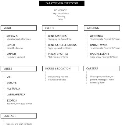
Your site map can be structured like a flowchart, built with software such as Visio or a free tool like Gliffy. Doing it this way presents your site map like an organizational chart, a series of objects connected with lines, labeled so you can see how the pages connect to one another.
Alternately, you can use an outline with bulleted lists and indentations indicating pages, subpages and other structural breaks. The tool you choose is not terribly important. What matters is that you develop something which accurately reflects the structure of your site. On larger projects, this is a substantial process itself, and may require a content inventory or competitive reviews.
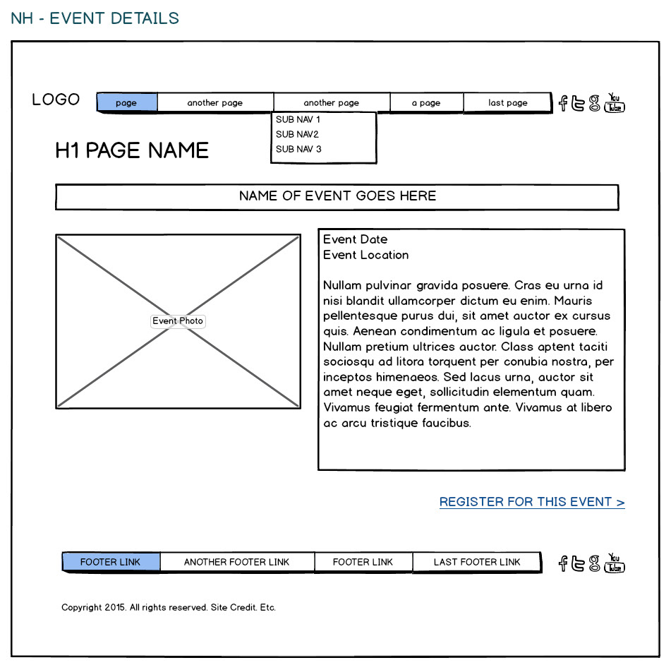
Here is an example site map for New Harvest, prepared in Adobe Illustrator.
Content Definition
Some content will be easy to define. On a contact page, for example, it's generally understood that you'll need to list business name, location, contact information, hours, and often, a simple contact form and map. Other types of content will take more consideration. This is another point where failure to carefully define your content will cause headaches later.
For example, you may want to include a photo gallery on your site. Good idea, but what, exactly, will this photo gallery look like? How will it work? Is it twenty images in a grid of thumbnails, with a nice pop-up overlay when you click them or a multi-page gallery with 1,000 photos, individually categorized with meta data tracked? Should users be able to rate the images? Comment on them? Download hi-resolution versions? Email them to a friend? Does each one open in a new window?
This is but one example of why it's so important to think ahead, dig deep, and define each type of content in as much detail as possible. Otherwise, you'll end up with the developer's best guess at what each type of content should be, what it should do and how it should look. Content elements like an "event calendar", "staff directory" or "blog" may provide a general frame of reference, but require clear definitions of what, exactly, they need to accomplish and how they will be used.
One way to help define content is simply to observe the functionality of existing websites and see what might be effective for your purposes. Browse the web with an eye toward content types and their form and function, and make yourself a collection of the methods you like the best and why they might work well for your website. A great way to start is simply by taking note of content types you like that are executed in a way you think works great.
Content Checklist
Here is a non-exhaustive list of common types of website content. Keep in mind these are just types, not definitions.
- Articles
- Audio
- Blog (sometimes with user comments)
- Banner advertising
- Discussion forum
- Documents
- E-commerce
- Forms for contact, quote request, or other purposes
- Physical products (how many?)
- Digital content (what kind and how many?)
- Email newsletter
- Event calendar
- Event registration
- Image gallery
- Link management (dozens or hundreds of links, ordered by category)
- Maps
- RSS Feeds, incoming (external, pulled from other sites in to yours)
- RSS Feeds, outgoing (your site's content, syndicated to other sites)
- Reviews/Testimonials
- Search
- Social media sharing links, i.e., Tweet, post to Facebook, etc.
- Staff directory
- Video — locally hosted or via YouTube, Vimeo or other provider.
Content Relationships
Some of your content will relate to other content. For example, the same content details may appear in different parts of the site. Map these relationships carefully.
Our New Harvest website is too small in scope to require this, so let's consider a giant restaurant expo with 100+ learning sessions over a weekend.
Let's say there are three different audiences: restaurant owners, chefs, and product vendors. You can enter and store all your events in the same "container", but you'll need to ensure that the sections of your site intended for these three distinct groups only display the events relevant to their audiences.
In this simple example, you can see that Owners should only see items 1, 2 and 4, while Chefs should see items 1, 2 and 3. Vendors see only item 2.
ID | TITLE | AUDIENCE |
1 | Trends In Fast Casual Dining | Owners, Chefs |
2 | Kitchen Innovation Awards | Owners, Chefs, Vendors |
3 | 3D Food Printing Is Here! | Chefs |
4 | Integrating Your Point of Sale (POS) With Delivery Services | Owners |
Also keep in mind that when content is changed in one area of the site, it may need to be changed in other areas for consistency and accuracy. For example, employees will join and leave your business, and change titles and responsibilities. Proper use of a good CMS should minimize duplication of content.
Separating Design From Content
Design and content are intimately related, but they are also separate. This may be confusing at first. The idea of separating design from content means that site content is almost completely free of design elements. So that we're not just thinking hypothetically, let's consider a simple, concrete example. Let's say your site has articles. For each article, there is:
- Title
- Meta title
- Meta description
- Author(s)
- Date of publication
- Categories to which it is assigned
- Teaser
- Article text
- Image.
Note: the term meta refers to the context for your information, used to identify what it is, who wrote it, etc. Some of it is not visible in its raw form to site users, but it is there, and it is important — used from everything from search engine results to displaying titles in browsers, and much more.
Together, these pieces of information comprise an article. They should also map neatly to fields in your CMS's database, where information is stored. At this point in the process, it doesn't matter what design you apply to the copy — fonts, layout, colors, author photo thumbnails, etc. The content is valid even in the absence of design. The website is capable of displaying all of these items on an article page, in the correct order. It may not look pretty in the page as plain text, but it reads correctly. It makes perfect sense, and it's all there. In other words, when you have all the above elements together, related to each other correctly, you have what (at least technically) constitutes an article.
WHY IT MATTERS
Until recently in "web time", web designers mainly worried about the desktop web, that is, they designed sites to work on desktop and laptop computers. With the enormous growth of mobile device use, this is no longer acceptable. In terms of content (we'll get to design in a later chapter), we need to collect more information about each piece of content in a website. Why? Content no longer just sits in a fixed area on a desktop-optimized site. It needs to be useful on other devices like tablet PCs and smartphones, and also may be shared across current social networks like Twitter, Facebook and LinkedIn, and future ones like CyberFriend3000 and GuanxiBuddy3. It's also saved for later reading via various services like Pocket, Readability and Instapaper.
3 Not yet real.
This requires that we further break up the content, and at the very least, that we create variations of content headlines and primary images for use in other scenarios. Now consider a more robust set of fields for an article:
- Title
- Alternate long title
- Alternate short title for social media
- Meta title (for search engines)
- Meta description (for search engines and some social media)
- Author(s)
- Author photo
- Date of publication
- Categories to which it is assigned
- Teaser
- Article text
- Image
- Alternate size image
- Thumbnail image.
It also means that you must let go of the idea that you have tight control of how your content appears. Unlike print, the web is a dynamic, shifting medium. Users consume content on a range of devices (Android tablet, iPod) and platforms (Twitter, Pinterest). Make sure your content is accurate and well-written, but if you want it exactly, irrevocably fixed, create a printed brochure instead. Now, depending on where your article appears, it will automatically display whatever fields are most appropriate. For example, to share your content on Facebook, you could use:
- Alternate short title
- Image
- URL
- The first two categories as hashtags (#websiteplanning, #planfirst) if there's room.
What Is Meta Data?
Meta data is content about your content. In the case of an article, everything besides the title and article text may be considered meta data. When some people hear "meta data" they immediately think "Oh, for search engines." That's correct, some types of meta data are used by search engines to index your site effectively. But meta data is also important to include so your site's content will be accurately represented on social media and elsewhere on the broader Internet.
Another aspect of collecting good meta data: over time, its organizational value increases. That is:
When you have 10 articles, tracking the authors and categories via meta data may not seem all that useful. In two years, when you've built up a library of 150 articles, you'll be glad you took the time to collect this. Now you can offer sorting and searching content in a way that's especially useful to users. But if you haven't planned for this from the start, it'll be difficult and time-consuming to add after the fact. Manually going through 150 articles, one by one, and adding meta data by hand isn't a lot of fun.
URL Structure
Whatever CMS you ultimately use to build the site, your pages will require a specific structure. Plan this in advance so you will have logical, cleanly structured URLs for every type of page within your site. This will need to be done in cooperation with your CMS developer. For example:
- mysite.com (Home page)
- mysite.com/blog (Blog main page)
- mysite.com/blog/ten-ways-to-save-on-a-kitchen-remodel (Single blog post. As you would expect, this is the URL for an article titled "Ten Ways to Save on a Kitchen Remodel")
- mysite.com/services/widget-repair (Internal pages under "services")
- mysite.com/articles/fixing-your-model-5-widget
Notice that humans can read these URLs. They also tell readers, at a glance, what they should expect to see when they visit these pages.
Where It Comes Together: SEO (Search Engine Optimization)
Assembling these previously noted elements properly:
- Quality writing
- Well-defined content, including proper use of header tags (h1, h2, etc.)
- Good meta data
- Logical URL structure.
is the most effective way to achieve good SEO for your site. These are not the only points that matter, but they are the most important, as they are key factors which you can influence when addressing how your site is built and structured. Your CMS should provide the framework for setting up these elements. Like many of the topics discussed here, SEO is very complex, with a huge number of moving parts, and needs its own book. To dig deeper, see recommended reading.
Wireframes
Once you've determined the structure of your content, you may choose to start the design process with wireframes. A wireframe is a visual representation of a page's layout, without the bells and whistles of the whole design. Often wireframes are produced in simple grayscale, with plain fonts and a notable lack of style. Wireframes do not include colors, fonts or any other design elements. They are just layout, without the nuance of design to get in the way of seeing the structure of the page.
Wireframes allow us to completely focus on the structure of the pages, to see what goes on them and how those elements interact without the distraction of the design. There are many great tools for making wireframes. Photoshop, Illustrator or Visio work well, as do specialized tools like Balsamiq Mockups. You can also work very effectively on paper or a whiteboard.
Alternatively you might want to skip pictures and jump straight to working prototypes, which have the benefit of making you think about the medium, because you're already in it, and make it easier to consider your design in the light of things like alternate devices, different screen dimensions etc. Working prototypes also allow interactive click-through for a greater kinetic sense of how elements might function and connect to one another within a site too.
What About Responsive Web Design (RWD) And Mobile Devices?
As you'll read below, the requirement that sites work across mobile devices is radically and rapidly changing the design process from top to bottom. When it comes to wireframes, you may want to create them for mobile as well as desktop, or "big screen" view. Or depending on your workflow, you may consider the wireframes step optional for mobile devices. This varies project-to-project of course, and you'll want to use the method that works best for your individual site.
Our tendency is to make things look appealing from the beginning of the process. In the wireframe stage, this should be avoided completely, as it distracts from the purpose of wireframes, which is to decide where things go and how they connect to one another on the page, not what font size to use or what color the navigation should be.
Depending on the scope of your project and the approach you favor, Wireframes may be a brief process or more involved.
Here are some sample wireframes for our fictional restaurant, created in Balsamiq:
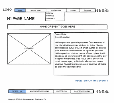
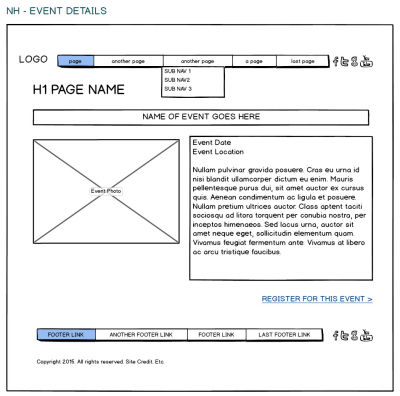
Once wireframes have gone through your review process, it's time to move to the visual and interaction design stage.
The Value Of Good Design
Think about the iPod. Apple Computer has been wildly successful selling products with exquisitely refined design, both physical and in their UI (User Interface). The iPod doesn't have any particular capabilities that its competitors lack. In fact, by some measures it is less full-featured than other music players. For example, early models didn't record external audio. You had to attach an additional piece of hardware to the iPod before it could record the world around it.
Nonetheless, the exceptional physical design of the product, combined with a highly intuitive software interface (and great marketing) make the iPod a far more coveted item than most competing products. It felt better. It felt beautiful and revolutionary. Even if it didn't offer the same bells and whistles as other MP3 players, people couldn't get enough of it. Now, years later, it's widely understood that the design of the iPod is what made it a runaway success.
When it comes to websites, however, the value of good design and attention to detail is often discounted. The thought is that as long as something works, it doesn't really need refinement. There's no reason to go further if millions of other people are doing just fine with the lowest possible common denominator. This is misguided thinking. Your website, along with logo, business cards, signage, letterhead, direct mail and other visual expressions of your brand are critical to the way customers perceive the business. The experience users have on your website is part of this impression. When a website is professionally designed (looks and feels like skill, talent and time went into building it), when it is harmonious, pleasing to the eye and easy to navigate, it makes a positive impression on site visitors.
Conversely, when a website is just passable, this may annoy customers, make a bad (or no) impression and discourage further visits to the site. And importantly, people who don't like your website often won't tell you about it. The web isn't very old, but here's a key question that has applied since the first business website went online.
- Q. If a customer goes to your site, searches for specifications on a product they know you sell, and finds nothing, what will their next step be?
- A. Leave.
Often, when a web user gets frustrated, they don't search further, they don't call or email, they just leave your site. You can get a sense of this by reviewing your website visitor statistics4 (if they've been set up properly, look at "bounce rate"), but these stats don't tell you what a visitor was thinking when they left your site.
4 Most commonly this will be Google Analytics, but there are other tools that offer this too.
And unless you're offering something wonderful and unique, customers will likely go elsewhere to find a similar product or a different service provider.
Good design isn't an accident. It isn't arbitrary. Every single pixel is thought out and executed according to an overarching principle of quality design. Intuitively visitors can tell when a site is well produced. Good design just feels better than bad design, and the experience of a user will inform his or her likelihood to purchase your products or services. It makes a big difference.
The Puzzling Popularity Of Ugly Websites
Of course, there are prominent examples where this isn't, or at least doesn't seem to be, the case.
While design certainly matters, some websites are successful despite their lack of design. Perhaps the best known is Craiglist. Almost entirely free, ubiquitous, but "un-designed" and clumsy to use, Craiglist is nonetheless very popular. Why? Because it works, and it established a position in the market very early. However, the popularity of ugly sites like Craigslist should not be be viewed as justification for poor design choices on your own site. Small businesses, especially startups, can ill afford to have a site that doesn't look good or function well. If you were to release Craigslist today, as a brand new website, it would fail spectacularly in this era of high design standards. Users are simply used to looking at sites that look better, work better than they did in the 1990s.
Responsive Design And Evolving Technology
In the past, most people got online using desktop or laptop, at home or work. Then coffee shops and other businesses started adding WiFi, and people brought their laptops for work or leisure web use — but the laptop and desktop were still all designers had to worry about. Once mobile devices like smartphones and tablets became ubiquitous, the designer's job got more challenging.
Instead of dealing with a modest number of variations in web viewing technology — for example, the unique quirks of different web browsers across different operating systems — Internet Explorer on Windows vs. Safari on Mac — designers now have to account for a wide range of devices, user agents (web browsers), screen sizes and resolutions. Additionally, common technologies like Adobe Flash, which used to work across most devices, can no longer be relied upon to work consistently.
Now and for the foreseeable future, we can expect people will continue to access the web on an increasingly wide range of devices of different sizes and capabilities. To answer the challenge of presenting the website so it's useful on a diminutive iPhone and an enormous flat screen TV, we have responsive design.
What Is Responsive Web Design?
Responsive Web Design is an approach to presenting content and design that allows text, images, video and other elements to change in size, appearance and layout according to the capabilities of the device on which they're viewed. These changes appear to happen "automatically," though, of course, a developer has specified exactly when and how these changes should happen in every possible scenario.
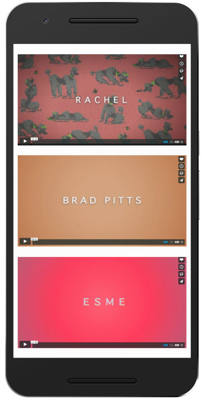
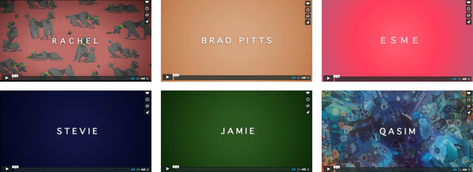
For example, here's a simple layout designed to display six videos on a page. On a full screen (for our purposes, a laptop or desktop), we show them in rows of three.

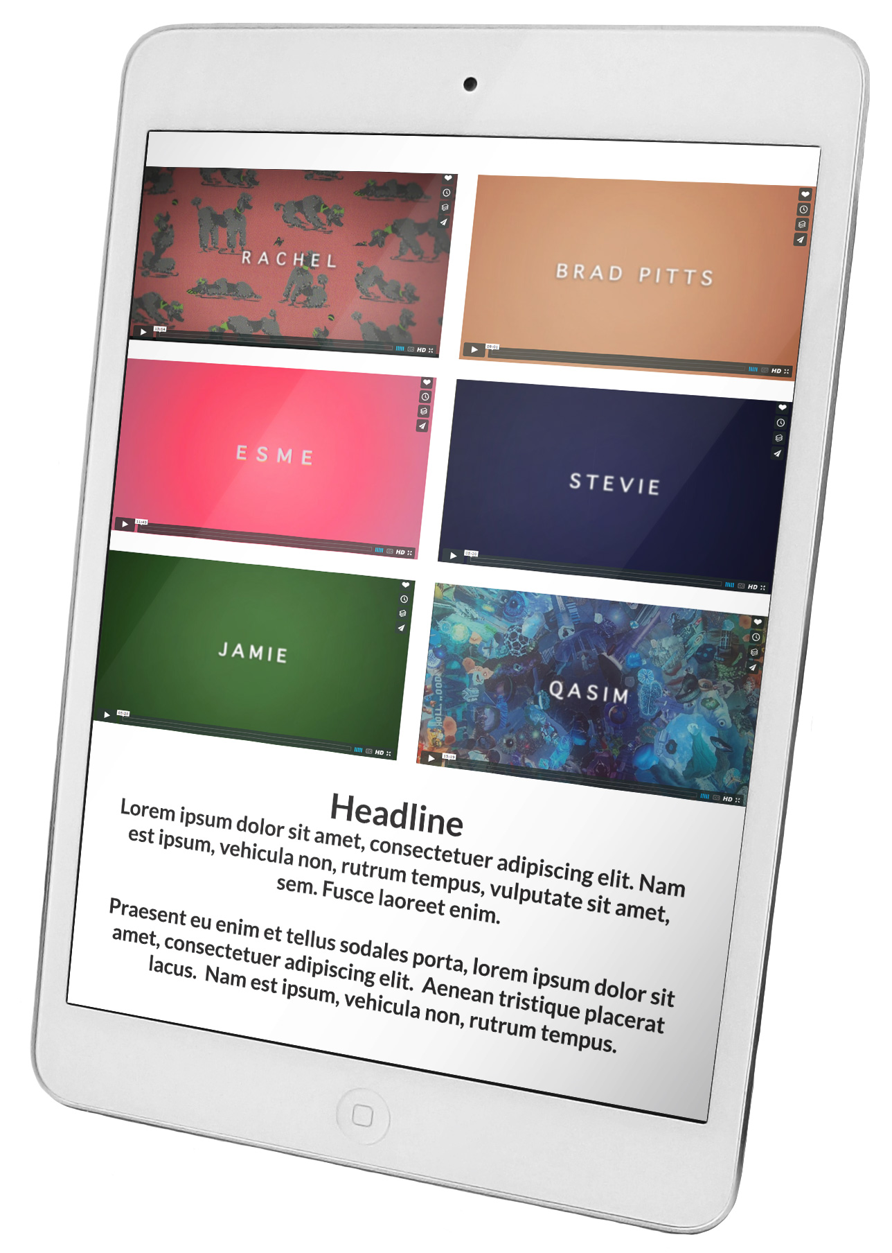
On a smaller screen, like a tablet, we show them in rows of two.

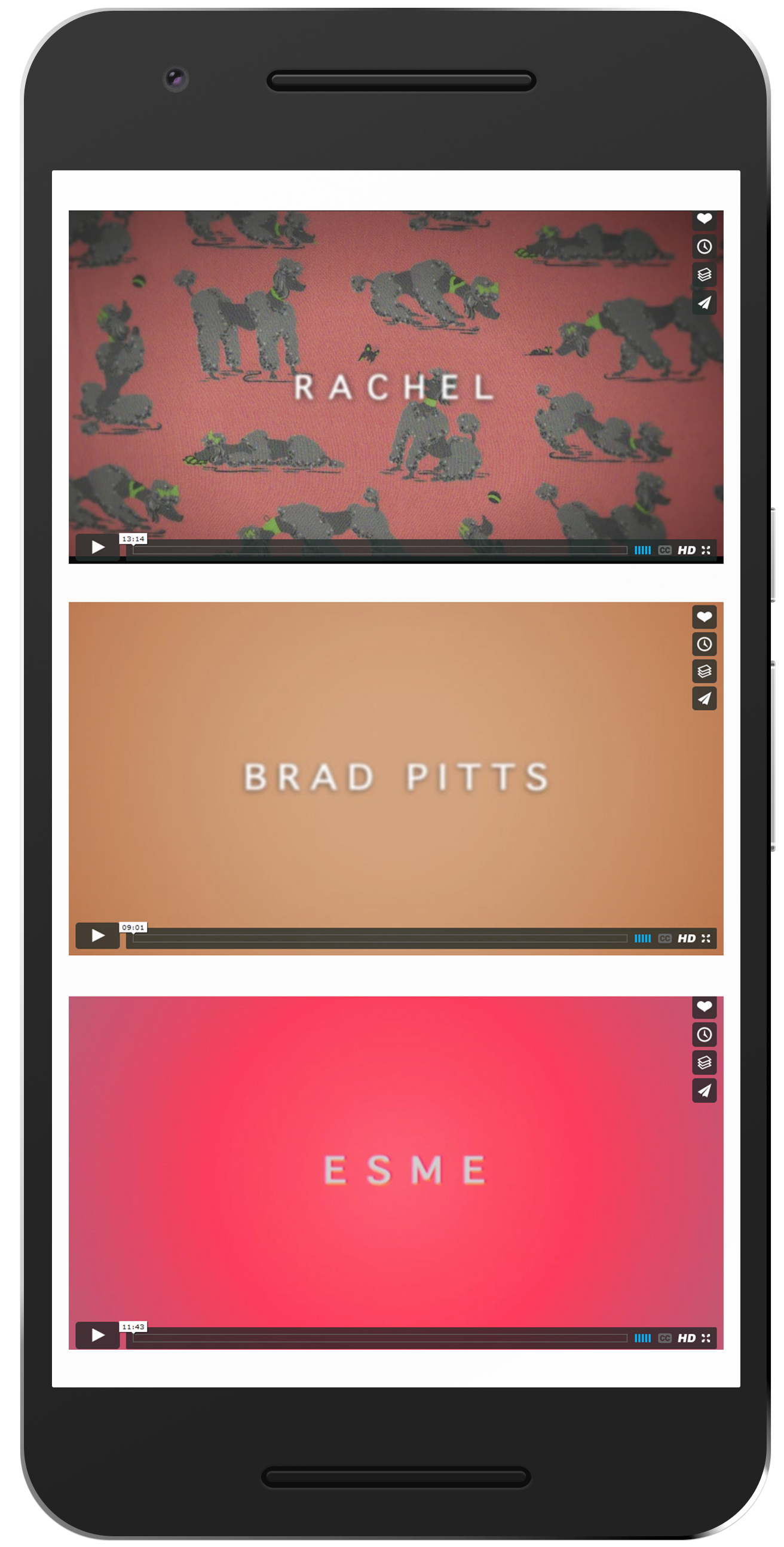
On a smartphone screen, we stack them in a single column and allow the user to swipe their finger down the screen in order to quickly scroll through them.
Different device, different experience
Consider a non-touch-screen computer with a decent-size screen: we assume the user has a mouse and keyboard, and will use these to enter information and navigate throughout the site.
By comparison, a smartphone has no mouse and often no tactile (button) keyboard. The touchscreen allows use of one's fingers to scroll, zoom, or cycle through content very quickly, and data is entered via a visual keyboard on the touchscreen itself. This screen only exists when we need it.
So we must keep in mind not only the size of the screen, but the way a user interacts with the information we present; for example, buttons might need to be larger.
Larger screens can show a lot of content at once, but scrolling through it quickly can be disorienting. Small screens have very limited "screen real estate", but it's fast and intuitive to use one's finger to scroll through long columns of information, like movie listings, pharmacy locations, or available appointment slots very quickly. We have gotten very comfortable with the process of touching our websites.
A good, responsive design will consider how people interact with particular classes of devices (smartphone, tablet, television) and offer content in an appropriate format.
Breakpoints
But how does the website know when to display the "big screen version" or the "tiny phone version" and everything in between? Inversely, how does the phone know what size the website should be in order to look its best on the phone's small screen? Since we can't count on devices to stick to a small and finite number of screen sizes/resolutions, we utilize things called breakpoints to tell the site how it should display on various screen sizes. Essentially, breakpoints refer to little bits of code which trigger the points at which the design will change its appearance. (This code basically says: "At smaller than this width, this is what the page should look like...at smaller than this new width, this is what the page should look like...etc.")
This is hard to explain in written language — the best way to see breakpoints in action is to open a fully responsive website on a high resolution desktop or laptop computer (this won't work on a smartphone, and may not work on a tablet either). Grab the bottom right corner of the browser window and slowly drag it up and to the left. Watch what happens to the content — at different points it will "break", that is, change how it displays. That's the exact same thing that's happening on your phone or tablet.
Breakpoints are coded using an approach called media queries, which tell the web browser how to display content based on the available screen area. These media queries tell the website exactly what the breakpoints are and what to do with the page when one is encountered.
A simple set of breakpoints, and their target resolutions, may include:
- "Big screen": 1100 pixels wide or wider
- Tablet: between 400 and 1100 pixels wide
- Smartphone: between 320 and 400 pixels wide.
While the available height of a screen is certainly relevant to how we want to display content, for breakpoints we are more concerned about screen width, and what is realistic to display in each row of our layout. Consider our example of videos above — since they are presented row by row, we have to know how much space, width-wise, we have available in which to show them for each screen size.
Next Year’s Model, Or “What Are We Going To Do About The iPhone 16S?”
As we should all be aware by now, web technology evolves — fast. The low bandwidth, dialup days required their own set of best practices, most of which are now obsolete. (Does anyone remember the days of 256 web-safe colors?)
We can expect devices and their capabilities to shift and evolve, and best practices to shift and evolve with them. A well designed website can remain useful and relevant for many years, but not forever. There will come a time when the technology a site is viewed on simply outpaces the site itself. At that point it's time to re-evaluate and make something new.
Responsive retrofits — a word to the wise
Designers are often asked to "retrofit" really old websites. This is almost never worth it. In almost every case, if a site is really old, it's much easier and far more cost-effective to simply start over with brand new everything and build from scratch. This may seem counter-intuitive (why not save some time and use the guts of the old thing?) but this is sort of like trying to create a new car without touching the engine which hasn't been maintained since 1967. It could be done, hypothetically, yes, but the time and energy and money that would go into fixing up the old engine so it complies with modern standards and runs well would certainly cost as much as if not more than buying a whole new one.
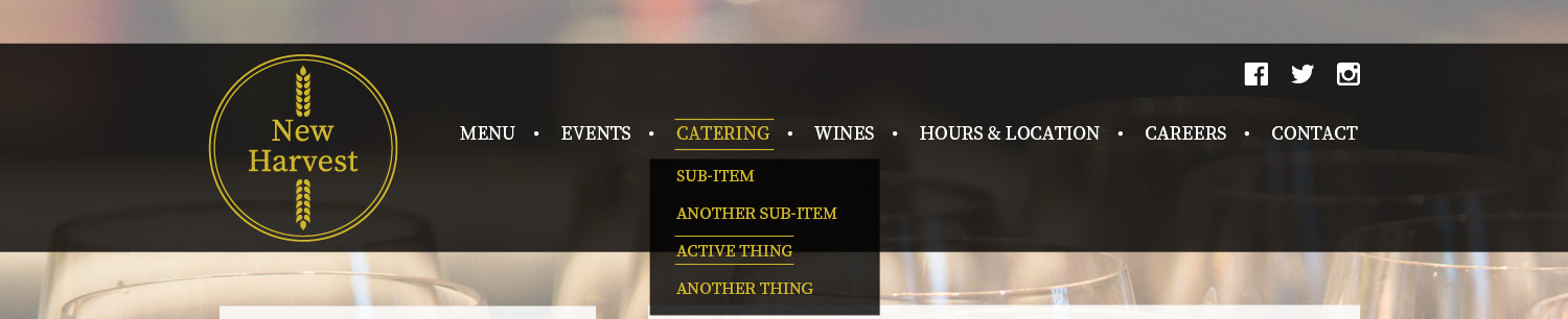
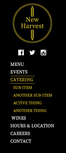
Navigation
Navigation is one of your first considerations. And it's the most important, since it's how users travel, or "navigate" throughout your site. A very common style of navigation on desktop websites is a row of links near the top of the site. You may have only a single level of links, or drop-down menus for some or all of them. This works great when you have a fair bit of screen real estate to work with.

However, when screens start to shrink, what can we do with the navigation? If we leave it alone, the links would be so small that they'd be nearly impossible to accurately poke with a finger on a phone (not to mention very hard to read). If we leave them the same size and the rest of the layout changes around them, that's not going to look very good at all and might be incredibly confusing for users.
The most common approach when making mobile responsive menus is to use collapsing menus when the site reaches its first small-screen breakpoint. We set a breakpoint at which the navigation will switch from a single row across the top to vertical navigation system that spans the full width of the screen. If we need drop-downs, we have them expand below each top level link. This looks like this, and if you've browsed the web on your phone, you've seen this method:

One thing to note here: In responsive land, wherever you have drop-down menus, you cannot have the drop-down's top level link take the user anywhere. Why? We must account for touch screens and a single button or link cannot do two totally different things at the same time. It's one or the other.
So, when the user touches the About link, for example, that action should cause the drop-down menu to appear. The link can't also take them to the About page — if it did that, there would be no way to trigger the appearance of the drop-down. Therefore, if you need a true landing page for your About section, call the first link in the drop-down menu Overview, and direct users to your About section landing page. Then when the user expands the menu, they can see all the links under About, and choose the Overview landing page to view that content.
Note: You might get around this limitation with JavaScript that detects whether a screen has touch capability and displays navigation accordingly, but you need to ensure your front end coder knows how to do this before assuming it will work.
You'll also note we repositioned the social media icons in a way that makes sense for a narrow display.
Relative Sizing
This is an essential concept in responsive design. In the past, fonts were often set at a specific size, for example, 14 pt (point) or 16px (pixels). Now, we can set font sizes relative to available screen area. This allows text to shrink and grow in a way that makes it more readable, and expand and contract dynamically on various screen sizes.
In fact, we can apply relative sizing to any element — columns, images, videos. This makes it easy to expand and contract everything on our page, based on breakpoints.
Images
One of the great things about this era of fast computers, large, high resolution screens, and great high bandwidth is our ability to use big, bold images to enhance our websites. Large slide shows are a common feature of home pages, and full screen videos are a constant. The huge slideshow is a great way to show off high-quality visuals. However, when we get down to smaller screens, we have less room in which to play, and may face bandwidth concerns like latency: when there is a significant delay between the browser requesting a page and it starting to load. It may still load quickly once it starts, but the initial delay is a problem, and will frustrate your users. Frustrated users are a serious problem.
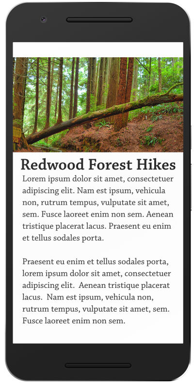
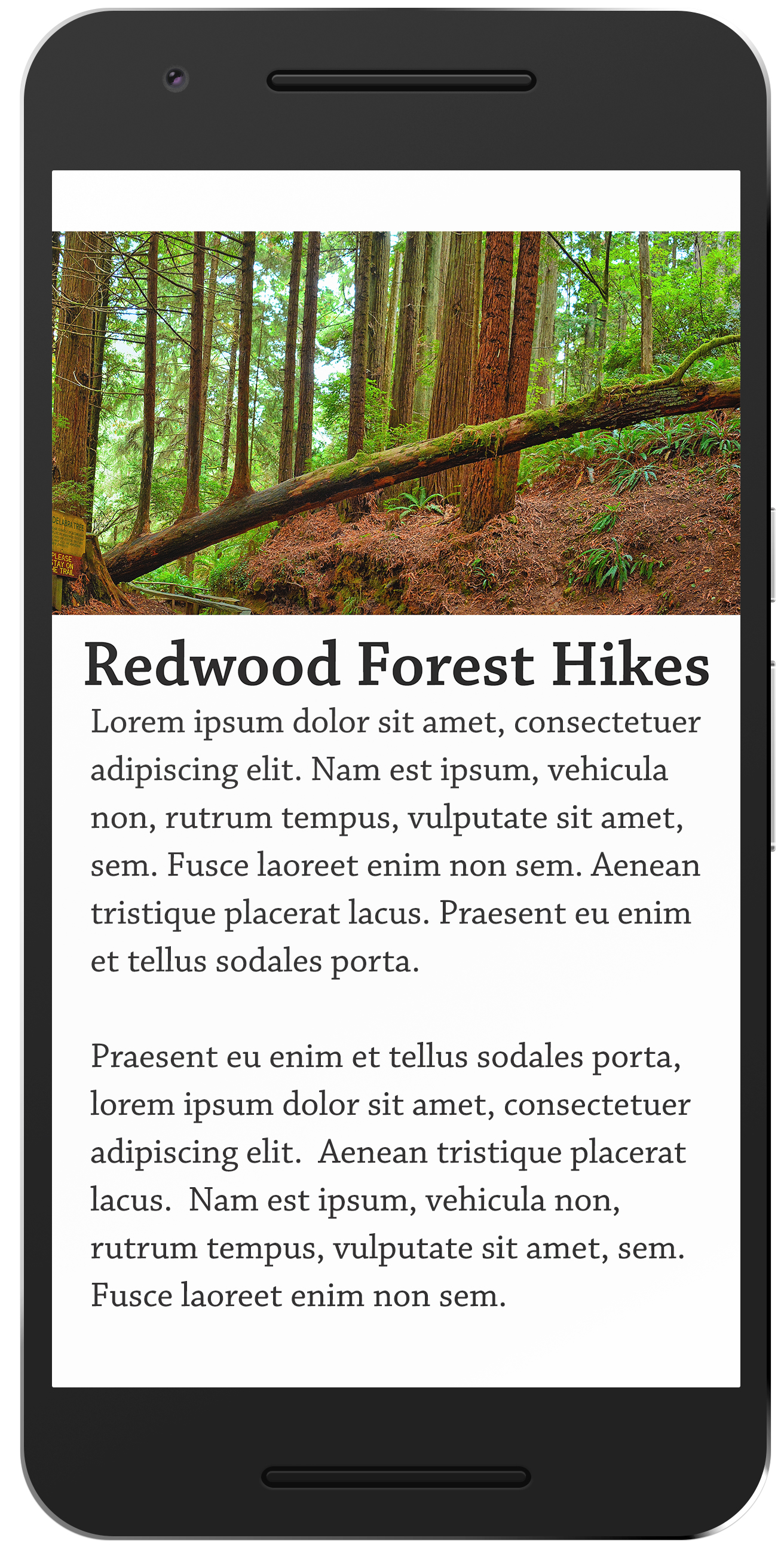
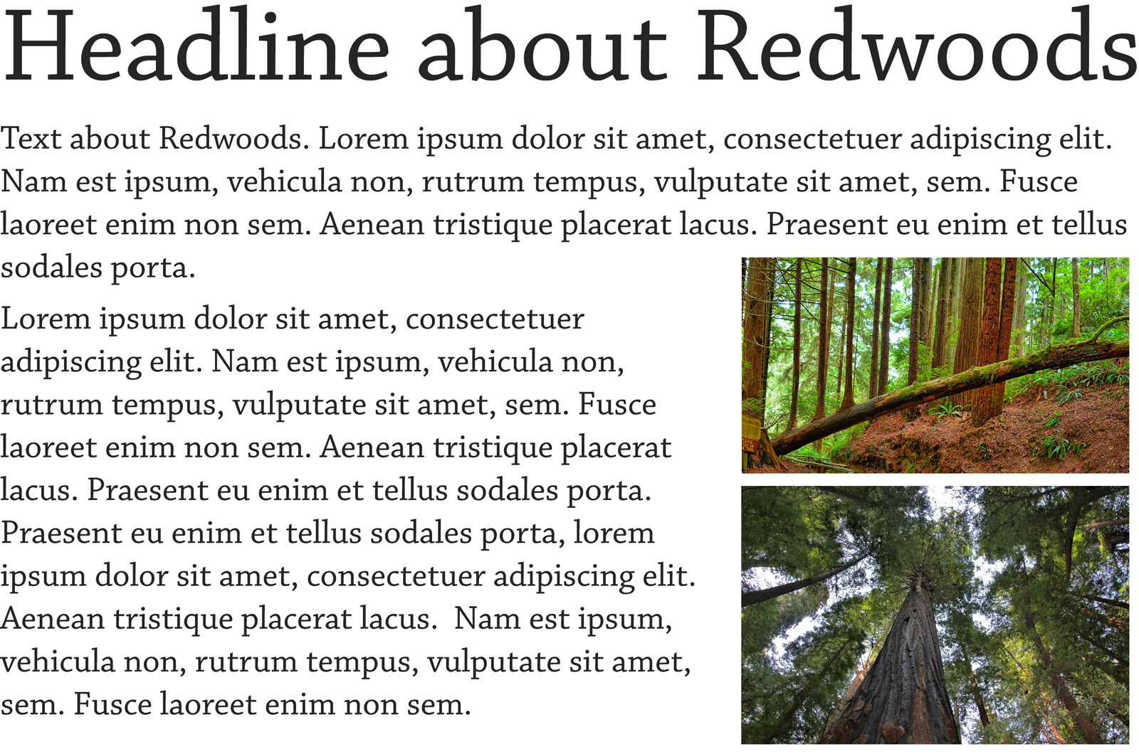
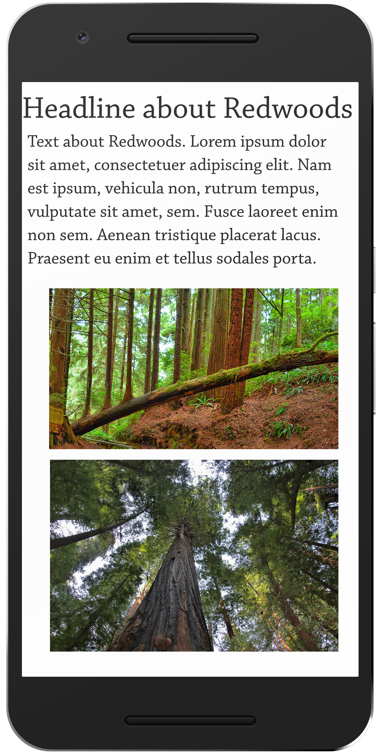
Our sample image is a stunning panorama of California's Redwood Forest, with some text overlaid. It looks great on large screens.

For smaller screens/less-than-ideal bandwidth, we have many options to deal with images — here are some common approaches.
The first is to simply scale them down to the available width of the screen.
This can work well for images that take up a big chunk of screen real estate on large screen, but if we choose this method, we're still loading the full image — which can increase load time, especially on devices with the aforementioned limitations.
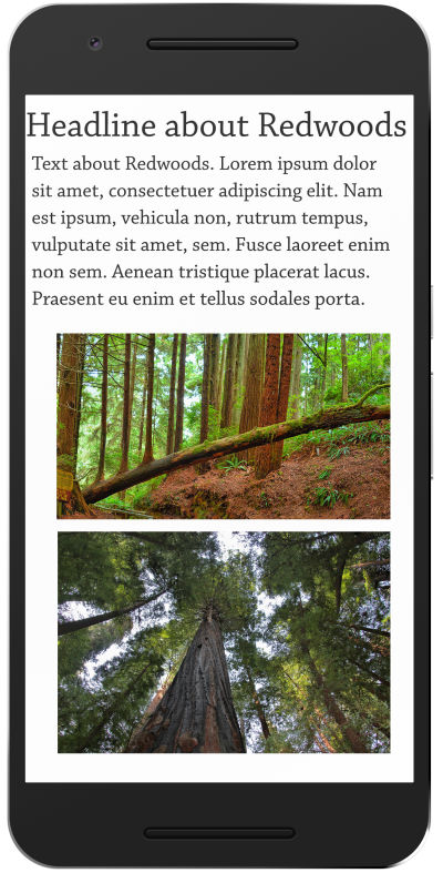
The second is to provide an alternate image that still conveys our message, but is better suited to the device.
We lose the panoramic effect, but load time is faster — key to minimizing user frustration. We've also moved our headline below the image for clarity and readability.
Commonly, for images that we "float" among text..
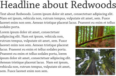
We will stack them, which may also expand them to the available width of the screen. And of course, the user will have to scroll to see the additional text.
Adaptive images give us more flexibility and save on bandwidth, and hence, load time, but they are more complicated to implement.
Using JavaScript, we check the capabilities of the device being used and display unique versions of the images tailored to it. Since this approach is evolving, I won't offer a specific technical solution here — some research will help you find the best solution for your project.
Key Considerations For Responsive Content
Content-first
- Think about the demands of your content.
- Build upwards from the content, thinking about what is most important: words, photographs, illustrations.
- Let the content drive the design rather than vice versa.
- Use progressive enhancement, that is, make sure your content is solid, engaging, and comprehensible, then build design features on top of it. For example, you might use the lazy loading technique for images, to insure core text content loads first, and users start reading it, before displaying images.
Considerations for advertising
While the Internet Advertising Bureau (IAB) offers various standards for fixed-dimension banner ads, these are no longer relevant to a responsive website where available space varies. If you need to serve advertising, you must pay careful attention to size and placement, and test your site on a variety of devices. You will likely need to use some of the same responsive techniques noted earlier (stacking, adaptive images) for banner ads. Also note that ad blockers may compromise your site's display of ads.
Taking advantage of mobile device capabilities
New capabilities come with mobile devices, like accelerometer, multi-touch, and, GPS (Global Positioning System). Consider how these might allow you to make content more relevant to users. For example, as the user gets nearer to a venue, instructions on how to find it will change based on their location (related to the website by the user's GPS). It's worth talking through new possibilities offered by mobile devices.
Responsive Images And Art Direction
Art Direction helps convey moods, messages, and concepts on your website. For example, let's say we want this cup of espresso to present the danesi logo very clearly. On large screens, this loosely cropped image will work great.

However, for smartphones, we may want to substitute this tightly cropped image to insure the logo is more prominent.

This insures the logo remains clear and readable, while maintaining a consistent feel.
Video
Video players need to scale appropriately to a device's screen size—there are various techniques to appropriately fit videos to the size and resolution of the user's screen (see the previous examples).
Video is a demanding medium — it may not be ideal over slow/bad connections, which are more likely on mobile devices. (Think of someone on the go, using whatever 3G/4G connection is available. It may be fast, or it may be spotty.) Never set videos to play automatically, and be careful of loading too many on a page at once — this cause pages to load slowly. As for images, consider using a "lazy loading" technique where video players defer loading until the user scrolls to them.
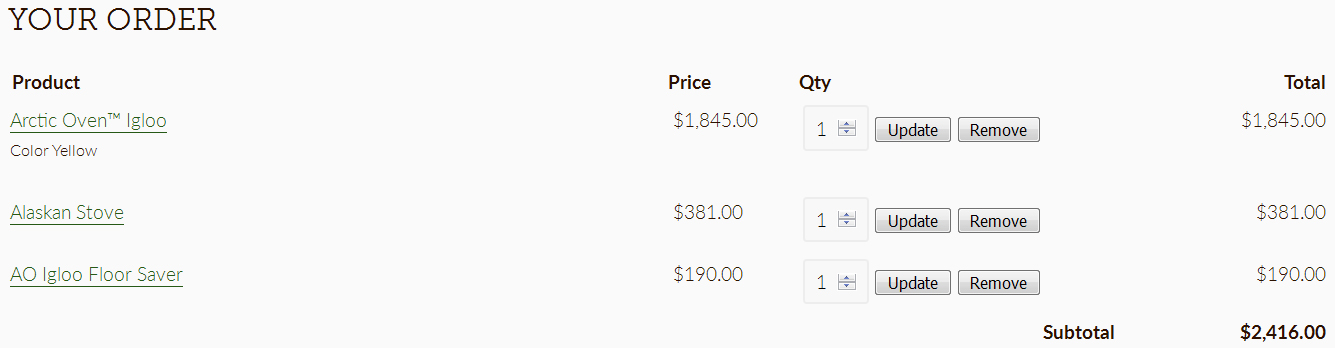
Tables
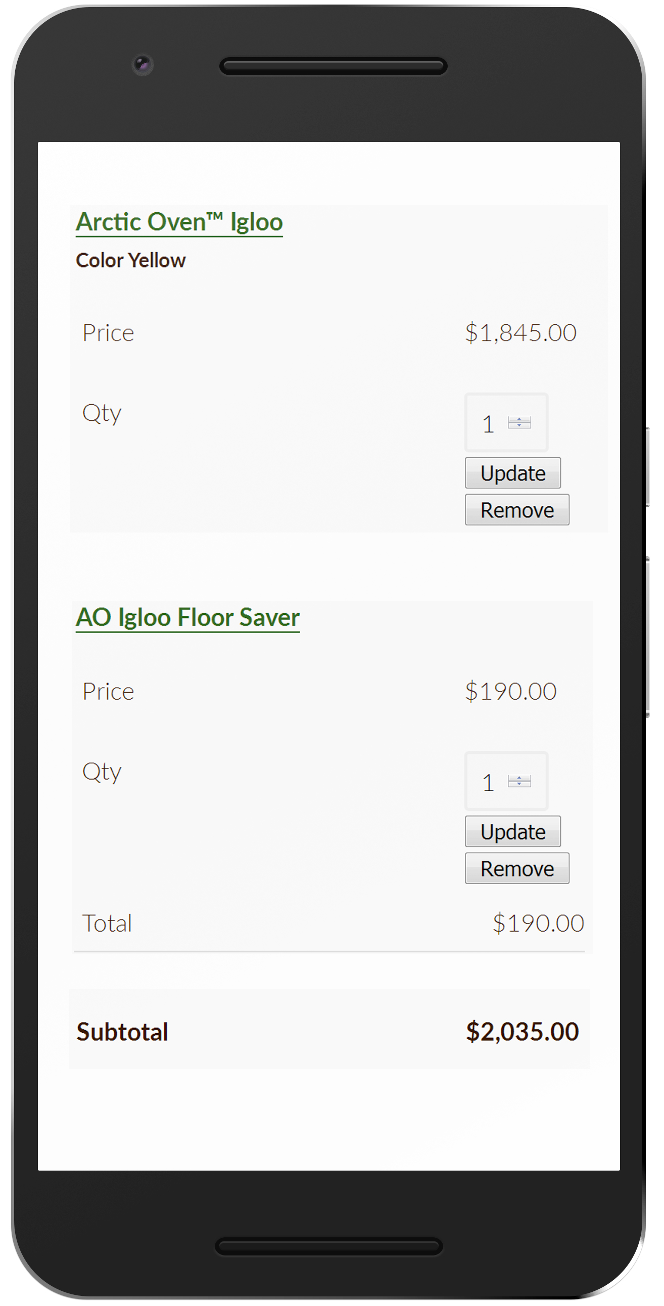
Tables are great for for displaying certain types of information. For example, items in a shopping cart.
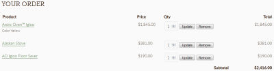
When we get to smartphone size, however, we simply don't have room for all these columns, so we use JavaScript to reformat the data to display in a useful format. There exist various technical solutions for this challenge. Research will determine the right one for your project.

Key considerations for tables
- What is the data in your table, and how can it be expressed in another way?
- Can you provide an alternate format for the table (for smaller screens)?
- Can you use a PDF?
Links, buttons, and hotspots
These require special consideration for touch devices. Make sure they are large enough to be easily accessed by a finger. More on touch target size.
What about feature phones, other limited devices or bandwidth limitations?
In some countries, feature phones are commonly used to access web-based content. (Most Blackberry phones are considered feature phones — they can access the Internet, but they don't offer the full range of smartphone features — robust web browser included.) Feature phones are not smartphones, and their user agents (browsers) can be very limited. There may additional concerns about bandwidth and latency, especially when serving populations in rural areas, developing regions, or anywhere Internet access is less than ideal.

Designing for these devices is outside the scope of this guide. If you need your site to be accessible on feature phones or devices with specific limitations, you must do additional research. Know your audience — if you're marketing heavily in an area of the world in which users use feature phones more than, say, Samsung Galaxy S phones, you might want to make some changes to your strategy, and build in contingencies for these users. There certainly are technological ways to make sure all your users have a rewarding experience on your site, it just may take some extra work.
In the next (and final) part of this series, I'll shed a light on the core approaches to creating a web design. We'll also discuss pattern libraries, pre- and post-launch coordination, as well as why technical documentation should not be underestimated. Once again, stay tuned!
Further Reading
- What Leonardo Da Vinci Can Teach Us About Web Design
- Facilitating Inclusive Online Workshops (Part 1)
- A Comprehensive Checklist For Running Design Workshops
- A Book Release For Click! And A Chance To Rethink Our Routines
 (vf, ra, yk, il, mrn)

