Connecting With Users: Incorporating Humor In Web Design

Email Newsletter
Weekly tips on front-end & UX.
Trusted by 200,000+ folks.


 Register!

 Flexible CMS. Headless & API 1st
Joan is applying for a small loan on all-online-loanzzz.com. She’s becoming frustrated with the number of financial-disclosure forms she has to fill out. She’s thinking about visiting her local bank to ask for a loan instead.
While waiting for a page to load, the application presents a cartoon image of a person wearing a business suit sitting in a jail cell. The image caption says, “Hey, everyone hates disclosures. We know you do, too. We’re doing our best to keep everyone out of jail. Please bear with us for a few more clicks. You won’t regret it, and our loan officers will stay out of jail.” Joan smirks at the image. She might not appreciate the number of forms she has to complete, but she understands the serious nature of applying for a loan.
Humor is an important aspect of life. Researchers find humor has many positive benefits. It can reduce stress, increase psychological well being and increase tolerance for pain. Most of us have had experiences in which we’ve used humor to lighten a mood or cheer someone up. Humor is integral and inherent to human relationships.
You can use humor in your design (both in the process and the product) to create a positive user experience. We want to develop positive relationships with our users — humor can help make that happen.
But how do I do this?, you might ask. Do I need to be a comedian? Should I format all of my FAQs as knock-knock jokes? The answer is no to both of those questions. You can incorporate humor in your design, maintain your brand identity and not look like you are trying too hard in the process.
Humor Has A Role In Design
People in general, many of them your potential users, enjoy humorous things every day: Side-splitting memes go viral, people share humorous personal stories on social media with friends and colleagues, awkward family photos get shared, and products are reviewed tongue in cheek, to name a few ways. We acknowledge humor done well over digital media: the Webbys have a humor category for its annual website awards; the Shorty Awards have a “Best Use of Humor” category for its social media award.
You don’t have to be all or nothing about your use of humor. You can use humor without presenting a comedy-focused experience. You can inject humorous elements in the experience, the same way you might add a unique icon: to add meaning and create a shared language with users. You can also use humor in your content to help form a connection with users.
Espen Brunborg, speaking at Beyond Tellerrand, discusses the importance of effective use of comedy in a landscape where many websites look and feel the same across industries. Humor can set your experience apart from others in a positive way. You make your brand memorable and build relationships with users by effectively using humor.
Humor could potentially lead to a deeper emotional experience for the user, a key component for an effective UX. I’ll talk about opportunities to insert humor in the experience later. First, let’s discuss types of humor to consider.
What Makes Something Funny?
I apologize in advance. I’m going to try to explain why something is funny. First, humor is extremely subjective. I happen to think I’m hilarious. I often make jokes during meetings and when I speak at conferences. Almost as often, no one laughs at my jokes. Humor is contextual. You might make a joke that is funny in one situation and taken seriously in another setting. Also, humor is cultural. My experience with humor has all been through the eyes of Western cultures. I wouldn’t assume that my view of humor is transferable to other cultures.
Researchers have attempted to develop theories accounting for why something is funny. The incongruity theory posits that people find humor when something happens that is not in line with their expectation — for example, an envelope being opened and then glitter exploding all over the room. The benign-violation theory suggests people find humor in situations where something seems threatening but they know they are safe. For example, puns often violate laws of language, but the words in them still make sense. Listeners face the threat of having to decode language in a new or unusual way, yet they still feel safe after realizing the words themselves have retained their meaning. Slate offers a good article discussing theories of humor more in depth.
So, why do we sometimes attempt and fail at humor? The theories touched upon above suggest that going too far beyond or not far enough at either creating incongruity or threatening a violation are reasons for humor to fail. For example, it would be very incongruous to stand up and shout expletives in the middle of the work day in an office. However, this would probably go too far in violating congruity for people to find funny. Or, from the benign-violation theory perspective, this scenario would meet the threshold for providing a threat, but people might not know whether they are safe from the person screaming curse words. Therefore, they might react in fear rather than humor.
Slowing Users Down (In A Good Way)
Whether you subscribe to either theory above or another, your use of humor is an active attempt to slow down users’ ability to process information. Researchers call this “elaboration,” a fancy word for paying close attention. Users elaborate on humorous messages because the incongruency or violation of the norm requires closer scrutiny to process the message.
Espen Brunborg says that using comedy to slow users down might actually enhance the experience. When it comes to processing information, we shouldn’t be afraid that this slowing down will negatively impact the experience. Users are unlikely to notice, unless they find the humor inappropriate. The benefit of having users engage in elaboration while using your product is that this has been shown to lead to increased processing and greater recall of content. If users engage in increased elaboration of your experience and content, researchers suggest (PDF) they will have a more memorable experience.
Six Types Of Humor
We need to understand context in order to use humor appropriately. Researchers have identified different types of humor. Choose the type according to the situation in order to increase the likelihood of success. We can often label attempts at humor with more than one category. Below are six types researchers have defined.
Comparison
This puts two or more elements together to produce a humorous contrast. Apple’s old “Get a Mac” commercials featuring our friends Mac and PC were examples of comparison. There was humor in comparing the hip and cool Mac to the boring and stuffy PC. It also had elements of exaggeration (covered below), given that it is doubtful Mac users share all of the traits of the Mac in the commercial (and, likewise, the PC users with the PC).
Personification
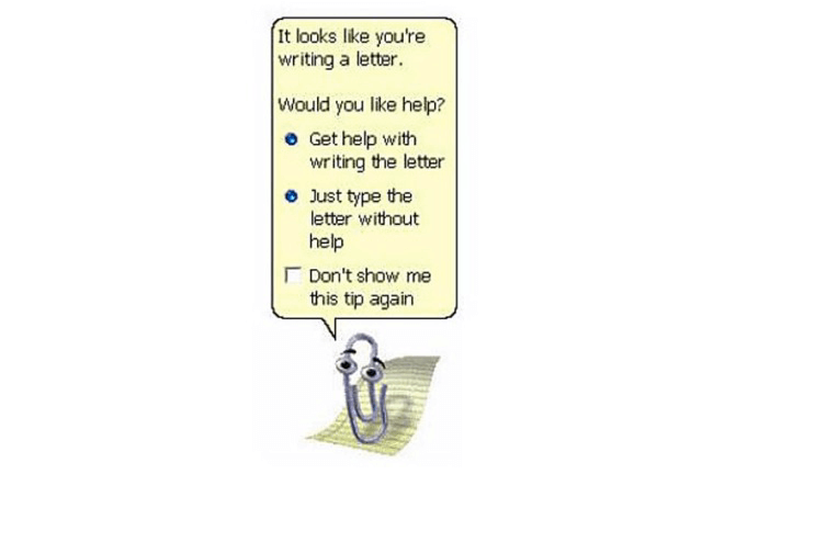
This attributes human characteristics to animals, plants and objects. Personification helps us understand complex concepts and might also make people more receptive to information. Clippy, the Microsoft Office assistant, is an example of personification. Microsoft’s hope was that a funny personified paperclip would help users learn critical tasks in the Office programs. Clippy is no longer with us, but personification continues. Users found Clippy to be annoying and intrusive, highlighting the need for us to understand our users and their context before bombarding them with what we consider to be humorous. Clippy actually slowed things down, a death sentence for any product meant to promote productivity.
Exaggeration
This overstates or magnifies something out of proportion. Exaggeration is often used to drive home a point. Researchers have found evidence that exaggeration makes people more aware you are trying to make a point, but not necessarily more open to the point you are making. “It took me forever to write this sentence” is an example of exaggeration — although Smashing Magazine’s editors might feel it’s true.
Pun
This uses elements of language to create new meanings that result in humor. Researchers have found that people are better able to remember puns over other types of information. You could take advantage of puns to make parts of your experience more memorable or to increase the likelihood that users will remember certain parts of their experience (such as their password). David Pope’s post on SAS’ blog uses puns to tie together relevant terms from SAS’ product to tell the story of how the company has evolved over time.
Silliness
This ranges from a funny face to a ludicrous situation. Sarcastic comments and situations could be classified as silliness. We see a lot of silly humor online and in movies. I opened this article with an example that you could classify as silliness. Philosophers suggest that this type of humor allows us to laugh at ourselves, a potential for removing barriers to learning and critical thinking.
Surprise
Humor can arise from an unexpected situation. A spring-loaded glitter bomb is an example of a surprise. People who think they are opening a letter are not prepared for the blast of glitter that covers them. Not everyone would find it funny, but the intent is to create a surprisingly humorous situation.
When To Use Humor
Use humor at the appropriate time and place in the experience. Remember that humor can enhance your relationship with users. Mix in humor to build your brand and relate to users. Humor is perfectly appropriate in otherwise benign situations: successfully sending an email, placing an order for food or updating profile information, to name a few.
For example, if someone has just successfully completed a transfer of money from their checking account to savings account, you might present them with a humorous message about building their nest egg. On the other hand, if someone doesn’t have enough funds in their account to cover a bill they are trying to pay, they probably would not appreciate a humorous element that reminds them of their financial situation.
Unless your experience focuses on humor, such as The Onion’s, there’s no reason to be slapstick or go overboard. Humor can become a distraction when it’s too much of a good thing. What follows are examples of when it is appropriate.
On An “About” Page
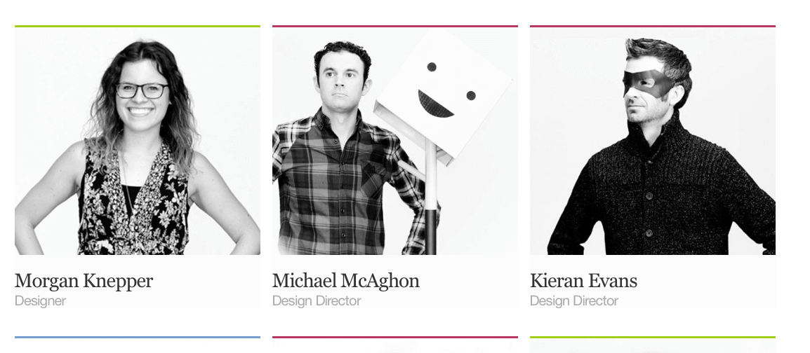
Current and future clients and staff will view your “About” page to learn about your culture. Highlight your sense of humor on the page if appropriate. The “About” page is an opportunity to show visitors the type of people they will be working with. EY Intuitive’s staff chose the photos below for their “About” page. Many of the staff express a sense of humor through body language or props. Imagine how many people who visit the office ask Michael how his box-on-a-coat-rack friend is doing, or ask Kieran whether he always wears his superhero disguise around the office.
To Convey Important Information
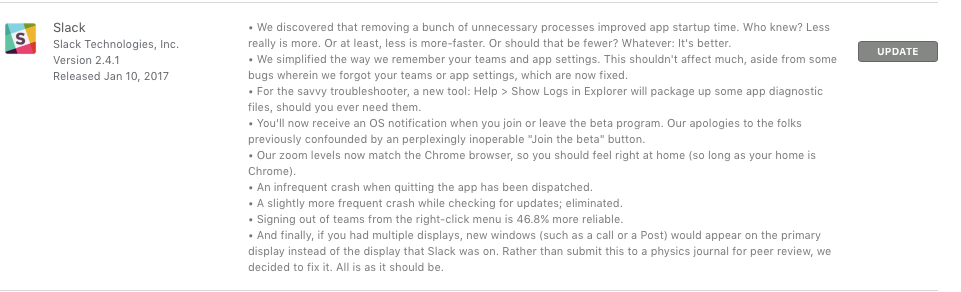
Researchers have found that people tend to pay closer attention when they encounter appropriate humorous messages. The folks at Slack have been masterful at getting people to pay attention to their product updates (shown below). Perhaps there are ways to present end-user license agreements (EULAs) and other traditionally tedious documentation in a way that better grabs the user’s attention. Even though your EULA might need to meet the needs of those with a law degree, your images or visualization of the EULA could use silliness to make it less taxing to read.
When It Builds Or Fits Your Brand
You can use humor to inject personality into the relationship between your brand and users. We don’t typically think of signing up for insurance and workplace benefits as being amusing. The level of complexity can be overwhelming.
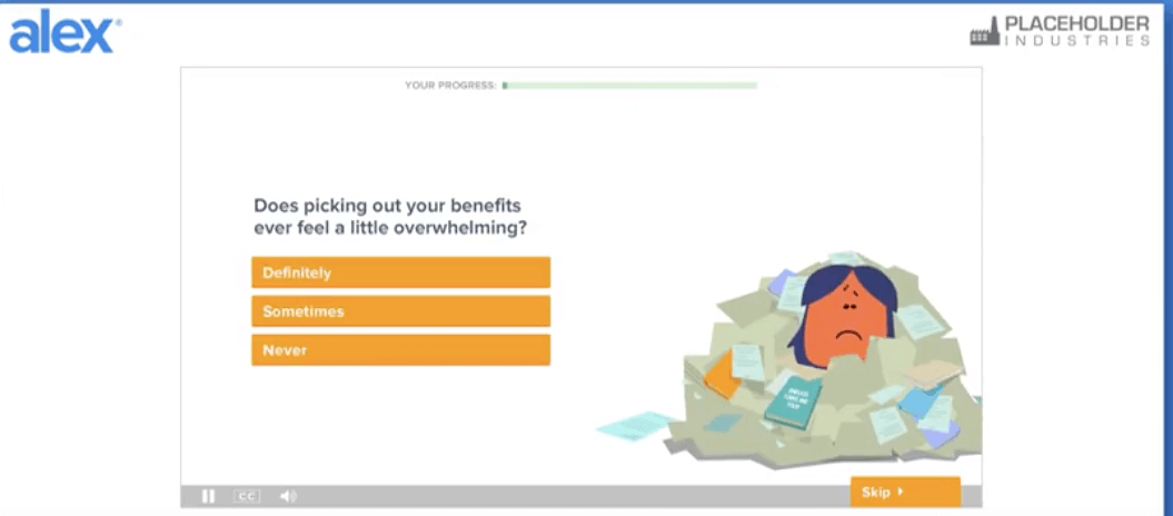
ALEX is a tool for communicating employee benefits. It builds its brand around humor to convey different benefits and options to employees. ALEX is careful not to go overboard, instead relying on subtle humor through images and a relaxed conversational tone (see below). Jellyvision, the company that created ALEX, maintains a sense of humor across the brand — for example, in its engaging blog posts.
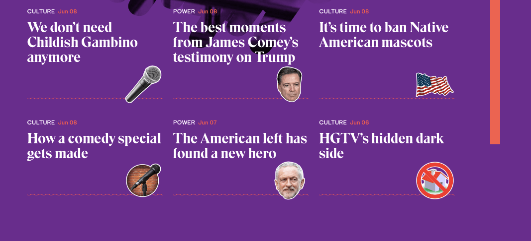
The Outline team intersperses elements of humor throughout its experience. For example, the floating heads and other objects next to the articles on its home page provide a humorous glimpse into the topics of the articles (see below). Silly wavy lines establish a shared language with users, who come to associate the silly wavy lines with the appearance of quotes.
As done with ALEX, you will want to use humor in a consistent way and tone if it will be part of your brand communication. It should be consistent across channels and media. For example, humor on your website should carry over to your marketing material. A content style guide, similar to MailChimp’s, would help with the consistent application of humor, regardless of who on your staff is creating the content and where that content will live.
In Chatbots
Chatbots are growing in popularity across industries. People want their chatbots to have personality, including humor as appropriate. In an article for NPR, Shay Maunz writes about the need for chatbots to have a warm and human-like personality for long-term success. You will need to account for some level of humor if you want your chatbot to have human-like conversational aspects.
On The 404 Page Or To Reduce Frustration
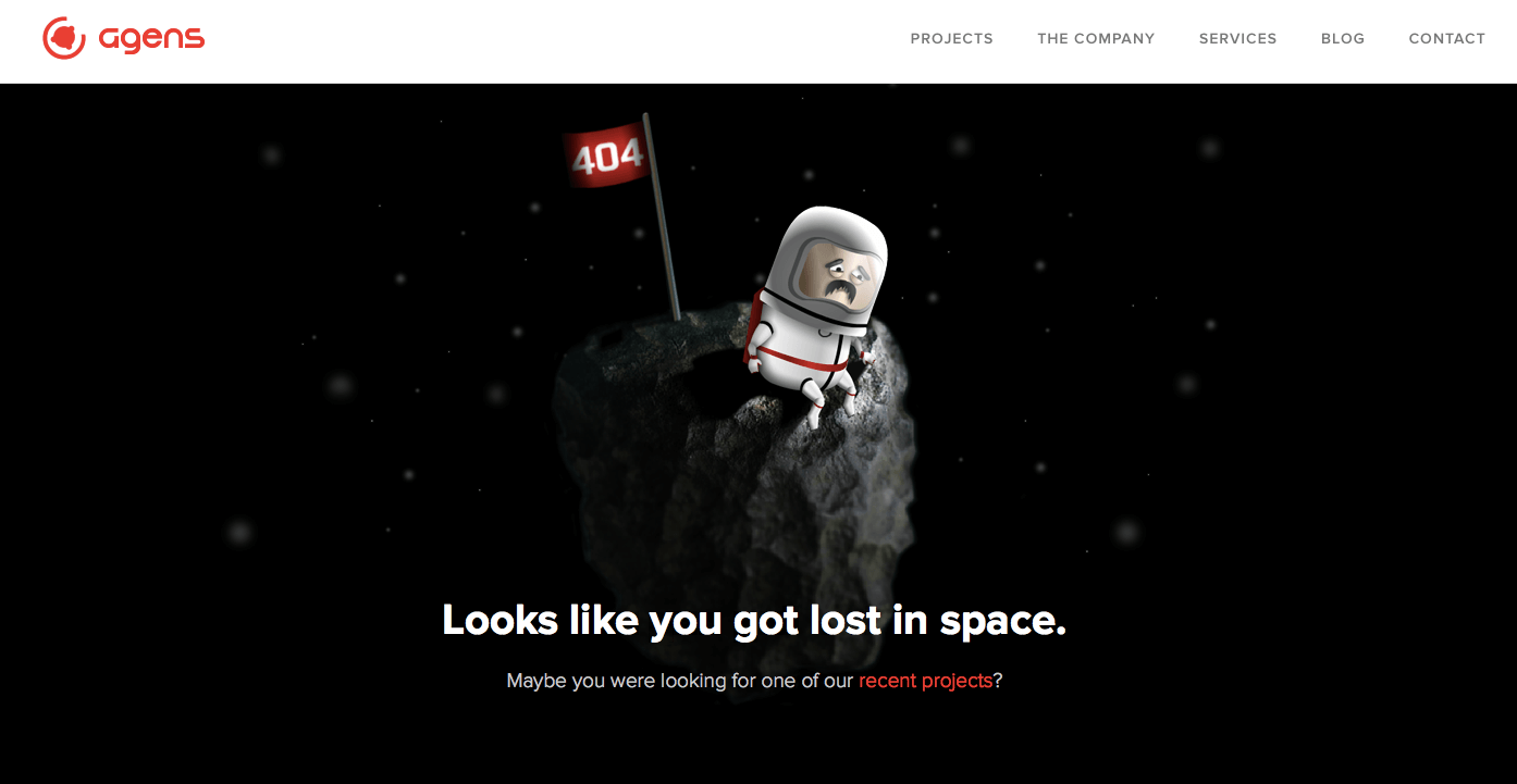
Many websites have humorous 404 pages. You can curb the frustration of users not finding what they are looking for with a well-done humorous 404 page. Agens, a Norwegian design and development studio, uses humorous images and animation on the theme of being lost in space on its 404 page. Equally important, it surfaces a link to existing content, allowing users to quickly navigate to a page that potentially meets their needs.
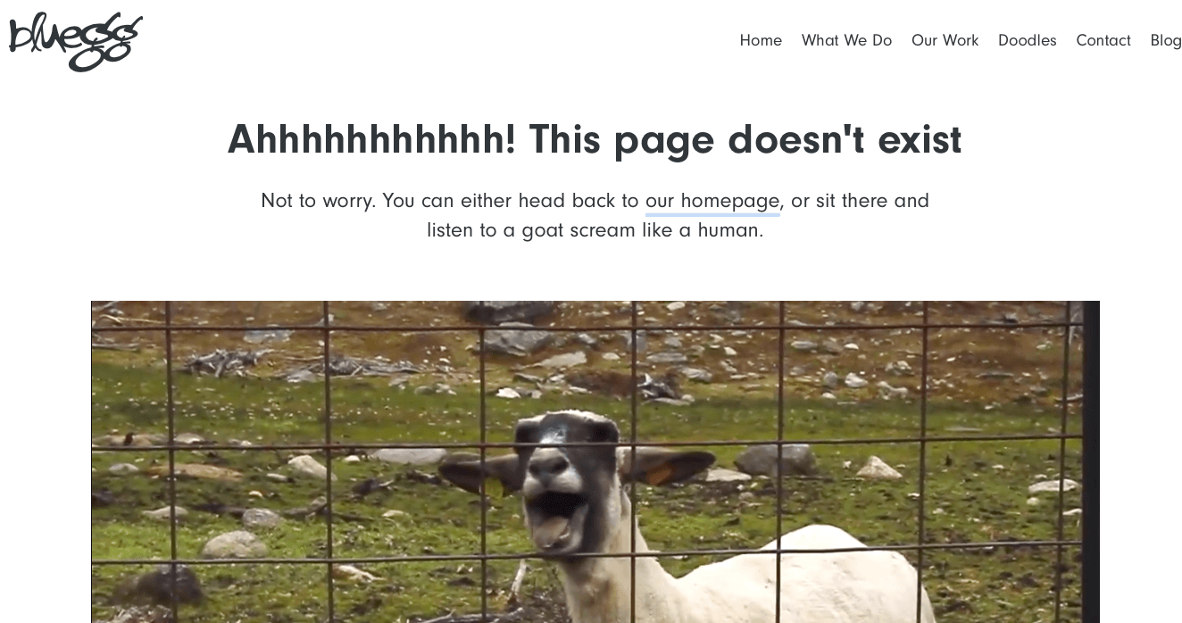
The folks at Blue Egg use humorous video and (slightly annoying) sound on their 404 page, linking directly to the home page.
When Not To Use Humor
You can damage your brand or experience if you use humor inappropriately or at inappropriate times. Most users want a quick and easy experience – don’t use humor to extend the time it takes a user to complete a task. For example, adding a knock-knock joke or funny comment to a page-loading screen is fine, but making the user click through a knock-knock joke to access account information is not.
Another option is to introduce humor tactically based on the user or company using your application — for example, going for a silly interface if you’re a startup but staying fairly straight-laced if you’re serving a government agency or bank. You could also let users choose when humor is presented. MailChimp accomplishes this with its “Party Pooper Mode.” Users who want the functionality of MailChimp without the humor can use this mode to remove some of the funnier elements of the application.
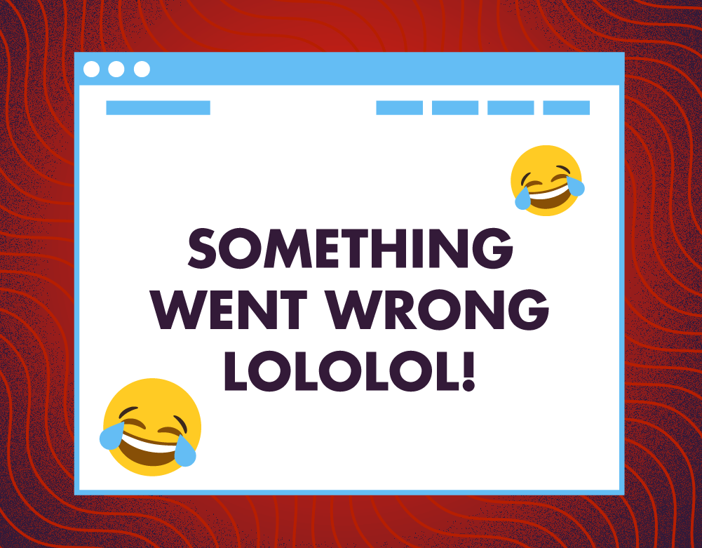
For Accomplishing Critical Tasks
Users usually want to accomplish important tasks quickly. Your humor shouldn’t impede their progress or cause confusion. Suppose you’re making a large purchase online, and you receive the message shown below after submitting your payment information. Not only is it unclear what has happened and how you can remedy the situation, but the laughing emoji comes across as overly sarcastic and condescending. You would likely feel confused about the status of your payment, frustrated at the levity with which the website treats the situation, and angry that you’re not presented with a quick and easy way to resolve the problem.
When It Is Out Of Line, Overly Sarcastic Or Mean
People often couch mean or negative comments in humor. Don’t make fun of your users. Messages conveyed in a digital medium can suffer from a lack of context, tone and intonation. That’s why so many people type “JK” (just kidding) after writing something intended to be humorous; some forms of humor demand visual and aural cues that tell us someone is joking. Users shouldn’t think you are making fun of them or being deliberately insensitive.
Groupon found itself in hot water after a failed attempt at humor in an ad that ran during the 2011 Super Bowl. The ad made light of the plight of people living in Tibet in a tasteless way. The media and customers noticed this immediately, with many outlets writing about the poor use of humor and the resulting damage to the brand.
UX designer Brandon Dorn has an excellent post on “confirmshaming.” Confirmshaming is the insulting microcopy that many digital properties have started to include when users try to opt out, withdraw membership or ignore a call to action (for example, declining to sign up for a newsletter). As Dorn puts it, confirmshaming is the digital equivalent of a salesperson following you around a clothing store telling you that your current outfit is ugly. I’ve also discussed confirmshaming in my chapter on framing content in Design for the Mind. Confirmshaming is insulting and disrespectful to users. If you feel a need to insult users in order to try to strongarm them into doing something, reconsider what you are asking them to do and why you don’t expect them to willfully engage in the behavior.
When It’s A Distraction Or Provides False Information
Users rely on you to provide accurate information and service. You will not succeed if they lose trust. Poorly done humor could decrease trust in your product. Avoid it by testing copy with users for both understanding and impact. Also, consider investing in a professional copywriter with experience in comedic writing.
I confess that I don’t enjoy anything about April Fool’s Day. A day dedicated to lying doesn’t sit well with me. Nevertheless, April Fool’s pranks have proliferated on the Internet. Often, these pranks waste time and backfire by misleading users. Some users might find a particular April Fool’s prank to be extremely humorous, but I don’t think it’s worth the risk of bad press and angry users. Similarly, avoid any attempt at humor that could mislead users and potentially cause them anxiety, regardless of what day it is.
With Great Power Comes Great Responsibility
You can do damage if you come across as condescending or insulting. Don’t prolong or distract users from completing critical tasks. As with any design element, if humor doesn’t improve the experience, don’t use it — even if the competition does. You are better off not using humor than attempting to use it and risking having to apologize.
Conduct usability testing to improve the chances that your use of humor will align with user expectations. Additionally, create personas to guide the use and type of humor that you employ. You could direct certain humorous elements towards specific personas and tone down the humor for other personas at various points in the experience.
Humor can give you an edge with users. Done appropriately, it can defuse a stressful situation, help build your brand and convey your message. You don’t need a funny product in order to use humor. There are many opportunities to use it appropriately. Depending on your product, you could start to incorporate it in your “About” or staff bio pages, or try it on your 404 page and gauge how the audience reacts. Test any attempt at humor prior to going live. Be open-minded and willing to take criticism. Users are not monolithic in their sense of humor, so be sure not to go overboard if humor isn’t the purpose of your product.
Additional Resources
- “Types of Humor in Television and Magazine Advertising” (Word document), Codruta Catanescu and Gail Tom, Review of Business
- “E-Learning Practice: Adding Humor to Your Online Class,” Paul Stoll, The University of Arizona
- “The Humorous Message Taxonomy: A Framework for the Study of Humorous Ads,” Paul Surgi Speck, Current Issues and Research in Advertising
- “The Effect of Humor on Memory: Constrained by the Pun,” Hannah Summerfelt, Louis Lippman and Ira E. Hyman Jr., The Journal of General Psychology
Further Reading
- Getting Practical With Microcopy
- A Fun Approach To Creating More Successful Websites
- This Interface Is A (Good) Joke!
- Effective Message Framing To Motivate Users


