How Usability Testing Drastically Improved My Client’s App

Email Newsletter
Weekly tips on front-end & UX.
Trusted by 200,000+ folks.

 Flexible CMS. Headless & API 1st

Most designers spend too much time with their designs to be objective about them. The best thing any designer can do is to collect feedback from real users. Testing uncovers pain points and flaws in a design that are not otherwise obvious.
Recently, I had an opportunity to experience this firsthand when iterating on HelloSign, the iOS app that enables users to scan, sign and send documents from their phone using the built-in camera. Thanks to testing, the app went from four stars to a solid five stars after a redesign. We’ll look at how the app started, how we ran the tests and how the product ended up with five stars.
The Original Design
This app has four primary sections: authentication, welcome, document creation and document editing. The biggest changes we made to the app were on the authentication and welcome screens. We’ll first briefly review the original designs of these screens, as well as the document creation and editing screens, to understand how the app works.
Authentication And Welcome
The authentication and welcome screens are important moments in the user’s initial experience of the product, because we want to move the user from signing up or — if they already have an account on the HelloSign website — signing in to creating documents. The app was designed to complement the website, with the understanding that users would already be somewhat familiar with the product and would likely have a user name. Had this been designed as a standalone app, authentication would have been a secondary option, rather than a requirement.
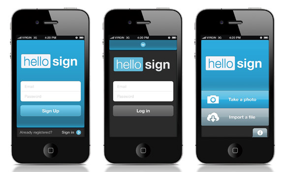
The original versions of the sign-in, sign-up and welcome screens.
Document Creation
The document creation process consists, in essence, of a camera, with guides to position the document in the frame. In designing this process, we looked to the camera screens of the iPhone’s native Camera app and of Instagram, as well as to the framing markers found in products such as Schwab’s app for depositing checks and Card.io’s app for scanning credit cards.
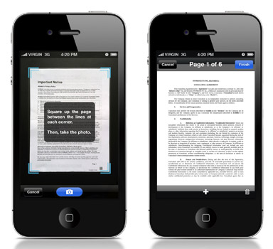
The final document creation screens.
Document Editing
After creating a document, the user is presented with the editing screen. Here, they can modify the document by adding signatures, text, checkboxes and date stamps.
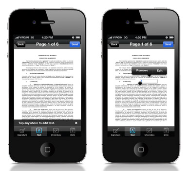
The final document editing screens.
User Testing
A few months after the initial version landed in the App Store, I was given an opportunity to iterate on the app. Before beginning, I decided to run a user test to better understand what in the app was effective and what could be improved.
While several user-testing services are available, such as Verify and uTest, I decided on UserTesting.com because of the quality and value that you get for the relatively inexpensive price. Different testing services offer different benefits, features and options; review them for yourself, and select the one that best fits your goals and needs. With UserTesting.com, you purchase a package of tests, and users will record videos as they go through whatever task you’ve assigned to them. You may also ask several follow-up questions of each user, such as, “What was the most frustrating part of your experience?” Conveniently, UserTesting.com provides four very strong default questions that will suit most tests.
As explained by Jakob Nielsen, testing interfaces on many users is not necessary in order to identify issues; even three to five users might suffice. Because this app is for on-the-fly document signing, we ran a test that took users through a typical use case: creating, editing and sending a document. Follow-up questions were based on UserTesting.com’s suggestions and queried users on ease of use, areas of difficulty and areas for improvement. You could ask many different questions. Once the tests were completed, after just a couple of hours, I could immediately identify several issues.
I reviewed each video twice. The first pass was merely to identify any glaring issues and to familiarize myself with the tester’s recording style. On the second pass, I paid closer attention, noting specific problems. During testing, most users won’t articulate problems they’re having, but the problems will be fairly obvious from their behavior. A problem is obvious when the user does any of the following:
- pauses for a few seconds when trying to complete a task,
- stumbles and has to backtrack in their steps or has to undo an action,
- expresses audible frustration (a sigh or grumble),
- takes a longer route to achieve a goal than expected,
- fails entirely at a task.
While there are certainly many others, these are some of the most common indicators of a problem worth delving into. The more tests you run (with small groups), the more problems you will identify. Running a test after each new design iteration is highly valuable, if you can afford to do so. Some problems might affect only a small percentage of your user base, while others might affect the vast majority. Spend time prioritizing the problems that you identify according to your existing list of features, goals and user requests. Not every problem is worth resolving.
The Redesign
The goal of HelloSign’s redesign was to identify and fix any major problems for users. As mentioned, one can take forever to resolve every last issue; budget limitations kept our scope small.
What Did We Learn?
The tests revealed a major problem with the authentication screens. It seemed to be a stumbling block because most users weren’t clear about whether they were in the “sign up” or “sign in” state. Users often tapped back and forth between authentication states before understanding which screen was for signing up and which was for signing in.
We also discovered the following:
- Creating pages was too repetitive a process. After taking each photo, the user had to tap “Add page,” take another photo and then repeat. This was tedious, and some testers remarked that the process felt unnecessarily repetitive, while others expressed audible frustration.
- Users could not edit a date after adding one. One tester wanted to add a past date to a document. While a “date” object could be added to the document, it showed only the current date (i.e. of creation) and could not be edited. This was confusing and unnecessarily restrictive.
- Markers for aligning the document during scanning needed refinement. Users had trouble lining up the document with the boundaries on the camera screen, with some expressing frustration and with many giving up.
Fixing Authentication
Our most substantial changes were to the authentication process, which was changed almost entirely. Dumping the user right into the sign-up screen, with only a “Sign up” button as a state indicator, proved to be confusing. During testing, most users seemed to expect this screen to let them sign in, not register. The revised screen added a step, forcing the user to explicitly select “Sign up” or “Sign in,” making it a conscious decision. An alternative solution could have been to add distinct labeling above the user name and password fields, because users typically read from top to bottom, although I was afraid that wouldn’t entirely resolve the issue.
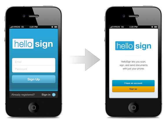
The original (left) and revised (right) welcome screens.
After selecting one of the two options, users were brought to one of two nearly identical screens, the difference being only in the labelling of the button, “Sign up” or “Sign in”. As you can see in the revision, the layout was simplified and Google authentication was added. Despite both screens being the same, forcing the user to choose a path cleared up any confusion.
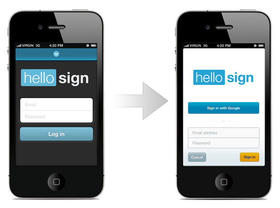
The original (left) and revised (right) sign-in screens.
Lastly, the home screen was heavily revised. While certainly clear before, it de-emphasized “Help” far too much and generally felt clunky and heavy-handed. The revision brought “Help” to the forefront and highlighted the “Scan” action, scanning being the primary purpose of the app.
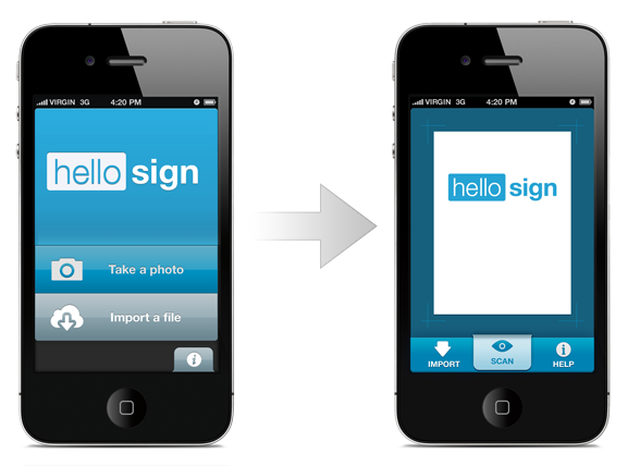
The original (left) and revised (right) home screens.
The Takeaway
Design is a highly iterative process, and all of the intuition in the world won’t help you to identify gaps in your product. As designers, we’re just too familiar with our own work to be able to easily spot where it fails. The only way to truly improve a design is to test it on real users and watch how they interact with it. Testing with a live app uncovered problems that led us to turn a four-star effort into a five-star product, with only a little work.
There are many ways to test a app, at an array of price points. It could be as simple as sitting down with a few friends and having each of them use your app for a few minutes, or as complex as hiring a moderator to bring in a variety of users to your office. There is also A/B testing, which can — and probably should — be done in conjunction with user testing. While user testing is great for big updates and for identifying major problems, A/B testing, which is less costly, is great for continually testing new ideas and underlying assumptions.
Remote services are inexpensive, and they structure the tests for you and free you from having to hunt down users. No matter how tight your budget or how simple the app, testing your design on real users is always worthwhile and will help you better understand where the product can be improved.
Further Reading
- Prioritizing Devices: Testing And Responsive Web Design
- Noah’s Transition To Mobile Usability Testing
- Where Are The World’s Best Open Device Labs?
- A Guide To Simple And Painless Mobile User Testing


