Smart Transitions In User Experience Design

Email Newsletter
Weekly tips on front-end & UX.
Trusted by 200,000+ folks.

 Flexible CMS. Headless & API 1st


When we design digital products, we often use design applications such as Photoshop and Sketch. Most people who have been in the business for a few years obviously know that design is more than just about visual presentation. Still, many continue to create static designs. Steve Jobs said this about design:
"It’s not just what it looks like and feels like. Design is how it works."
Our experience and impression of a product are shaped by a combination of factors, with interaction playing a fundamental role. No longer can we think of user interfaces as static designs and add the magic of interaction later on. Instead, we need to embrace the interactive nature of the Web from the very beginning and think of it as natural constituent.
Let’s look at some examples in which smart interaction, defined by subtle animation, gently improves the user experience.
Animated Scrolling
The blessing and the curse of the Web are hyperlinks. When you click on a link, it could take you anywhere, from a product page to the website of the creepy old puppet store down the street. The result is a loss of context.
One of the great things about the user experience of books is the linearity. Every chapter in a book builds on the last. You must read chapter one in a primer on economics to understand chapter two. When you skip a chapter, you are aware that you might miss something and, thus, lack some knowledge about the subsequent content. On the Web, and especially on long websites, this often happens subconsciously. By adding a scrolling animation, we can fix that:
Compare that to this:

Compare the default behavior of “name” anchor links with the animated behavior. Skipping content is not an unconscious action anymore; it’s a decision. In fact, Hope Lies at 24 Frames Per Second has a menu button for its mobile view that sends you to the top of the page, without any animation. It took me more than a minute to figure out what actually happened.
Takeaway: Abrupt changes in an interface are hard for users to process. Don’t leave them in the dark; always show what’s happening.
Stateful Toggle
As we saw in the last example, transitions help users understand the pace and flow of an interface. Nothing feels more unnatural than a sudden change, because sudden changes just don’t exist in the real world. Let’s look at another example: toggle menus. Users associate the “plus” symbol with the action of adding content or expanding an element. By rotating it by 45°, the plus becomes a cross, an interface element widely understood to mean “close”:
This simple transition completely changes the meaning of the icon. Such a small detail means the difference between having to guess what will happen next and knowing what the icon means in either state. That toggle is pretty user-friendly, if you ask me. Also, note that the plus sign always rotates in the same direction as the content, reinforcing the flow of information.
Takeaway: Make your website element understandable in each state.
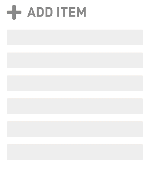
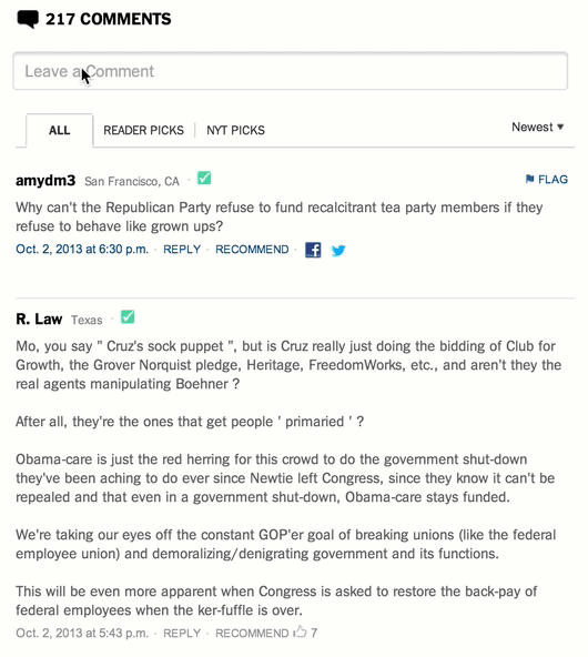
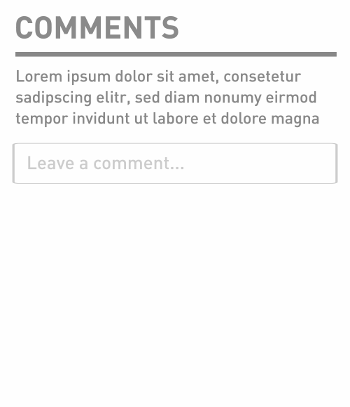
Collapsed Forms And Comments
The comment forms on many blogs and news websites are not the happiest-looking elements. Why? Well, most of them are not exactly friendly, right? When you are ready to post a comment, you just want to start typing the comment itself and nothing else. Instead, a typical form asks you all kinds of other stuff first. It’s annoying.
To motivate people to comment more, we can collapse the form and show only the most crucial element: the comment field. When the user clicks on the field, you can expand the form accordingly. A real-world example of this progressive disclosure can be found on the New York Times’ beta website:
You could take this even further by setting the cursor’s focus to the comment field when the form expands. This approach has a problem, though: A key principle of interaction design is that an action should always happen close to where the interaction occurs (near the locus of attention). We could go one step further, then, and animate the comment field to orient the user:
You could even pin the comment field to the top, expand it accordingly and display additional fields below it.
As you can see, this reduces clutter and makes the comment form more inviting. But what about collapsing all of the previous comments, too?
By collapsing the comments, we get the scroll bar to represent the length of the article itself, instead of the entire page. A common practice is to automatically load comments when the user reaches the bottom of a page. We should avoid forcing the user to click unless there is a really good reason to.
Takeaway: Progressively disclose in order to reduce UI components to their essence. Reveal features as the user needs them.
Pull To Refresh
One of the most exciting interactions to emerge shortly after the introduction of the iPhone was “pull to refresh,” pioneered by Loren Brichter. It allows the user to update scrollable reverse-chronological content. You can see this concept in action in Twitter’s app. Once you’ve scrolled to the top of the stream of tweets, scroll a little further to refresh the stream.
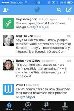
Why does this work so well? Before pull to refresh existed, users had to hit the refresh button in their browser to load more content. By connecting the user’s desire of finding more content with the action of refreshing, the need for an explicit action became obsolete.
Takeaway: By connecting intent with action, the experience becomes more seamless.
Sticky Labels
Sticky labels are another subtle yet useful combination of a user-interface component and a meaningful transition. Check out Edenspiekermann’s use of this technique in its portfolio.
The project label scrolls along with the content, thus providing context for the images on the right, until the next project appears. This behavior is similar to that of the address book in iOS and is especially helpful for providing context in long sections. The transition offers both improved orientation and smooth context-based descriptions.
Takeaway: Use sticky labels for long sections in which descriptions or titles add valuable information to content that doesn’t fit in the viewport.
Affordance Transition
The concept of affordance derives from cognitive psychology and refers to particular characteristics of an object that guide the viewer.
In the context of user-interface design, the usability glossary (PDF) of the EU’s website defines it as follows:
"An affordance is a desirable property of a user interface — software which naturally leads people to take the correct steps to accomplish their goals."
Ridges are often used to enhance affordance. Ridges around a button suggest that the button can be manipulated. This UX technique was widely popularized by the camera app in iOS.
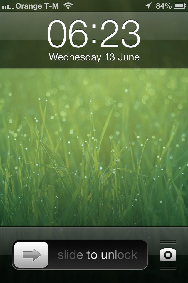
iOS 6’s lock screen featured ripples around the camera icon, suggesting draggability. Apple removed it in iOS 7, apparently because users got accustomed to it, making the icon look more like a standalone button now. What happens is still the same, though: When you drag the button, the lock screen bounces up, revealing the camera underneath. This is a great technique to point users to features in an interface.
Takeaway: Give elements a high affordance to point users to features in an interface.
Context-Based Hiding
Google Chrome on iOS has had context-based hiding since it launched. This is what it looks like:
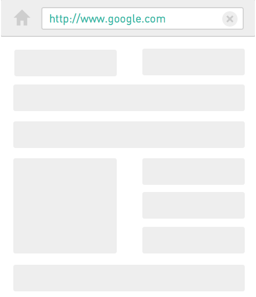
The basic idea is that the browser chrome and navigation controls hide automatically once the user scrolls down. As soon as the user scrolls up again, the controls reappear. This approach both enhances the contextual experience (focusing on the content itself) and increases screen space. The latter is, of course, particularly important on mobile devices.
The underlying assumption is that users will flow with the content that they’re consuming. As soon as they stop the flow, a change of context is likely required; thus, the navigation controls reappear. While this technique saves screen space, check whether the assumption holds up in your use case.
iOS takes this a step further. When you reach the bottom of a page, the controls expand again. It’s a good example of dynamically incorporating the needs of the user in an interface.
Takeaway: Use context-based hiding to enhance the user’s focus and save screen space.
Focus Transition
About a week ago, Nikita Vasilyev, a Toronto-based UI designer, came up with a pretty neat idea. He developed a script that animates focused elements. While still experimental, the concept is pretty interesting. Have a look at his video below. (And please put your earphones on — the music is epic.)
When navigating by keyboard, the user is often not clear on where the focus has moved to upon pressing the Tab key. Animation points them to the right spot on the page. The transition is subtle but has a big impact on orienting the user.
Takeaway: Orient the user, regardless of how they navigate.
Conclusion
These are only a few examples, among many others out there. The point is not to show the latest and fanciest interaction techniques, but rather to highlight how small interaction details can significantly improve the user experience.
If we are to design better digital products, then we need to challenge our current beliefs and see how interaction patterns can potentially ease the user’s life. I’m not saying we should reinvent the wheel, but it would be pretty naive to stop exploring. So, get out of your comfort zone. Keep exploring and testing.
If you like this article, you can follow me on Twitter, or join me for a bar of Swiss chocolate in Switzerland.
Which transition patterns have you found especially useful in your projects?
Further Reading
- “Why Transitions Are Important
- Improving User Flow Through Page Transitions
- Using Motion For User Experience On Apps And Websites
- To Use Or Not To Use: Touch Gesture Controls For Mobile Interfaces
 (al, il, ea, mrn)

