How To Add A Personal Touch To Your Web Design
The Web is technical by nature. Different scripts and pieces of code are linked together through hyperlinks, forming an endless net of interwoven, encrypted information — data that is accessible only through technical interfaces, such as Web browsers, or applications. Yet, Web professionals have made it their calling to tame the “wild” Web and turn it into an accessible, user-friendly and, most of all, personal medium.
“Personality will set your brand apart from competitors and help you connect with a passionate audience.”
Designers can do plenty of things to counteract the technical appearance of the Web. One very effective way is simply to make it look less technical, by using a more human, personal style.
In this article, we will discuss different aspects of freehand drawing and writing in Web design and how they can enhance the user experience of your website.
Identity And Authenticity
Freehand drawings and other sketched elements are a great way to show personality and convey a feeling of authenticity. Imagine getting a letter or greeting card from someone you cherish. Do you expect the text to be typed or handwritten? A handwritten note is way more personal than a computer-written one, right? On the Web, it’s similar. It might be a different medium, but content that obviously comes directly from a human is more authentic and more trustworthy. Let’s look at three examples of how freehand drawings can help you create an identity and stay authentic.
Look And Feel
First of all, hand-drawn content has a unique look and feel. Compare it to handwriting. Creating a personality and unique appearance for your brand or product is important.
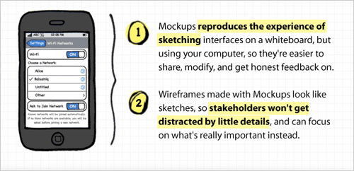
Balsamiq does a great job here. It offers a mockup and wireframing tool. While its features are quite advanced, its look and feel is basic, recalling pen and paper sketches from way back. The low fidelity helps us focus on the essential functionality while also making the product authentic and distinctive.
Recognition
Freehand drawings have character. Through the touch of human imperfection, they gain a certain tension that is hard to recreate digitally. This special touch draws attention and allows people to pause to appreciate and process the hand-drawn content, more so than they might appreciate any old perfectly illustrated image.

The source-code editor Notepad++ has a distinctive hand-drawn logo. The little chameleon not only reflects the functionality of the program (the transformation of code), but is also cute and draws attention. The sketched style reflects the creative nature of what you can do with Notepad++ and makes sure you don’t confuse it with other editing tools.
Personality
Obviously, freehand drawings carry personality. They are authentic and help users to connect with your website or app. Hand-drawn content confirms that real people are behind the content, people who have put thought and effort into the design to make it usable and trustworthy.
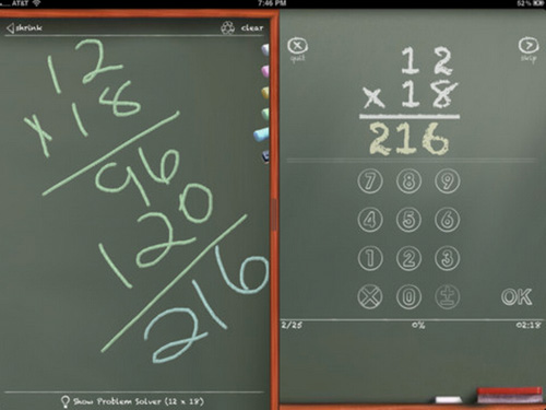
MathBoard is an iPad app that help kids practice their arithmetic skills. The app has a classic chalkboard look, freshening up the dry and precise character of arithmetic. The whole app is set up in quiz form, and kids can actually write on the board to do rough work if needed. The personal appearance of the app makes it easy and attractive to use.
Information And Content
The way you present information on your website determines whether people will see it and, even still, understand it. Draw attention to your content at the right time in the user’s visit to your website. The content should look attractive and promising enough to involve the visitor. Information must be clear, relevant and actionable in order to be effective. Below are three examples of ways in which freehand styles can make the presentation of your content more effective.
Explain Features
You can use freehand drawings to explain your product, such as its features. Creatives often use simple sketches to explain a concept or present an idea that might otherwise take ages to put into words. With your website, you encounter a similar situation. You’ll have a product, concept or idea that you want to get across to visitors. By using hand-drawn icons or simple sketches, you create an intimate atmosphere, as if you were speaking to your visitors directly.
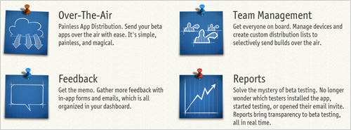
Online service TestFlight makes use of just this effect. In addition to the many other hand-drawn elements on its website, the company points out its main features with simple sketched sticky notes, accompanied only by a few brief lines of text. This conjures the idea of presentations, drawing attention to the features one by one to make them more clear.
Visualize Workflows
Freehand style is also a great way to familiarize visitors with your workflows. No one expects you to come up with the perfect solution out of thin air. The fact that you admit that a process is involved and that this process can be rough and bumpy only makes you human and likeable. It demonstrates that you try out different directions before deciding on the right track.
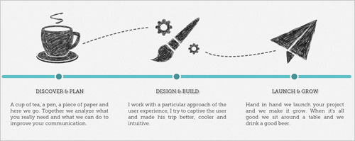
Designer and front-end developer Alex Faure demonstrates well how a hand-drawn visualization of a workflow can educate visitors and build trust. He seems to not only know what he is doing, but also thinks things through and involves his clients in the process.
Guide Users
Whether you are designing a website or an app, keeping your users in mind and guiding them towards the various goals they might have is always important. Hand-drawn icons can be a good way to do so. It’s no secret that icons are helpful when navigating a website or app. Why would hand-drawn icons be any different? While perfectly illustrated icons might be more detailed and clearer, they are computer-made and can easily look sterile and technical. Hand-drawn icons are personal, and we are more inclined to accept guidance from another human than from a machine.
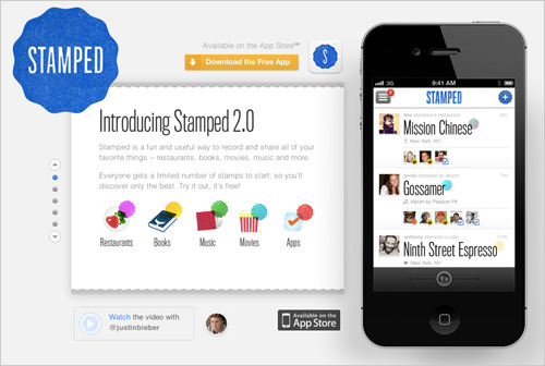
The iPhone app Stamped uses very nice, meaningful icons to guide users. The app enables you to stamp and share your favorite things, such as places, books and movies. The hand-drawn style perfectly matches the personal nature of the app, encouraging users to keep stamping.
Team Presentation
The importance of team pages increases continually. While we used to accept a certain level of anonymity on the Web, we are now eager to know who is behind a website, service or product. Also, having the hypothetical option to contact someone is not enough; we want to know exactly who we would be contacting. The more personal your team presentation, the more likely your visitors will trust you. Here are some suggestions on how to enhance your team presentation with hand-drawn elements.
Be Likeable
Being perceived as likeable is important. Even if you offer a ton of information on yourself, if people think you are arrogant or too extravagant, it will do no good. We are much more willing to trust someone we like than someone whose character we cannot assess. Hand-drawn elements can make you more likeable by making you look creative, spontaneous and easy-going.

The Knock Knock Factory welcomes its visitors with a personal and likeable presentation of its team. The pictograms sketched on the chalkboard in the background say a lot about Keith, the “fearless leader.” The company obviously considers it important to give visitors a clear picture of who they are about to deal with. It’s catchy and gives visitors a positive feeling, before they have even looked around the rest of the website. It creates an immediate personal connection and makes the visitor feel welcome to the website.
Be Trustworthy
Besides likability, trustworthiness is also important. At the end of the day, anyone can hide behind a website, pretending to be someone they are not. Showing authenticity is a great way to make sure visitors take you for who you are. Only if people trust you will they open up to what you have to say or engage in your desired actions, such as buying the product. Hand-drawn elements are usually not the easiest content to produce for a design; they require skills such as creativity and passion — skills we associate with honest and trustworthy people.
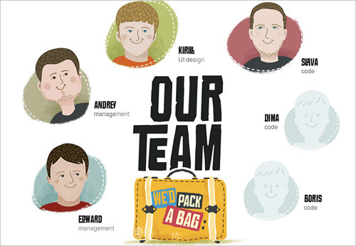
The software agency Polecat has found a trustworthy way to introduce itself. Instead of realistic photographs, it has put thought and passion in its team presentation, using abstract yet creative illustrations. The illustrations have a rough and sketchy look to them, making them even more human. And only first names are disclosed, giving an easy-going, familiar feeling.
Be Real
An important aspect of trustworthiness is authenticity. Your visitors must not doubt that you really exist and that you exist in the way that you present yourself on your website. The Web can be a scary place, especially considering that users will probably never meet the people behind websites in person. Anyone can use a Web font, but handwriting and hand-drawn elements reveal something about your person, making you look more real.
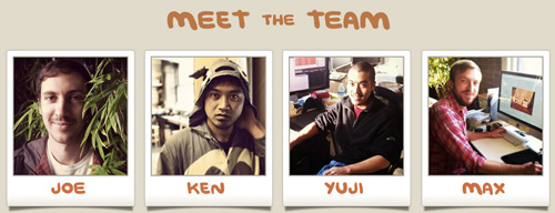
The people at Grove found the perfect balance between creative, carefree and authentic for their team presentation. Snapshots of all team members are neatly arranged as Polaroids, with the names looking handwritten. It looks as if someone walked through their work space, taking Polaroids of everyone, including the team’s dog. Does it get more real than that?
Storytelling
Freehand drawings are a great way to tell stories. Storytelling is extremely personal, an ancient means of communication, mediated at most (back then) by a cave wall. This basic method of exchanging information transcends all technical advances and gives us a comforting, human feeling. Sketches help us ignore the impersonal nature of the Web and put a face to the humans behind it.
Entertain
Entertainment entails emotional involvement — something that is much easier to achieve when humans are involved, rather than mindless machines. On the Web, hand drawings are a great way to establish a familiar and human experience, one that helps visitors to relax and enjoy themselves.
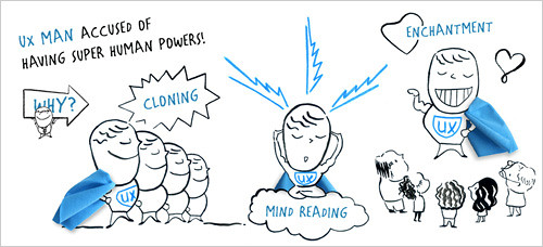
The prototyping tool Axure welcomes visitors to its home page with an amusing yet informative story about UX Man, who is “accused of having superhuman powers.” The freehand style of the drawing is eye-catching. There is no reason to doubt that a lot of thought has gone into this fun and inviting landing page.
Explain
Hand-drawn stories grab our attention because we like to recognize human elements on the Web. Whereas a too-clean Photoshopped image might not gain our trust, hand drawings appeal directly to our emotions, making us more attentive and receptive to information.
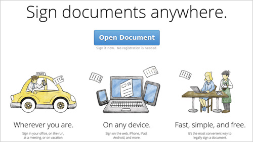
The app SignNow uses hand-drawn images to explain its main benefits right on the home page. The way it lines up the benefits, connected by the “flying” documents, creates a narrative. You can almost hear someone explaining the images as you read the descriptions below. The story draws visitors in, making it easy to follow.
Engage
Personalized elements such as freehand drawings also engage visitors. Along with user experience, “user engagement” has also become a hot topic. Once engaged, we are interested and willing to perceive and process the information given to us. So, a website that manages to engage us has already made a big step towards a positive user experience.
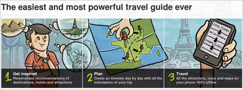
Travel app TouristEye engages effectively with a good story. The step-by-step introduction to its product is turned into a small adventure story, a treasure hunt waiting to be solved. Even without the text, the drawings are meaningful and reflect the free spirit of a trip.
Attention-Grabbers
Freehand elements, such as handwriting, are just not what we expect in a technical medium like the Web. They go against the straight lines and symmetry that we associate with the Web. Thus, a perfect opportunity to grab the visitor’s attention. Handwritten comments and instructions feel human and make us feel like we are being addressed directly.
Invite
You can use this personal method of communication for different things. First, you could easily invite visitors to perform certain actions, such as liking you on various social media platforms or sharing your content. We are more likely to respond to messages that appear to concern only us, not the general public. Even though the message is on your website for everyone to see, you can create a feeling of connectedness by addressing visitors directly.
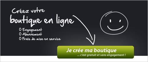
Weezbe use a handwritten message on its landing page, together with a happy smiley and an arrow that guides the visitor’s eye to the green button. The header is simple yet effective, drawing attention to the call-to-action button without being intrusive or annoying.
Make Curious
You can also use hand-drawn elements to make visitors curious and, in doing so, to guide their line of vision and trigger certain actions. For example, arrows are a great way to guide the attention of visitors.

The creative agency Radley Yeldar shows a minimalist drawing of a hand that appears to be tapping on the screen, along with the line “This is not just a footer.” The visitor is motivated to mimic the gesture of the hand and click on the screen, if only to find out what happens. This is a great subtle way to bring the footer to the visitor’s attention.
Point Out Details
Last but not least, hand-drawn elements can be handy for pointing out details. Again, it’s all about grabbing the visitor’s attention and drawing it to the relevant area. Just as you use arrows and other marks to highlight content in a book or other offline medium, these elements work great on your Website. After all, highlighted elements bear a certain importance that makes them worth checking out.
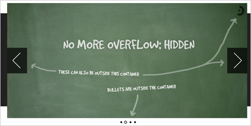
Orbit uses hand-drawn arrows to point out adjustable elements of its image slider plugin. The hand-drawn quality of the arrows draws attention to the defined areas of the slider, and it also stands out, obviously not being part of the slider itself.
Don’t Overdo It
Sometimes, freehand drawing doesn’t suit the nature of a website. Make sure not to overdo it and that visitors would truly appreciate a more personal design. Don’t hesitate to ask visitors if you are not sure how far to go; for example, by conducting a live survey on your website.
While certainly many examples are out there of how not to use hand-drawings on a website, let’s look at only one. The aim of this article is to point out positive examples and offer ideas on how a freehand style can improve the user experience, but it is also important to be aware that it’s not always effective and that you should use hand-drawn elements within reason.

For example, designer Joshua Keenes uses hand-drawings to draw attention to his social media buttons. While the concept might work, the fact that he overdoes it has two side effects. First, so much is going on that your attention gets lost before even getting to the actual target, making you lose focus before taking any action. Secondly, the invitation to hit one of the buttons becomes quite obtrusive and pushy, likely scaring people away, rather than welcoming them to the social community.
Conclusion
Having a personal experience on the Web is becoming increasingly important. We no longer want to visit cold, formal and anonymous websites. Rather, we want to feel comfortable surfing the Web and to meet the people behind a website, and we need to trust them before we are willing to interact with their website.
Freehand drawings have a human quality, the perfect bridge over the gap between the technical, impersonal Web and the accessible, user-friendly and personal experience that we expect today.
Further Reading
- The Personality Layer
- Finding Your Tone Of Voice
- Give Your Website Soul With Emotionally Intelligent Interactions


 Flexible CMS. Headless & API 1st


