A Sticky Menu Is Quicker To Navigate

Email Newsletter
Weekly tips on front-end & UX.
Trusted by 200,000+ folks.

 Register!
 Flexible CMS. Headless & API 1st

Most designers would agree that navigation is one of the most critical components of a website. Despite this, it is not always easy to use or access. Traditionally, users must scroll back to the top of the website to access the navigation menu. I recently wondered whether sticky menus makes websites quicker to navigate, and I conducted a usability study to find the answer. Let’s look at the results of the study, a few implementation techniques and some related challenges.

What Is A Sticky Menu?
Sticky, or fixed, navigation is basically a website menu that is locked into place so that it does not disappear when the user scrolls down the page.
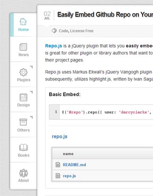
In other words, it is accessible from anywhere on the website without having to scroll. Although sticky navigation can be applied to any menu, such as the footer or social media buttons, we’ll focus on the main (or primary) navigation of a website. The image below shows the difference between standard and sticky navigation on a mobile device.
Usability Study
Research Conditions
For the study, I created two test websites that were nearly identical. The only difference was that one of them had standard navigation and the other had sticky navigation. Forty participants were timed in completing five tasks on the first website. Then they were asked to complete five different tasks on the second website. The order of the tasks was alternated between users to balance out the familiarity factor. The websites were tested on desktop machines, and participants were not told the differences between the websites until the end of their session. Data was not analyzed until the testing was completed. The results of the study yielded two interesting conclusions.

1. Sticky Menus Are 22% Quicker To Navigate
The data from the study indicated that participants were able to find what they were looking for quicker when they didn’t have to scroll back to the top of the page. 22% might not seem like a big number, but it can have a big impact on visitors. According to this data, sticky navigation could cut 36 seconds off of a five-minute visit to a website. Of course, keeping visitors on the page longer is only a benefit if you are enhancing the user experience along with it. Forcing people to dig through a website to find something does not qualify as such.
2. 100% Preferred Sticky Menus Without Knowing Why
At the end of each session, users were asked whether they noticed the difference between the two user interfaces. No one was able to identify it. The changes were subtle, and none of the users caught on because they were focused on completing their tasks. Participants were then asked whether one of the websites felt easier to use. Six of the 40 participants had no preference, but of the 34 that did have a preference, 100% of them indicated that the website with the sticky navigation was easier or faster to use. Many comments along this line were made, such as “I don’t know how the websites were different, but I felt like I was spending a lot less time clicking with the first one.” Such comments indicated overwhelming favor for the sticky navigation.
Desktop Software Navigation Menus
Imagine typing a document in Microsoft Word and having to scroll up to the top of the first page every time you wanted to bold a word or widen the margins. Just the thought of that sounds frustrating. Most desktop software provides access to the entire navigation menu no matter what you are doing in the application. The Web browser is no different; we would find it ridiculous to have to scroll to the top of a website to access the address bar of a browser.
Some Good Examples
Facebook and Google+ recently adopted sticky navigation, but they are among the minority. Of the 25 most visited websites in the US, only 16% currently have sticky navigation. Below are some examples of other websites that do an excellent job of pulling this off.
Fizzy Software This is a perfect example of horizontal sticky navigation at the very top. Everything feels comfortable while you’re using the website.

Web Appers The navigation here is vertical and on the left, somewhat resembling Google+’s navigation. The only downside here is that if the screen’s height is shorter than 560 pixels, then the bottom portion of the menu could become inaccessible, which was the case when I tested the website on a netbook.
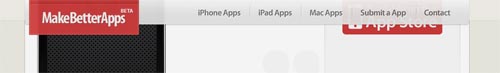
MakeBetterApps Here is another great example. Making the navigation slightly transparent, giving a hint of the content beneath it, is a nice touch.
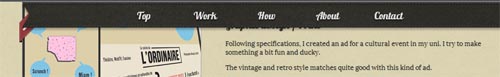
Rodolphe Celestin This sticky navigation spreads all the way across the top, but when you scroll down the page, the design of the menu changes slightly. Simplifying the design like this can be a good technique, as long as it doesn’t feel inconsistent. Also, the designer has taken an increasingly popular approach by making the entire website just one page; the menu links are anchors that bump you down the page. Some nice transitions and hover effects make this website enjoyable to use.
Ryan Scherf The navigation on this website is vertical and only icons. The creativity here is impressive.
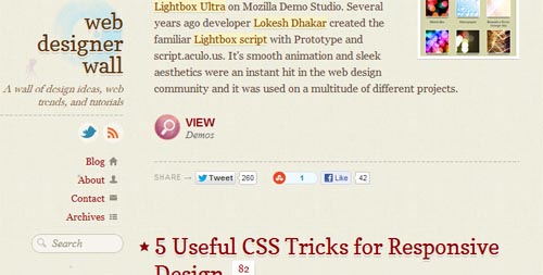
Web Designer Wall The sticky vertical navigation works well on this website because the menu has only four items. This works well enough for blogs that I wonder why others don’t adopt this approach.
While sticky menus aren’t the most popular form of navigation, more and more examples are popping up all the time.
Getting Started
Avoid iFrames
This might seem like a straightforward way to implement sticky navigation, but avoid this method. iFrames cause more problems than they solve, particularly with cross-browser compatibility, security and search engine optimization. iFrames have their place, but they shouldn’t be a major part of your HTML layout.
CSS
CSS is a great way to implement sticky navigation. It also seems to be the most straightforward, most lightweight and quickest to code. The three things to pay attention to are position, margin-top and z-index. Setting the menu’s position to fixed disables the element from scrolling with the rest of the page. This will likely throw off your margins if your navigation is horizontal, so you’ll want to adjust for that. Finally, use z-index with a horizontal menu to make sure the navigation sits on top of everything; this will make the other content slide underneath the navigation as you scroll. Here is the general idea:
#navigation {
   position: fixed;
   z-index: 10;
}

#header {
   margin-top: 50px;
}
You will have to play around with the CSS to make this technique work right for your website. Additional information can be found on the W3C’s website.
jQuery And JavaScript

If you would prefer a jQuery or JavaScript solution to a CSS one, then you could try out one of the following options:
Many other solutions and scripts are out there. Please include your favorites in the comments below.
What’s The Bad News?

There are many opinions on this topic, and some would argue that sticky navigation isn’t worth it. Here are some things to be aware of.
Design Limitations
Going with sticky navigation could rule out some design choices that your team might not be willing to give up. For example, the most logical place for horizontal sticky navigation would be at the very top of the page, above everything else. While easy to implement, it might not be what your users need.
Distracting And Intrusive
If not done carefully, sticky navigation can be distracting. Some sticky elements get delayed when bouncing back into position as the user scrolls down the page. Others are so tall or wide that they dominate the layout and impede access to the content. Navigation should be easily accessible but should not compete with the content for attention.
Mobile Compatibility
Fixed-position CSS and certain JavaScript implementations lack support in some mobile browsers, which is a cause for concern among some developers. The article “Organizing Mobile” by Luke Wroblewski has some great principles to keep in mind when creating navigation for mobile devices. Responsive design techniques also offer some solutions for adjusting the navigation based on the size of the screen.
Be aware of the level of support offered by each device. Knowing compatibility issues beforehand will save you time in the end. When Can I Use? has some interesting information on support for position: fixed. Brad Frost has also done some of his own testing and analysis, providing some interesting insight in his accompanying video.
Sticky Menu Conclusion
Why do we Web designers and developers continually force our users to scroll up and down the page in search of the navigation? This is not a problem in desktop software, and we now have the statistics to show the benefits of sticky menus. Navigation on 84% of the top 25 most visited US websites could be made quicker by implementing sticky navigation.
Of course, it’s not appropriate in every situation, especially when real estate is tight. But do seriously consider sticky navigation, while always accounting for usability and the overall user experience.
Further Reading
- Planning And Implementing Website Navigation
- The Elements Of Navigation + 6 Design Guidelines
- Implementing Off-Canvas Navigation For A Responsive Website
- Breadcrumbs In Web Design: Examples And Best Practices
 (al, mrn)

