The State Of E-Commerce Checkout Design 2012

Email Newsletter
Weekly tips on front-end & UX.
Trusted by 200,000+ folks.


 Flexible CMS. Headless & API 1st
A year ago we published an article on 11 fundamental guidelines for e-commerce checkout design here at Smashing Magazine. The guidelines presented were based on the 63 findings of a larger E-Commerce Checkout Usability research study we conducted in 2011 focusing strictly on the checkout user experience, from “cart” to “completed order”.
This year we’ve taken a look at the state of e-commerce checkouts by documenting and benchmarking the checkout processes of the top 100 grossing e-commerce websites based on the findings from the original research study. This has lead to a massive checkout database with 508 checkout steps reviewed, 975 screenshots, and 3,000+ examples of adherences and violations of the checkout usability guidelines.
Here’s a walkthrough of just a handful of the interesting stats we’ve found when benchmarking the top 100 grossing e-commerce websites’ checkout processes:
- The average checkout process consist of 5.08 steps.
- 24% require account registration.
- 81% think their newsletter is a must have (opt-out or worse).
- 41% use address validators.
- 50% asks for the same information twice.
- The average top 100 checkouts violate 33% of the checkout usability guidelines.
In this article I’ll go over each of them and explain exactly what’s behind these numbers, showing you some real life implementations of do’s and don’ts when it comes to checkout processes.
The Average Checkout Process Consists Of 5.08 Steps (But It Doesn’t Influence Usability Too Much)
The average checkout consists of 5.08 steps, counting from the shopping cart to the step where the order is actually placed — often a “review and confirm order” step. The shortest checkout process is one step (including cart) and the longest being a massive nine steps.

Above you see the distribution among the top 100 grossing e-commerce websites in regards to the number of checkout steps they have. Note that only a single website had one step (including cart), and the “average” for this one website therefore shouldn’t have been given too much weight.

Above, we’ve plotted the websites grouped after the number of checkout steps, moving out from the x-axis, as the groups average checkout usability score moves up the y-axis. As you can see, we’ve found that up until six checkout steps there isn’t a noticeable relation between the number of checkout steps and the quality of the user’s checkout experience. This matches the test subject’s behavior we observed during the checkout usability test back in 2011. What matters the most for checkout experience isn’t the number of steps in a checkout process, but rather what the customer has to do at each step.
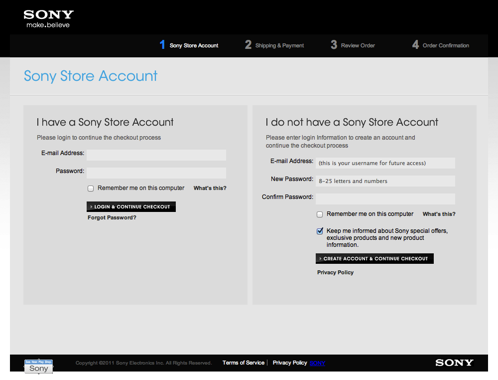
With that being said, there does seem to be an upper limit to the number of steps practically achievable in a checkout process before it begins to hurt the checkout experience. The websites with eight or nine steps have accumulated a significantly lower score in checkout usability than the rest of the checkout processes. This is often a result of required account registration (which typically induces more steps and is bad for checkout usability) as well as the fact that websites that end up with over eight checkout steps simply have more chances available to screw up the experience for their customers. At the time of testing, these were the websites with eight or more steps: Sephora (8), Amazon (8), Peapod (8), Sony (8), Safeway (9), ShopNBC (9) and W.W. Grainger (9).
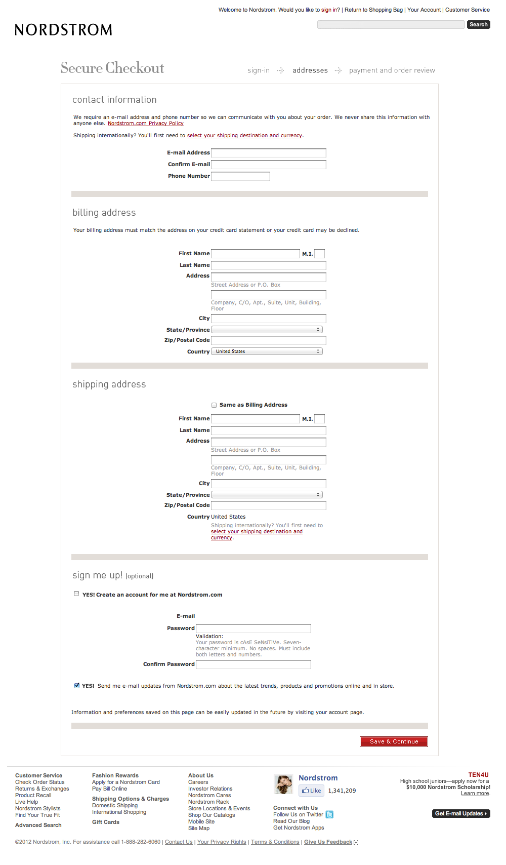
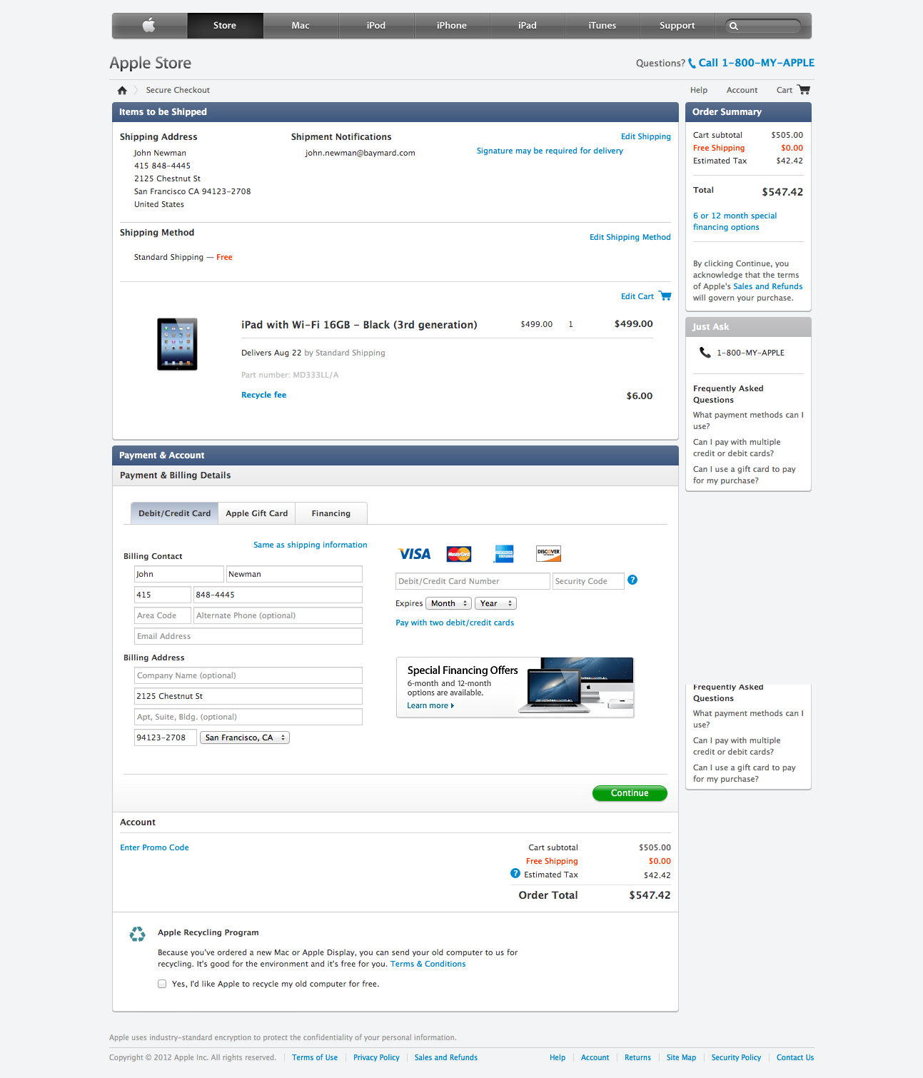
To recap: don’t focus too much on the number of steps in your checkout — instead spend your resources on what the customers have to do at each step, as that is what matters the most for the checkout experience. Three examples of this are the checkout processes of Apple, Walmart and Gap, which are all seven-step checkouts that perform approximately 50% higher than the average top 100 grossing checkouts (not to say that they are perfect, there are still room for further checkout improvements). While in theory it is possible, in practice none of the benchmarked websites with eight or more checkout steps had a checkout process that wasn’t greatly under-delivering in regards to the checkout user experience for a new customer.
81% Think Their Newsletter Is A “Must Have” (And Don’t Value Customer Privacy)
81% of the 100 largest e-commerce websites “assume” that their customers want their promotional emails by having a pre-checked newsletter checkbox (or worse) at some point during checkout.

One reason why customer hate being required to create an account to complete a purchase is because they have a mental model of account = newsletter. This became evident during the user testing, where we heard the same complaint over and over again: people hate creating an account when buying online. When we asked the test subjects why, 40% told us that they “didn’t want any newsletters”.
For years websites, including e-commerce websites, have tricked customers into “accidentally” signing up for newsletters that they didn’t want by visually downplaying a pre-checked “subscribe to newsletter” checkbox. So people have come to expect, that when they sign up for a new account, that they also sign up for a newsletter, or “spam” (as more than half of the test subjects had referred to such newsletters).
This mental model sadly isn’t just a misconception, but evidently something learned the hard way. Pre-checking the newsletter checkout is one thing, but of those 81% of the websites that think their newsletter is a “must have”, 32 of them proceed to do something even worse than pre-checking a checkbox:

These 32% automatically sign up their new customers for their newsletters with no way of opting out during the checkout process, and often burying this fact deep down in their privacy policy. Typically, the only way for customers to “opt-out” on these websites are either by a privacy tab in an account settings section (if they were forced to register for an account) or by an unsubscribe link in the newsletters that the customers will automatically start receiving.
So what the test subjects displayed of account = newsletter is something they learned from shopping at websites (such as these from the top 32%). Only 8% of the top 100 e-commerce websites value their customers inbox and ask them to opt-in if they want to receive newsletters (as does the last 11%, which don’t offer newsletter subscriptions at all during checkout.)
24% Require Account Registration
To put it differently: 24% don’t offer the customer a “guest checkout” option when placing an order, but force them to create accounts on their websites.

During the checkout usability study, we (as have many others have before us) have identified multiple reasons why potential customers resent being forced to register for an account just for placing a simple order. We’ve already touched upon one of them, the mental model of account = newsletter. But let’s quickly list a handful more of them that we’ve found during the study:
- Signing up for an account means more steps and form fields to complete during checkout — essentially taking longer to complete.
- Most customers already have a myriad of logins and passwords to remember and don’t want more of them.
- When creating an account, customers are more likely to realize that you’re storing their information indefinitely.
- Many customers just don’t understand why they need an account to buy a product. As one test subject clearly expressed during testing: “I don’t need to sign up for anything when I’m buying a perfume in a regular [brick and mortar] store.”

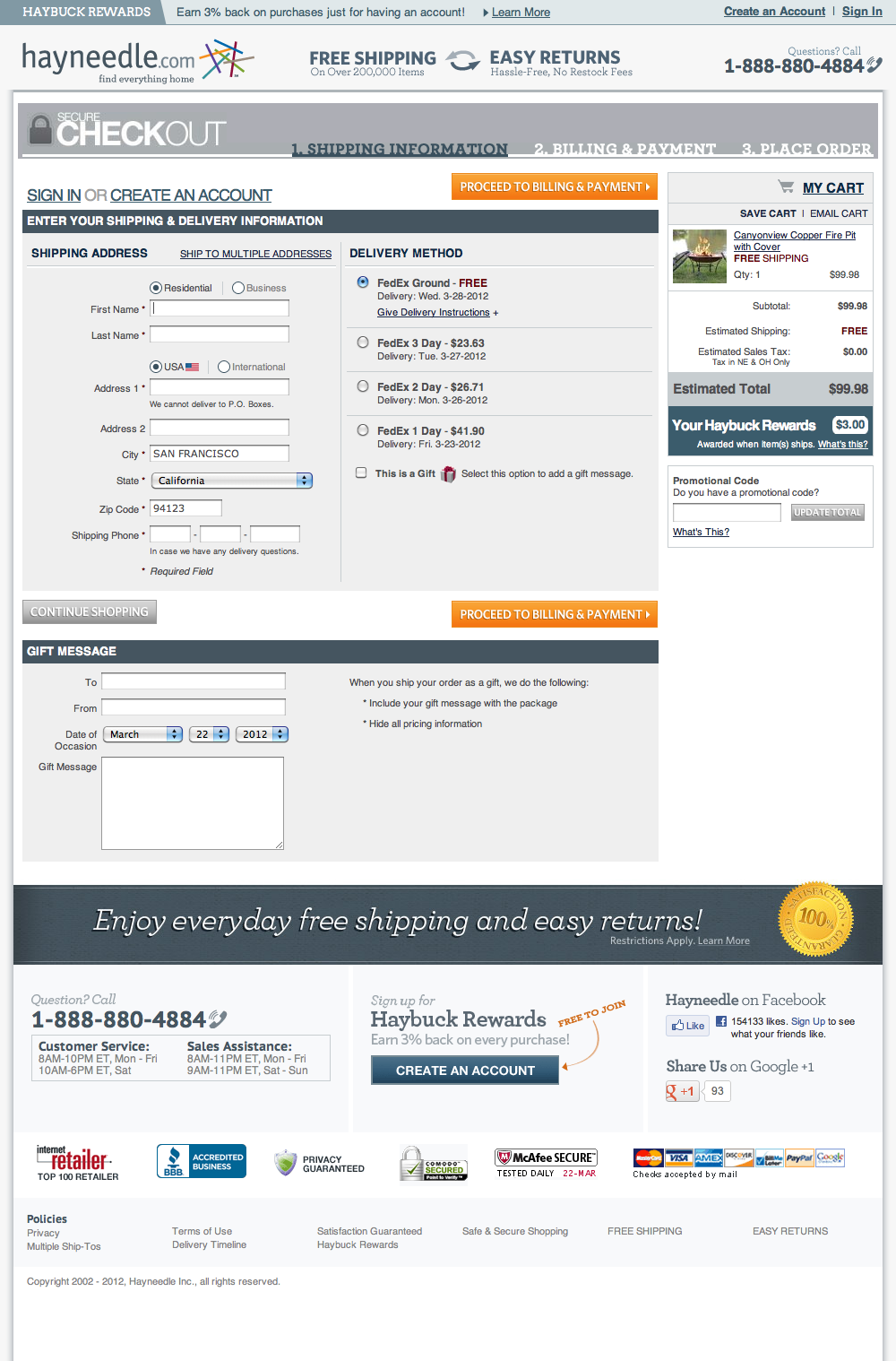
When you do it right (as 76% of the e-commerce websites have done) and provide the much appreciated guest checkout option, you still have the possibility of asking for an optional account creation along (or after) the purchase. This can be done simply by creating a short section with a brief description and an optional password field. During the checkout usability study no test subjects were put-off by this approach, and just left the optional field(s) blank if they weren’t interested in creating an account with that particular website. But they generally liked the option on websites where they were interested in becoming repeat customers.
If we look into the type of websites that typically require account registration, there is a slight tendency towards them being the highest grossing websites:

Of the 23 websites that had more than $1 billion in online sales (Internet Retailer 2010 sales estimates), 35% of them required account registration, whereas for the rest of them grossing less than $1 billion (and down to $148 million) it was only 21% that required account registration during checkout.
41% Use Address Validators
Of these 41%, 12% (relative) don’t allow their customers to override the validation mechanism in case the address isn’t recognized (though the customer is absolutely sure the address is correct).

An address validator can be a smart way to avoid common customer typos that might cause shipping problems, ones that otherwise would have resulted in undelivered or delayed orders. But street names, postal codes, etc. aren’t consistent, nor permanent. So the possibility still exists that it’s the address validation mechanism/database that is erroneous — not the customer’s input. Those subsets of websites that don’t allow the customer to force proceed through a potentially wrong address validator (at the time of testing: Office Depot, ShopNBC, Amway Global, FreshDirect, and CafePress) will leave the customers with no other option but to abandon their purchase as they are technically locked-out from completing the checkout process.

The advisable approach — implemented by the vast majority of the 41% of those websites utilizing address validators — informs the customer that the typed address doesn’t match, yet still allows them to force proceed if they are sure that the address is right.
50% Ask For The Same Information Twice
Instead of pre-filling the already typed-in information for the customer, 50% of the e-commerce websites add needless friction to their checkout experience by asking for the same information more than once. This is rarely at the same page (although that does happen) but is most often happening across multiple pages. Sometimes it’s the customer’s name that isn’t pre-filled from the address step to the billing step. Other times it’s the zip code that the customer provided at the cart step (e.g. for a shipping calculator) which isn’t pre-filled at the the shipping address step. Although it is only fair to assume that in most cases users calculate the shipping to a certain zip code, this would also be the zip code that they plan on shipping the order to.

Retyping information is a tedious task on a regular computer, but on a mobile device most users will find it outright annoying. Considering that all the benchmarked websites gross $148+ million per year in online sales, it seems rather sloppy that only half of them have dedicated the resources to removing needless checkout friction by ensuring that they don’t ask for the same information more than once (across multiple pages).

On the same note for reducing needless checkout friction, only 10% of the websites helped their customers to fill-out even less form fields by pre-filling the state and/or city fields based on the zip code that the customer provides.
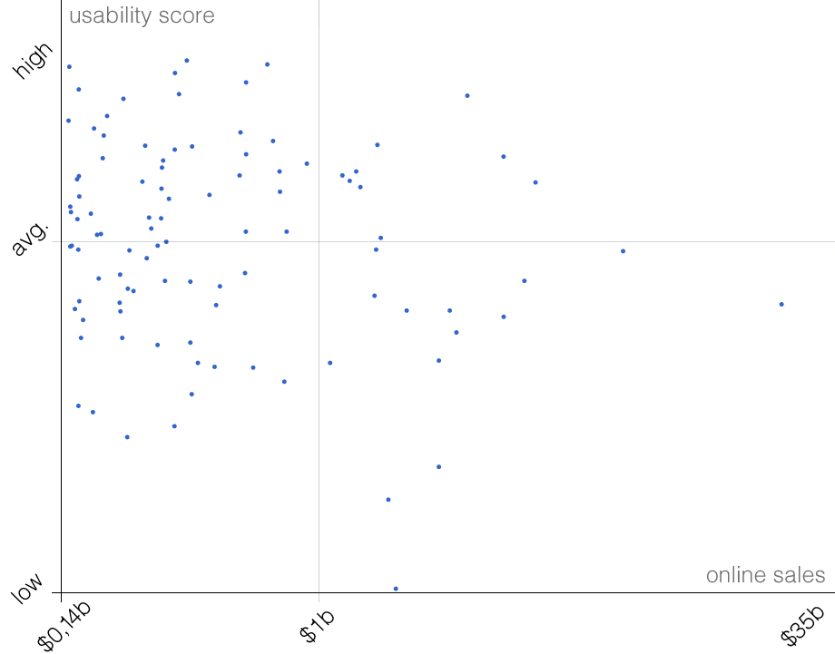
The Influence Of Revenue And Industry
The e-commerce websites grossing above the $1 billion mark scored 44% worse on checkout usability (for a first-time customer) than the e-commerce websites grossing below $1 billion.
When taking a closer looking at the checkout experience of these 23 websites that gross over $1 billion, it’s likely that some of that gap exists because these websites are more focused on forcing as many customers into their account eco-system as possible. Furthermore, the top grossing e-commerce websites also tend to be the ones with the most complex marketplace systems. These marketplace systems often end up inducing a lot of derived complexity into the checkout process, due to shipping and legal constraints, for a deal where the website only acts as the middleman. In comparison, some of the “smaller” websites in the top 24 to 100 grossing range had one simplified goal for their checkouts: to let the customer move as swiftly as possible through the checkout process.

If we take a look at specific e-commerce industries, the Automotive Parts industry had much better checkout usability than the rest of the industries (scoring 110% higher) whereas the Office Supplies industry scored the lowest (38% lower than average). Food & Drugs followed right behind in providing the worst checkout experience.
It’s interesting to see the that in both the worst and the best scoring industries, all three have a very similar checkout process. In fact, their checkouts are almost identical; have a look at Staples’ checkout, Office Depot’s checkout, and OfficeMax’s checkout. I’m not going to speculate on who “was inspired” by whom, nor does it really matter. But in the Office Supplies industry it’s unfortunate, because as a consequence they all suffer from a very sub-standard checkout experience (38% lower than the average). While it’s clear that some of the top 100 e-commerce websites are using the same system vendor (and thus, end up with similar features and sequences in their checkout flow), the tendency of similar checkouts between competitors weren’t noticed to nearly the same degree in some of the other e-commerce industries (e.g. in Electronics).
The General State Of E-Commerce Checkouts
If we have an overall look at the top 100 grossing e-commerce checkout processes, the average checkout violates 21 checkout usability guidelines. This is an indication that checkout improvements are still much needed if the average cart abandonment rate of 65,95% is to be lowered (“50% Ask for Same Information Twice” also points in this direction).
This overall lacking of checkout experience — even among the highest grossing e-commerce stores — is hardly rooted in an unwillingness to improve checkout experience, but is most likely due to a combination of factors, such as:
- Flows are much more difficult to improve than single pages.
- Checkouts often need deep, back-end integration, and thus require more IT capabilities to modify/test upon.
- Checkouts haven’t been on the agenda for top management (although, I believe this has changed a lot in recent years).
- Checkouts are for most designers much more dull to work on than product pages, home pages or new ad-campaigns.
- In a few cases, a poor user experience can still be good for business, at least in the short run (e.g. sneaking people into your newsletter).
- No Web convention for a checkout process exists.
- “Best practice” for checkout designs are scattered and scarce (only two to three research-based resources exist).
- Feedback from those who use the checkout process are only several degrees of separation from those who design and develop it.
- Improving most somewhat-optimized/decent checkouts aren’t 1 to 3 “big fixes”, but are most likely to be 10 to 30 smaller checkout changes.
If you want to further examine the checkout processes and flows of the 100 top grossing e-commerce websites for yourself — without filling out some 1,300 form fields, as we have done — you can do so in the free part of the 2012 E-Commerce Checkout Benchmark, as we’ve decided to make that part of the database publicly available.
Further Reading
- Infinite Scrolling, Pagination Or “Load More” Buttons? Usability Findings In eCommerce
- Combining UX Design And Psychology To Change User Behaviour
- Meet Hydrogen: A React Framework For Dynamic, Contextual And Personalized E-Commerce
- Rebuilding A Large E-Commerce Website With Next.js (Case Study)


