Designing For Device Orientation: From Portrait To Landscape
The accelerometer embedded in our smart devices is typically used to align the screen depending on the orientation of the device, i.e. when switching between portrait and landscape modes. This capability provides great opportunities to create better user experiences because it offers an additional layout with a simple turn of a device, and without pressing any buttons.
However, designing for device orientation brings various challenges and requires careful thinking. The experience must be as unobtrusive and transparent as possible, and we must understand the context of use for this functionality.
Nearly all mobile and tablet applications would benefit from being designed for device orientation. This article covers some of the basic concepts that designers and developers can use to add device orientation to their process. We’ll present some of the challenges when designing for device orientation, along with some solutions.
Using Device Orientation For A Secondary Display
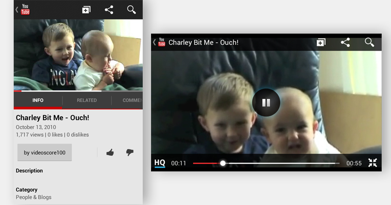
YouTube’s mobile application is a great example of device orientation design. Portrait mode offers a feature-rich interface for video discovery and the user’s account. Landscape mode provides an immersive experience with a full-screen video player and playback controls. When the video ends, the display switches back to portrait mode, prompting users to quickly tilt the device back and browse for additional videos.
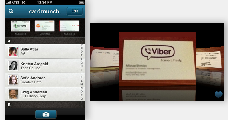
However, using orientation to display a secondary interface can be confusing for users. For instance, in CardMunch (a business-card reader by LinkedIn), users can convert business-card images into address book contacts using the smartphone’s camera. Rotating CardMunch to landscape mode changes the interface altogether to a carousel overview of all of your saved cards.
This interface lacks any visual clues about its orientation, and it has limited controls. You are unable to edit or add business cards, making the carousel screen somewhat frustrating and confusing, especially if you’ve launched the app in landscape mode. In addition, the lack of visual clues in this landscape mode will deter most users from rotating the device and discovering the app’s other features.
Categories Of Orientation Design
To help UX professionals and developers, I have categorized four main patterns of device orientation design.
Fluid
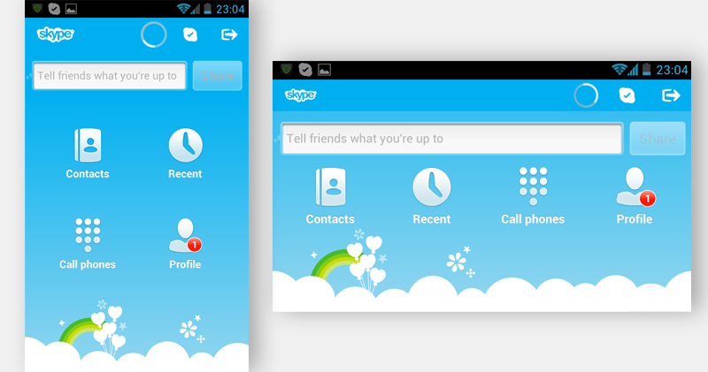
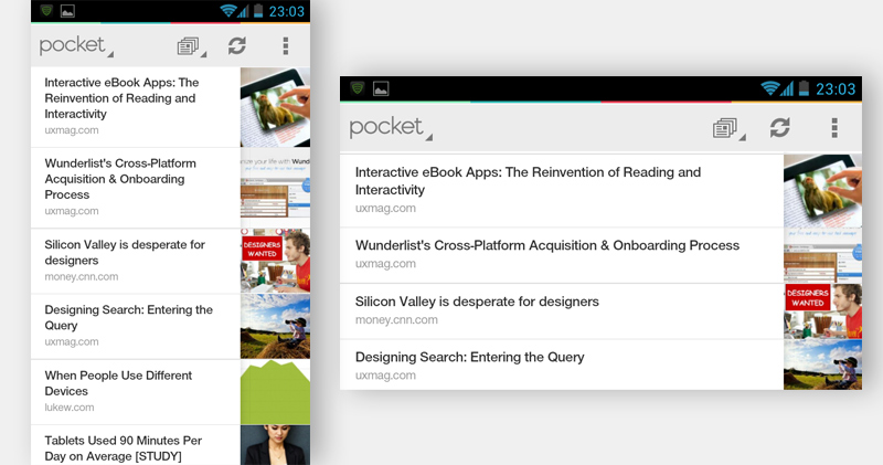
This interface simply adjusts to the new orientation’s size.
Extended
This interface adjusts to the screen’s size, adding or subtracting layout components according to the dimensions of the chosen orientation. For example, IMDb for the iPad uses the wider screen in landscape mode to add a filmography on the left. This list is also accessible in portrait mode by clicking the “All filmography” button in the middle-right of the screen.
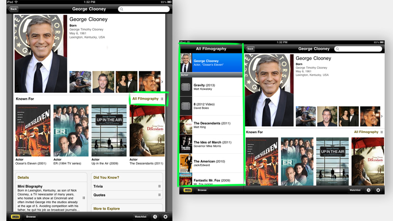
Providing visual elements and functionality in any orientation ultimately gives convenience to the user. However, not forcing the user to hold the device a certain way is crucial, especially if the desired functionality does not appear in the default orientation.
Complementary
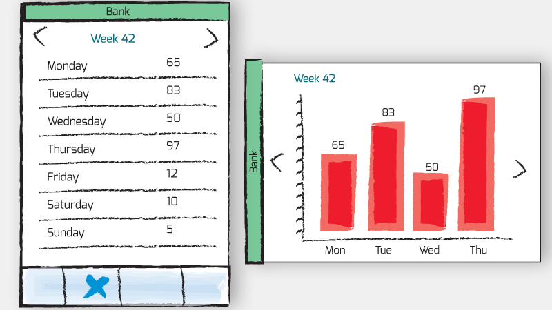
With this interface, a changed orientation triggers an auxiliary screen with relevant supplementary information. An example would be a mobile financial application that displays data in the default portrait mode, and then provides a visual graph when the user rotates to landscape mode. The orientations show similar or complementary data and depend on each other.
Continuous
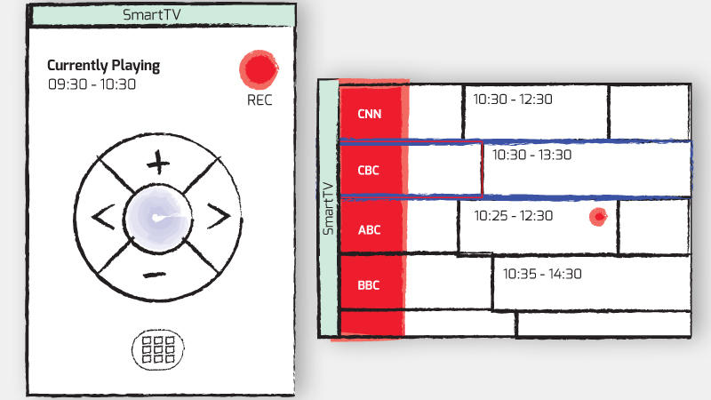
Like YouTube, a continuous design enables the user to access a secondary interface by a simple rotation of the device. An example would be using a smartphone as a remote control for a smart TV. Rotating the device to landscape mode would reveal a full program guide, while also maintaining functionality for changing channels, browsing programs and recording future episodes.
Considering The Default Orientation
Above & Beyond is an interactive eBook for the iPad about the life and work of the American caricature artist John Kascht. The beautiful art in this book is displayed in both portrait and landscape modes. However, horizontal mode shows important interactive elements that do not appear in portrait mode, such as a way to return to the main menu. Portrait is the iPad’s default orientation, so including this type of added interactivity only in landscape mode might confuse many users.
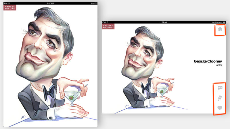
While portrait mode shows a detailed look at the art, and the interactive eBook provides some instructions at the beginning, a solution might be to allow users to tap the screen to reveal the menu. The default orientation for most smartphones and for the iPad is portrait. However, landscape is the default for Android, Windows 8 tablets and BlackBerry’s Playbook. To avoid confusion, remember that the primary orientation of your app should always serve the device’s default mode and functionality, not the other way around.
Understanding The Context
When designing an application for smart devices, consider the context and circumstances in which that application will be used, particularly when designing for device orientation. Case in point: interactive cookbooks have become very popular. Hardware and accessory manufacturers are creating devices to help us use the iPad in the kitchen, including a washable stylus for use while cooking.
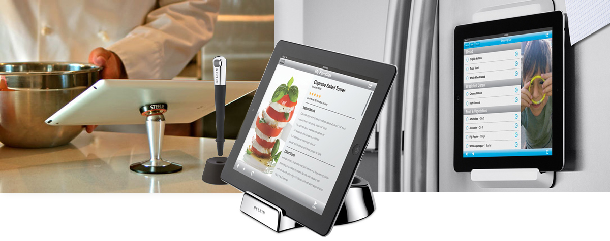
We can use orientation to create a better experience in a cookbook. Using the iPad’s default portrait orientation, users can flip through the book and view the full recipe and ingredients list for a particular dish. Rotating the device to landscape mode will change the interface to a cook-friendly layout, with large buttons and step-by-step instructions. This cook-friendly interface would also prevent the tablet from auto-dimming, and it would allow users to flip pages by waving their hand in front of the built-in camera to avoid touching the screen with messy hands while cooking.
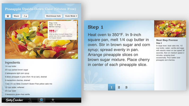
Understanding the context of the kitchen and how people cook with the iPad would make the interactive eBook much more functional. With the added consideration of device orientation, the user experience would be better overall.
Visual Clues About Orientation
An auxiliary screen or added functionality that depends on orientation can sometimes be counterintuitive. Without any visual clues in a particular orientation, a user might miss the added functionality altogether. A classic example of this is the iPhone’s built-in calculator, as pointed out in Salon’s post “How to Change the iPhone Calculator Into a Scientific Calculator” — functionality that many users do not know about.
When designing for device orientation, visual clues increase findability and makes the user experience intuitive and transparent. Below are a few examples of visual clues for device orientation.
Title Bar
Affixing the title bar to the top of the default position in either orientation is a subtle clue for the user to tilt their head (or device) to read the text in the bar. This technique is essential when using orientation for a secondary display and serves as a gentle reminder about the added functionality.
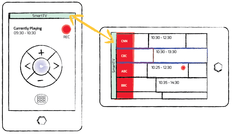
Note: This method will not give affordance to the added display in the default (portrait) orientation. In this case, I recommend coach marks, a quick tutorial or a walkthrough video (when appropriate) to illustrate that the application is using orientation for a secondary display.
Toggle Switch
Much like the universal icon for sharing or Apple’s familiar action button for sharing, I propose a standard icon to represent device orientation. You can download the icon shown below and use it freely.

The icon should appear at all times and be used as a toggle switch between orientation displays. Using the toggle would not require the user to rotate the device for the secondary view, but it would gradually encourage users to rotate the device to view the secondary interface without pressing the icon. Rotating the device back to the default orientation would automatically adjust the display. Ultimately, this icon would serve as a visual reminder for the added functionality; the user would not need to use this control to switch between orientation displays but would simply rotate the device instead.
Below are illustrations of this toggle icon in use:
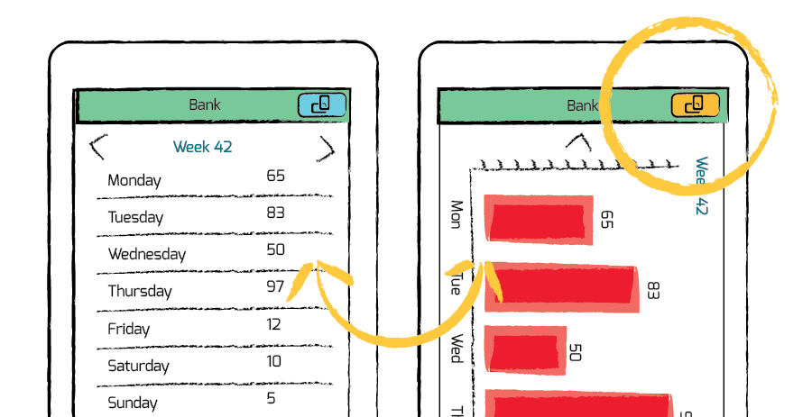
If standardized, the orientation icon would give affordance and serve as a visual clue. Here is an illustration of this toggle icon in a corner triangle.
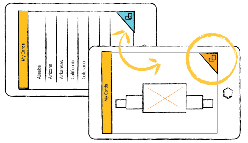
Note: The device orientation icon is not a proven idea, and the value of adding this somewhat redundant UI control is debatable. However, in my opinion, the idea is simple and effective and would enable designers to more fully rely on device orientation to enhance and extend their applications. Hopefully, the proposals here will spark a conversation in the design community and lead to a solution whereby, with a simple turn of the device, essential functionality is added to any application.
The Drawer
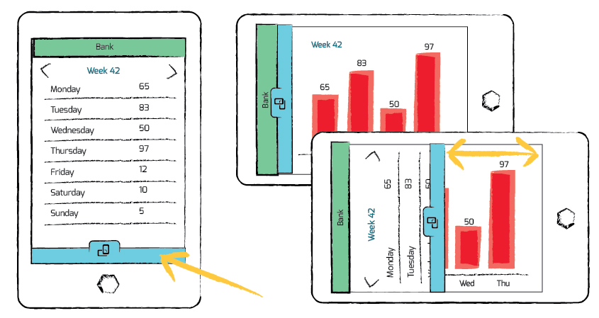
The idea here is to show a drawer-like control that users can tap or swipe in order to see the secondary view. Rotating the device would automatically open the drawer, much like a curtain opening. By using an animation to open and close the drawer, the designer can create a memorable effect for displaying data based on orientation.
Conclusion
Designing for device orientation is not new. For example, when rotated to landscape mode, smartphones open a larger virtual keyboard, and the email applications in tablets switch to a master–detail interface. However, device orientation design is widely treated as secondary to the main interface because it is often missed by users who stick to the default orientation, mainly because they are not aware of its availability. By adding simple visual clues to the interface, UX professionals can make the case for using device orientation to enhance their products and, ultimately, for providing more engaging and user-friendly experiences.
Further Reading
- Responsive Web Design: What It Is And How To Use It
- Breakpoints And The Future Of Websites
- Building A Better Responsive Website
- How To Build A Mobile Website


 Flexible CMS. Headless & API 1st


