Form-Field Validation: The Errors-Only Approach
Error pages for form-field validation are dreadful. You’ve just filled out 20 form fields, yet you get the same bloated page thrown back in your face because a single field failed to validate.
I clearly recall the often loud sighs of despair during our last usability study each time a test subject encountered a validation error page.
Further Reading on SmashingMag:
- Web Form Validation: Best Practices and Tutorials
- Useful Ideas And Guidelines For Good Web Form Design
- Web Form Design: Showcases And Solutions
We also noticed that test subjects who had been exposed to validation errors began to take preventive actions to avoid them in subsequent steps, by writing things such as “N/A” in the “Company name” field if in doubt about whether the field was optional.
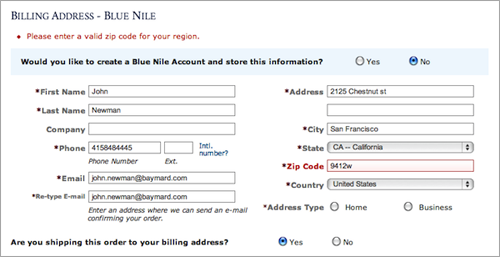
When getting the exact same page but with an error message, the user will feel they have made little or no progress, despite having typed 90% of the form fields correctly. (Image: Blue Nile)
Some of the frustration with validation error pages likely stems from the user being returned to the same page they came from. Being returned to the exact same page is problematic for a couple of reasons:
- With all form fields still displayed (valid or not), the user might have difficulty identifying the few erroneous fields among the many valid ones.
- More critically, seeing the same page twice makes it seem like the user has made no progress, despite having just filled in numerous form fields correctly.
At Baymard Institute, we reflected on this problem and got an idea that we call “error fields only” — which is exactly what this article is about. Before exploring this idea, let’s look at three traditional types of validation techniques: “same page reload,” “optimized same page reload” and “live inline validation.”
1. The Traditional Way: Same Page Reload
Here’s a typical validation error page from Staples’ checkout process:
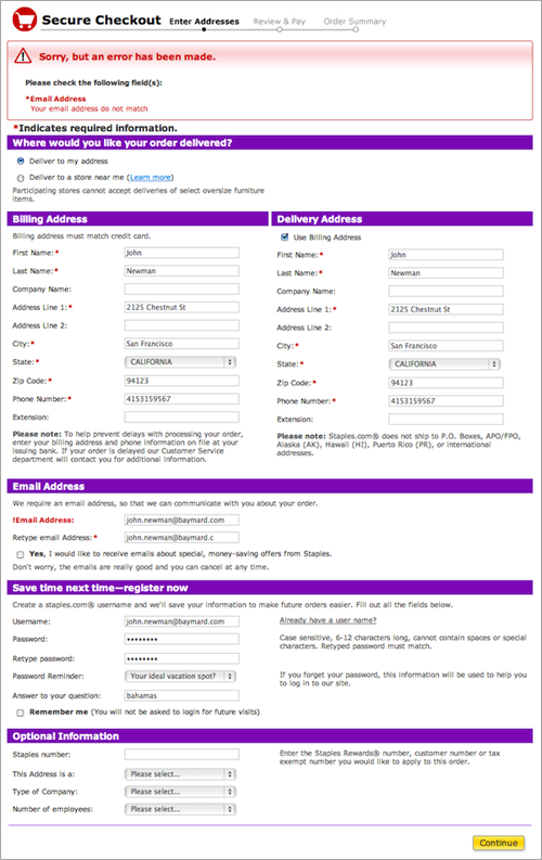
The current error page for Staples’ checkout process. Besides having a subpar indication of errors, Staples also breaks a handful of checkout usability guidelines.
When the user first submits the page, the entire page is reloaded, but with indications of validation errors. A message at the top of the page tells the user they have made an error and describes what the error is; further down the page, the label for the erroneous field is in bold and red.
This is significantly better than the sad practice some websites adopt of only highlighting the erroneous field in red or bold (without any description) and letting the user guess what went wrong. But the implementation could be much more thorough. Let’s look at how Staples’ page could be improved.
2. Same Page Reload: Optimized
To have a fairer baseline for comparison, we’ve made three changes to substantially improve Staples’ error page:
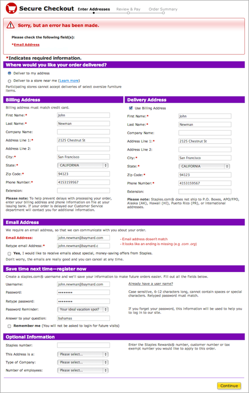
A simple mockup of an optimized version of Staples’ error page. Notice the anchor link at the top and the tailored description near the erroneous fields.
The three changes are:
- The error description at the top indicates the number of errors (if there’s more than one) and lists them.
- These listed errors are links that take the user directly to the corresponding field (especially important in long forms).
- A tailored message for each erroneous field shows either an example of correctly formatted data (for example,
john@example.com) or a tip on what might be wrong with the data (for example, “Looks like the ending in the email address you provided is missing (.com, .org, etc.),” instead of just “Email wrong — please correct.”
Now, in addition to being able to locate the erroneous fields and spot multiple errors more easily, the user actually has guidance on how to correct their data. Some input errors are plain cases of mistyping or obvious details being forgotten, which most users will spot immediately; but if the user lacks clues and can’t instantly see why the data is invalid and has to guess in order to proceed, then they will likely abandon the process.
While better, this second implementation (and the first) still result in a poor experience. The user still gets the whole page with all 31 form fields thrown back at them, despite having inputted 90% of the fields correctly. The signal-to-noise ratio is still high (two errors among all valid fields). The user will likely scroll up and down the form to make sure all errors have been fixed and, finally, scroll down to click that “Continue” button once again. This diminishes the user’s sense of accomplishment and makes their effort to resolve the errors unnecessarily cumbersome.
3. Live Inline Validation
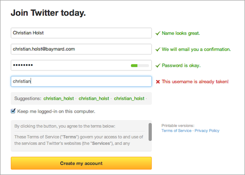
A very effective technique that resolves some of the issues with the last method is “live inline validation.”
Here, each form field is validated separately as the user types. The error handling is most often instant, with the user being told that their data doesn’t match the expected format (although the user can scroll past and try to submit the form anyway). Luke Wroblewski has done some excellent usability research on the inline validation techniques that work best.
Inline validation alleviates the aforementioned issues by indicating progress and by pointing out the erroneous fields (since the page does not reload). This makes the technique useful for forms in which the fields can be validated independently. In other cases, the data isn’t as simple as a user name, password and email address; sometimes the data needing validation is an array or a set of data. In the realm of e-commerce, one might need an address or credit card to be validated.
To live validate a credit card, you could perform a Luhn check to verify the format of the number, and you could verify the expiration date and security code (or “card verification value”) for the correct number and type of characters. However, the validation could still fail if the data doesn’t all match up when the payment vendor tries to authorize the card or if the card is declined. With live inline validation, the user would be first presented with a green checkmark as they input data in each field, and then they would see an error message after submitting the form if any of the fields didn’t check out. Alternatively, live inline validation could be disabled for just those fields for which the data has to be checked remotely. However, this has the drawback of an inconsistent UI, whereby some fields are validated live while others aren’t.
For address validators, the format of the inputted data could be correct, but the address itself could still fail validation (for example, if the address doesn’t exist). Again, live inline validation would begin here with checkmarks indicating to the user that the inputted data is correct, but then, when the user submits the address form, the website would (confusingly) change its mind and tell the user that it doesn’t recognize the address after all.
Our suggested approach, the fourth and last validation technique, tackles these problems.
4. Error Fields Only Approach
As we’ve seen, there are different ways to display error messages, each with its own strengths and weaknesses. Based on these observations, we thought of a validation technique better suited to complex data. What if we removed all validated fields on the error page that reloads? What if we displayed only those fields that failed validation? So, instead of reloading the entire page and showing all 20 fields of the form when only the “Phone” and “Email” fields have errors, you would simply show a page with those two fields and the corresponding messages.
With this approach, the picture is quite different. The user now gets a new page, or an overlay, with just a couple of error fields. A summary of the validated data would also be displayed, along with an “Edit” link in case the user spots something they want to correct. Staples’ error page would then look something like this:
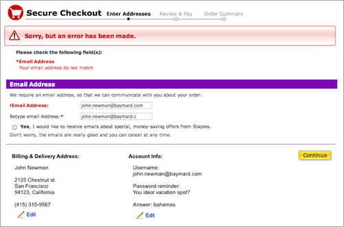
A simple mockup of what Staples’ error page would look like with this fourth approach. Only erroneous fields would be shown, and all validated data would be summarized below with an “Edit” link.
This approach makes the error page much more digestible than the traditional technique, and it makes abundantly clear which fields are the problem, which is particularly helpful in long forms.
Now, the user simply has to fix the fields shown and hit “Continue” — no scrolling, no having to pick out erroneous fields from valid ones, no repetition of the same page, just a simple page explaining exactly what to fix and how to proceed.
When To Use Each Validation Technique
Compared to the two traditional reloading techniques (i.e. 1 and 2), the “live inline validation” and “error fields only” techniques both offer the user a sense of progression and a clear distinction between erroneous and valid fields.
The “error fields only” approach is usually best when inline validation wouldn’t quite work. In April 2012, we benchmarked the top 100 e-commerce websites in the world and found that only 8% use live inline validation during checkout (likely due to having to validate both postal addresses and credit cards). In general, the longer the form and the more complex the inputted data and its dependencies, the more likely the error-fields-only approach is the best choice.
Inline validation is effective for simpler forms. When the data is an array or set, such as with postal addresses and credit cards, then the method becomes problematic. In this case, the UI would be illogical (the user would see each field validated individually and then suddenly fail collectively) or inconsistent (only some fields would validate as the user types). Of course, this technique would still require the page to be reloaded as a fallback, in case the user submits the form regardless of inline error messages (or if they have disabled JavaScript); therefore, the page reload techniques (the traditional and newer versions) might be best even for simple forms.
On smartphones, the error-fields-only approach has an advantage over the same-page-reload technique, because users typically lack an overview and context of the form due to the small screen. In such cases, displaying only the erroneous fields would help the user focus on the task at hand.
Rethinking Validation Error Pages
The error-field-only approach is merely a concept, and it needs both refinement and testing. An even better solution to these user experience problems most likely exists. Maybe having a traditional (although optimized) error page with green checkmarks next to the validated fields on the error page (to indicate the user’s progress) would be a better solution; or perhaps applying a slight fade to validated fields, making the erroneous ones stand out, while maintaining the context of the page.
The error-fields-only approach is more an attempt to inspire and a call to action to rethink how we handle validation errors and thus provide a better user experience.
While we can agree that validation pages aren’t the sexiest part of Web design, we should give them attention because their quality will determine whether the user comes to a screeching halt or feels a small bump on the road.
Got your own examples, mockups and ideas for validation errors? Share them in the comments!


 Flexible CMS. Headless & API 1st

