Design Process In The Responsive Age
You cannot plan for and design a responsive, content-focused, mobile-first website the same way you’ve been creating websites for years—you just can’t. If your goal is to produce something that is not fixed-width and serves smaller devices just the styles they require, why would you use a dated process that contradicts those goals?
I’d like to walk you through some problems caused by using old processes with responsive design. Let’s look into an evolving design process we’ve been using with some promising new deliverables and tools. This should provide a starting point for you to freshen up your own process and bring it into the responsive age.
Further Reading on SmashingMag:
- Responsive Web Design: What It Is And How To Use It
- Responsive Web Design Techniques, Tools and Design Strategies
- Sketching A New Mobile Web
The Problem
The issues caused when trying to force new results from an old process are significant yet, strangely enough, not immediately obvious. We’ve all just gotten used to them, like the annoying quirk we didn’t realize we had, until someone points it out. And from that point forward, it drives you crazy.

For example, when we create a desktop-sized, fixed-width site layout in Photoshop and hand it to a developer to interpret into HTML/CSS, we are asking the developer to make a lot of design decisions—possibly without even realizing it. Below is just a small sample:
- How should the layout adjust for smaller-sized devices? (It sure would be nice to have a hierarchy of important page elements based on their purpose, huh?)
- What is the hierarchy of the content? (Gee, all that “Lorem Ipsum” doesn’t make it obvious?)
- How does the navigation respond to smaller screens? (How do I handle ten links with five child pages each revealed on hover with a 320×480 touch device?!)
This can cause major problems if the developer doesn’t feel confident in the visual arena. Even designers/developers who feel comfortable making those calls can get in hot water. In the end, the developer is often forced to make assumptions where plans were not made clear beforehand—sometimes days before feedback from designer or client becomes available. Sometimes it works, sometimes it doesn’t.
Work More or Work Efficiently?
It’s easy to resort to working more to resolve these new challenges. What comes naturally? Do a desktop and mobile-sized wireframe, then turn around and design a desktop and mobile-sized layout. This sort of solves the problem. You and your developer have more to work with, at least. However, what about all the device widths in-between—you’ll have to cover those as well, right?
At this point, you wake up and realize you’re stuck in a familiar loop of ever-increasing deliverables and ever-shrinking profits. Using this old process to tackle new problems doesn’t really solve any of them, and it’s going to kill you from lack of sleep, make you poor from lack of profit, or both.
There are some good ideas floating around dealing with new processes. Some smart folks are of the very sensible opinion that the only answer is to design in the browser. However, other smart folks have admitted for the quiet rest of us that it’s really, really hard to design freely in the browser—at least with current tools.
Of the emerging new process ideas, those that involve responsive HTML/CSS prototypes look very promising. I’m planning to investigate these further. However, there are some definite challenges with this approach, not the least of which is the time it takes to create them when the site content is complex. Most of the examples I’ve seen are fairly generic, which doesn’t translate well to real projects.
Currently, we are successfully using a different approach. It attempts to optimize content, design, and development time, finding a budget-friendly balance of appropriate direction from all disciplines—something that is effective, lean and uses quick, widely-accessible tools.
Solution: The Priority Guide
I used to call this my “mobile-sized content prototype wireframe thingy.” For obvious reasons, however, I was encouraged to change the name by pretty much everyone I know. I liked the specificity of the name, but brevity won out. So, I settled on: Priority Guide.
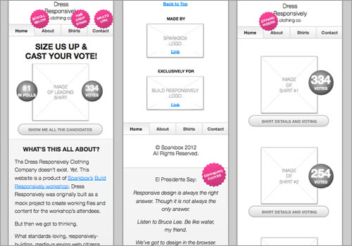
Essentially, with the priority guide, we create a single deliverable that provides direction for content-focused design and mobile-first development in something resembling a wireframe.
By nature, a mobile-sized approach is narrow and forces more of a single column layout. The single column, in turn, causes a linear display of content and features. This linear display makes priority and hierarchy much more apparent than a desktop-sized wireframe, especially if you attempt to use a draft of real content instead of greek text—hence the content prototype.
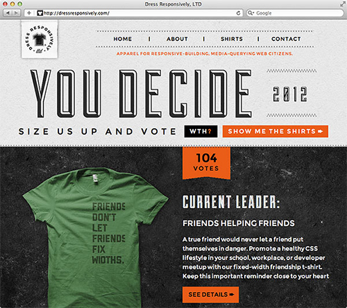
At that point, armed with just this priority guide, the designer sets off to create something beautiful. The designer cranks up trusty ol’ Photoshop and begins a new layout at a traditional desktop resolution—just like you may have done for the past ten years. For a good web designer (outfitted with his super-duper powers of visualization), it is a snap to make design decisions for a desktop resolution while looking at a mobile plan. That’s just how their minds work.

Download a hi-res JPG of the final design.
Once the design work is done, the handoff to the developer consists of the completed desktop-sized design and the original mobile-sized wireframe.
Don’t Let the Simplicity Fool You
This approach may sound simple—which is part of the beauty of it—, but it also provides some real benefits:
- The developer is provided a sort of bookended direction, both desktop and mobile. Two guides to follow, each offering unique information. Some interpretation still has to be made, which isn’t a bad thing, but there is far less guess work.
- The designer is given a wireframe that provides hierarchy but does not dictate desktop-sized layout, where ample real estate allows for more creative room to breathe—designers need to be given their freedom, lest they shrivel up into sad, hollow, hipster-jean-wearing shells of themselves.
- From the prototype and their linear approach, hierarchy can be understood fairly quickly, and the foundation for mobile-first markup and style is implied but flexible.
- All of this is done in a two-deliverable process, like before, so it saves time and budget. Any method you get better results in the same amount of time (or less) is a good thing.
A Note About Context
Any conversation concerning mobile web draws questions of context. Is there a “mobile context”? If one does exist, do users actually have different expectations of a website’s content while they are mobile? And, if users do have different expectations, how do we address them? Whew.
In short, those questions aren’t what this article is about. These issues are being discussed in depth elsewhere. I believe that questions of context can be answered very differently, depending on the project. I’ll leave it to you and your team to apply due diligence in addressing context.
What I will suggest, however, is that you tread very carefully when making assumptions about your users and limiting content as a result. Though a mobile context may exist, you can’t make those assumptions based on screen size alone. People surf the web on their phones from their couches, and they have all the time—and expectation—to access all of your site’s content as they sit and watch TV. This is why we believe in a responsive web design approach that acts as a safety net where little to no content is abridged from the experience of the user. This is the approach reflected in the above article—plan for all content in all contexts.
Tools To Consider
Style Tiles
Designer Samantha Warren just recently presented her concept of Style Tiles at SXSW. She was featured just days later on A List Apart discussing the same concept. We love it. It’s one of those concepts that makes you slap your forehead, wondering why you didn’t think of it sooner. It makes sense for web design in general, even more so in responsive design where client delieverables are much more tricky. We are already planning to integrate this into our workflow. We envision this deliverable being presented to a client during the wireframing process, so progress concerning style and layout can be made separately but concurrently.
Keynote for Wireframes
I’ve been loving Keynote for wireframes lately—it’s even great for mobile-sized content prototype wireframe thingies. If you haven’t tried it, give it a shot. It’s quick, easy to learn, and easy to share. A really interesting article was written recently about designing in Keynote. I’m not sure I’m ready to go that far. However, it’s a fantastic wireframing and planning tool, and there are some great kits to get you started.
Conclusion
If you gain nothing more from this article, let me remind you what you already know: don’t be afraid to try new things. No process is a silver bullet—the same is true of tools and deliverables. If the ideas above don’t fit your project, scrap them and try others. However, you must evolve your design process to account for the evolution of the web and users. If you hope to solve new problems, you’re going to need a new approach.
You must also address the very human issue of communication. Earlier and more frequent collaboration among team members and the client must become the rule in your workflow, not the exception. Content, design, and development team members must review and collaborate regularly at every stage in the creation process until the site is live. We can’t ‘throw it over the wall’ anymore—at least, not if we want our sites to be excellent. There are simply too many moving parts now. Go forth and collaborate.
(jc) (fi)


 Flexible CMS. Headless & API 1st


