Removing Stumbling Blocks In Mobile Forms
I normally try to be as attentive as possible, but this time a big crack in the pavement caught my shoe and threw me completely off balance.
After reporting my clumsy accident to friends and family, I instantly received comments like: “be more careful” or “better watch out next time”. In the end, I started to defend myself—if that crack would not have been there, I most likely would not have been face-planted.
When it comes to filling out forms on a mobile phone, I have observed many users running into a similar experience, merely less painful in its physical aspect. Many elements within a mobile form affect how smoothly users will get to a service or product hiding behind a form of any kind.
Further Reading on SmashingMag:
- Animated Microinteractions In Mobile Apps
- Browser Input Events: Can We Do Better Than The Click?
- The (Not So) Secret Powers Of The Mobile Browser
There are several factors that can be considered to be stumbling blocks throughout the journey of filling out a form. Specifically on a portable device, this journey is complicated by the fact that we have to consider contextual parameters such as time, location, or limited input options, in comparison to a firm desktop experience. In this post we will look at the most common stumbling blocks for mobile devices. Moreover, I will discuss design strategies to avoid stumbling blocks and to facilitate a safe and quick stroll through forms for mobile users.
Help Users Stay On The Right Path
Some might say that elegantly designed forms can be compared to the likes of an efficient traffic system—as soon as you enter the road, you also enter a world of permanent and dynamic guidance that helps navigate you safely to your final destination. For example, the crosswalk signals tell you when it is okay to cross the street, just as the street signs signal the names of the streets that you are on.
Street lights are also provided to help you navigate through difficult terrain in the dark. Keeping in mind your ultimate destination, you ultimately decide where to go, step by step. Road signs present your options and point out limitations. You can follow the traffic, take a short cut, or obey the navigation system on your phone.
In this situation, comprehensible and timely feedback is vital. The same applies to mobile form design. Signposts and immediate feedback encourage users to complete a form. Although inputting data on a mobile device can be very cumbersome, many people happily key in vast amounts of information when using services such as Twitter, Facebook, or text messaging on their mobile devices. Such services are good examples of how seemingly poor interfaces will not stop people from using a much wanted service, as long as the return of their effort is evident. People who understand and trust the outcome of their journey are less likely to hesitate about wandering even down a difficult path.
However evident the effort of typing on a mobile device might be, inputting data can take some time and can also become frustrating very quickly. Letting your users know almost instantly that they provide data in the wrong format, or that their username is already taken, is important. In the same way, a form can tell them where they are within the form, to make sure they don’t type the right data into the wrong field.
Furthermore, portable devices are more likely to suffer from connection errors and slow connections than desktop devices. Client-side validation techniques, such as HTML5/CSS based or optimized JavaScript approaches, have proven to be advantageous in this case, as they reduce the amount of data transfer to easily allow UI enhancements while coping with less stable connections. But keep in mind when using JavaScript for form validation, that some mobile browsers (such as the Blackberry OS browsers—except of the most recent one), are not JavaScript enabled per default. Therefore, users who are unable or uninformed about how to change their settings will benefit from implementations following the concept of progressive enhancement. The less time users spend on retyping data or waiting for data to be validated the quicker and happier they will get through a form.
Minimize Steps And Crossroads
One of the biggest take-aways from the Keystroke-level model in form design is that navigating along interactive elements requires both physical as well as mental activity. This can have a severe impact, especially on a mobile phone, based on the natural way of interacting with a portable device. Every input field within a form requires users to scroll through it, understand its meaning, focus on it, and then provide the correct information.
Due to the fact that people use their devices in a lot of different ways and these devices vary “greatly”, form elements that are spread over several input fields are prone to be rendered on a mobile device in a way unintended by the designers. As an example, during user testing sessions, I sometimes see users getting stuck on providing their phone numbers when having zoomed in on the form. The typical behavior is to enter their entire number into the first box provided for the area-code, completely missing the second input field. After submitting the form, they are puzzled about why there are two fields and the corresponding error message.
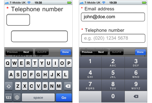
Separated telephone number fields (left) in comparison to a unified field (right) with optmized input type and a label within the field to remind users about the area code.
To allow users to get through a form quickly, there are a variety of compression techniques to reduce the amount of fields needed to provide certain data. Many of them require more post-processing on the back-end. If you can’t dissect numbers on the back-end, smart defaults or clever instructions work just as good. Some of them simply require a thought about the way of keying information into a field. For example, using a predefined drop down to provide the date of birth, rather than a loose input field or htlm5 optimized input fields for numbers, mail addresses, or other types of data, when appropriate. Dynamic input masks can help users to provide even quite complicated types of data with ease. Moreover, it will just take you a minimal effort of scripting.
At other times, forms might benefit from rather unconventional approaches such as text input fields for a quick and easy country selection. Furthermore, there are a variety of libaries such as jQuery mobile to optimize input fields and to ease validation, even for complex data.
Overall, our goal is to allow people to navigate through the form, achieving the quickest possible success with the least necessary effort. At all times we want them to feel that they are doing the right thing, and that their time is well spent. Brevity is crucial. Some people get stressed when spending too much time on trying to find hidden checkboxes, switching between keyboard layouts, or attempting to understand skewed marketing questions. Some people get physically tired answering redundant questions, filling unnecessary blanks, or scrolling up and down to find a required field that they just missed. To reduce cognitive load as well as physical effort it is important to remove optional steps from a user’s radar of attention, simplify the way of inputting information wherever possible, and to create a comprehensible flow throughout the form. If the process is too complicated (or the effort too high) a dropout is quite likely.
In the end, fine-tuned and streamlined forms will save your company phone calls from frustrated users and lead to more and more happy ones as it requires them to spend less time navigating through input fields and figuring out their meanings.
Uitilize Signposts And Mark Paths Clearly
Another great design concept to exploit for form designs are the Gestalt laws of grouping to help support the orientation of users. Applying grouping principles to a multiple questions form allows us to structure content, to create a visual flow, and to group related form elements.
In many projects I have seen design teams arguing about whether to break down a rather long form for mobile devices into several short pages or rather for one long page. Either way, there are endless possibilities for both design approaches to elegantly confirm users about their progress. This helps them recover from their errors, and to make them feel confident that the data being saved will not have to be reentered (in case they loose the connection, or accidentily close the application).
Both design approaches have their individual benefits, the only spanning factor here is the breakdown of the long form into meaningful and manageable chunks. For single-page designs, this means that it should even be possible to visually distinguish the single steps from one another. Especially with portable devices, the longer a form page is, the faster users will be able to scroll through, in case they have to jump between fields. Poor visual guidance in this way will result in users missing to fill out fields, losing sight of fields, and/or getting frustrated by searching for them after being presented error messages. White space and general grouping techniques are therefore vital to create visual guidance throughout a form.
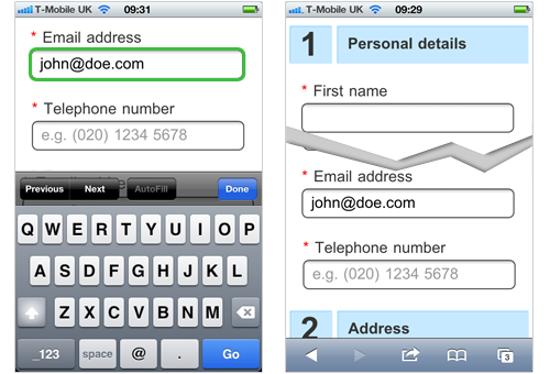
Using color coding to highlight the active input field from other input fields (left) or to visually differentiate sections from one another in a long form (right).
Distinct grouping in interface design is a basic exercise because of its power for reducing processing speed and cognitive load. A while back, Matteo Penzo investigated the effect of different visual grouping techniques for a typical sign-up process. In his eye-tracking study, he analyzed the importance of label alignment for input fields and highlighted the superiority of top-aligned labels in many cases. Easy to distinguish input fields with top-aligned labels in close distance to one another allowed users to look at the label and the field in one go.
Other techniques required higher processing efforts, thus increasing the coginitve load and the time it takes to process the entire form. Less effort is good, and despite the granular example, we have to keep in mind that all these factors add up through input elements, the different sections, and the form as a whole within the website. The more complex the form, the bigger the effects of distinct grouping. Reducing the need for visual fixations allows a reduction in cognitive load, helping users to focus on their task and allowing your form to function almost like a navigation system—helping users to find their way to the goal.
By considering the effects of distinct groupings, we support our human capability to naturally perceive objects as organized patterns and take away the need for users to create an understanding about the form by reading the questions in depth, relating to the elements mentally. Naturally we want users to read through the questions. But similar to a vis-à-vis conversation, we can use facial expressions in combination with the words we say to underline our message and to get it across more easily.
Allow For Platform-Dependent Shortcuts
One of the major reasons that users get stuck on forms when filling them out on portable devices is limited visibility. Users, who are entering key information into a form’s field, usually have more than half of their screens covered with the keyboard, input suggestions, and other status information. To navigate between fields, and for general orientation, I see in many testing sessions where participants frequently try to disengage the onscreen keyboard, when looking for certain fields, or scrolling through the form to increase visibility.
However, many people will use the “return” button on the bottom right of the keyboard to disengage it after keying information into the field, or even to confirm their input for the single field. Although this approach helps many users to get rid of the keyboard (and to see the form on their whole screen), pressing the button also means, in many cases, that the form will be sent to the server straight away. Therefore, many users will be confused by a loading screen and the need to wait for a server response after pressing the “return” button.
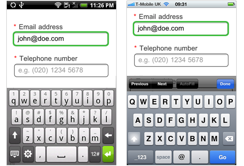
The return button on Android (left) and iOS (right) is very salient within Web forms, and pressed by many users without the intent to send off the form.
Using the keyboard to send off a form is very handy, when using a single field form such as a search box. However, for multiple question forms on portable devices, it is important to check the form on the client side before sending it off, when users press the “return” button (by accident) to avoid confusing loading times. To ensure that your form is not submitted by accident, there are plenty of client-side validation tools; jQuery plugins, for example, provide everything we need.
Provide Contextual And Personalized Guidance
In short, be a tour guide. After all, designing a good form is like planning a hike with friends or family. Not only do we need to find out who will be on the trek, we need to plan for breaks, points of interest, and unguided side-treks in order to make sure everybody gets the most of their hike. However, as most of you will know, most hikes are not free of problems, and difficulties are inevitable; people can wander off, some might need help or more time to get through challenging passages, weather conditions are bound to change, and general mistakes happen. It is seldom that all of these inevitable difficulties will evolve into a real problem as long as we are prepared. Similarly to a hike, difficult situations are all about awarness, clear communication, and guidance. All it takes is a good approach to inform users what their problem is and what they can do to fix it.
There are plenty of techniques to help strayed users find their way back to the right path. Putting messages under input fields, for example, has proven to be quite a solid approach for telling users what has gone wrong. In combination with noticeable color coding (i.e. red for errors, or green for confirmation) you can be sure to get the necessary attention.
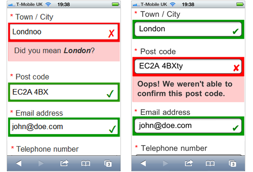
Two designs showing prominent error messages for misspelling hints (left) and general processing errors (right).
Another important aspect that is often neglected when it comes to messages within forms is the choice of words. On the one hand this refers to what we say, and on the other, it is about how we say it. Your error messages or instructions will most likely be read by a nontechnical human being. Let’s create messages as we would be talking directly to your user: avoid jargon, be tactful and brief. There are many useful recommendations on how to design effective error messages. Most importantly, we want our users to understand what happened and why it happened in a clear fashion.
On top of that, most users will not only appreciate clear notification, but also advice on how to fix the problem right away. Dyson, for example, managed to reduce support calls and increase the confidence in their products with a simple change in the way they display error messages. Rather then showing the problem (e.g. “Low Voltage Error”), they switched to displaying possible solutions (e.g. “Check Power Cable”). In this way, they are not only making their users aware of problems, they are also giving them guidance on how to fix them. On your form, many different users will possibly make similar mistakes. If possible, it is a good idea to analyze inputs to include a solution for the problem that helps users to recover them quickly. Ideally it even relates to the data they wrongly provided.
Wherever error messages pop up troughout the day, try to record them. At the end of the day, those records can tell us where stumbling blocks are still hiding, and what we need to improve to smooth out the path.
Conclusion
Mistakes happen—c’est la vie. Ideally though, we should aim to avoid most of the tripping hazards that delay so many users from filling out forms on a portable device. Similar to an uneventful stroll on the pavement, the smoother the path is to the destination, the more likely users will complete the journey. Easy orientation, no detours, clarity, and a little bit of guidance are a traveler’s best friends. And experience shows that the further users get before stumbling upon an error, the more likely they will put extra effort into completing the task.
Ultimately, other stumbling blocks may exist apart from the ones I discussed. So try to connect your analytics to the activity on the pages to find out where people drop out of the process. This will show where stumbling blocks may exist and help to remove one block after the other to ensure the user the smoothest journey.


 Register!


 Flexible CMS. Headless & API 1st

