Why Transitions Are Important
Life and nature are one big transition. The sun slowly rises to mark a new day and then slowly sets to mark the end of the day and the beginning of night. We are created in the womb and from small cells we grow, are born and gradually age until we die.
Perhaps these natural transitions in life are what make artificial transitions feel… well, right. Sometimes, though, when something jumps from one state to another, it feels OK but doesn’t quite feel right.

A transition that has been designed to be slow can feel awful. When designing an application, an interface or any type of structured content, we must ensure that users understand where they have come from as they arrive at the new page or state. The transition from one screen or group of content to another should feel natural and should be tested on devices of varying power and speed to get a wider view of how the transition feels. Too fast, and it may appear broken or jumpy; too slow, and it will be frustrating to use.
Further Reading on SmashingMag:
- Improving User Flow Through Page Transitions
- Smart Transitions In User Experience Design
- Designing In The Transition To A Multi-Device World
- Providing A Native Experience With Web Technologies
When discussing design, the word “transition” usually conjures up thoughts of overblown PowerPoint presentations or home-made movies made with cheap video-editing software. But there is more to transitions than meets the eye.
Transitions take us from one state to another all the time, many times a day in fact. Most of the time, these transitions feel completely invisible (as they should), and until they are taken away we don’t really know they are there. This article discusses transitions and how well-designed transitions can enhance the user’s experience by imparting a sense of control and easy navigation. We will also discuss how poor transitions can impair the user interface.
What Is A Transition?
By definition, a transition is “a change from one form or type to another, or the process by which this happens.” As mentioned, we make transitions all the time without really knowing it, and they certainly extend beyond our computer interfaces. A well-designed transition takes the user from point A to point B very quickly while conveying the path they have taken.
Transitions are common in interface design, as we know, but are also used in movies and product design. In product design, transitions are triggered by touch, movement or physical handling of the product; in interface design, however, transitions are triggered by navigating through the interface of the application or Web content. A transition should be designed to give the user a sense of their virtual position or location within the interface.
Examples Of Transitions
Cinematic
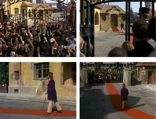
In a scene near the beginning of the 1971 movie Willy Wonka & the Chocolate Factory, winners of the golden ticket gather outside the gates of the mysterious factory to see the elusive Willy Wonka emerge.

Frames from Willy Wonka & the Chocolate Factory (1971).
As the scene unfolds, the viewer watches from behind the crowd, through the gates, towards the factory; the next camera angle takes us from behind the crowd to just inside the factory gates; and then we’re beside Wonka as he limps along the red carpet; and then we jump to watching him from behind. Although there is no visible “tweening” throughout these transitions in camera angle, we the audience still perfectly understand where we are.
We are watching the movie from our comfy chairs and yet we are made to feel as though we are physically present near the factory. This is an emotional transition.
Interface
If you have an iPad or iPhone, pick it up and go into the settings. Tap around between the menu options to see how the screen slides from right to left and left to right. Scroll to the bottom of any screen to see the soft bounce that indicates you have reached the end of the content. These simple quick transitions were carefully designed to give the user a sense of location within the operating system. Only when you slow these transitions down do you notice the detail that has gone into these in-between bits.
The iOS transition effect in slow motion, by Lim Chee Aun. (Watch this on Vimeo.)
Although we are not viewing a physical location, as in a movie, the OS still gives the user a sense of location by letting them know through the transition where they are navigating to and where they have come from. When you tap on a menu button, the screen shifts to the right to show the next step, and to the left to show the previous step.
Google Chrome on Windows shows us another simple transition, as seen in the video below. When opening a new tab, you see it open with a brief animation from the left. Closing the tab animates it back to the left before disappearing.
The Path app, which is available on both Android and iPhone, is packed full of interesting transitions between states. It’s worth downloading to see how it handles jumping between features.
When the app opens, you go from the splash screen to the actual content with a quick page turn. Clicking on the main menu will spring open the menu options, which spring back once you close the menu. This detail shows the user where those menu items come from, and while we may not consciously think about it, it’s an important detail in the overall user interface.
The Scorekeeper app has what appears to be a very simple interface. Solid colors and a lot of straight edges give the impression that the app is easy to use — and perhaps even that little thought has gone into the visual design. But look again. The transitions in this app are beautiful. When a player is awarded points in a game, the app updates their ranking in the list, using excellent transitions to move the player from their original position to their new one.
Product Design
I’m afraid I have to use Apple again for this example. If you’ve ever bought an iPhone, you would have noticed the design of the packaging. The compact box with matte laminate finish has been thought through to the last detail. The vacuum effect that you get when lifting the lid means that you’re not just breaking a seal and cracking open a box; rather, the lid slowly slides open (similar to the experience of the OS), taking a good second or two to reveal the shiny new device. This unboxing could be described as a physical transition.
Though not an obvious transition, the MacBook’s power light gently pulses when the device is sleeping. The transition is interesting because its fading in and out mimics the natural breathing rhythm of a sleeping person. This can be considered a transition because it’s a visual indication of the state of a device that is neither on nor off, but in between the two states.
Automotive
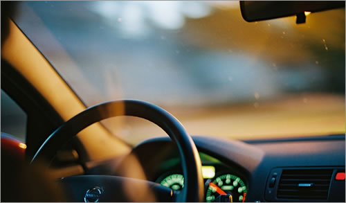
Modern cars are packed full of excellent transitions that guide the driver through various states. For example, the cabin light comes on when you unlock the door, and then it gradually fades as you buckle the seat belt and start the engine. The subtle lighting takes the user from pedestrian to driver in one smooth transition.

(Image credit: eduard_orbitron)
Nature
As I sit in my chair typing this article, I can turn my head from left to right. By doing so, my field of vision shifts. If I want to look at something to my left, I turn my head — in the process catching everything that crosses my line of sight — until my eyes arrive at the object of attention. My eyes and body have made a transition, and it’s important that we be conscious of our actions as human beings to discover more about natural transitions. Watch the video below to see how the human body transitions from one state to another.
Why Are Transitions Important?
As designers, we do our best to make content easy to find, easy to read and aesthetically beautiful. But as processors become more powerful and technology advances, the devices and systems people use to access this content will hurtle forward, and we’ll discover new ways to deliver this content. We’ve quickly adopted touch methods, and now gestures are becoming important, too. With this in mind, we need to give users a sense of location in our applications, and transitions will play an important part in this.
Most Web content now is organized as “pages”: clicking or tapping a link simply show the page behind that link (provided the connection is fast enough). There is rarely any form of transition from one page to the next, and we have become used to this method of displaying Web content. But we can introduce useful and beautiful transitions into Web content — such as by using jQuery ScrollTo — but these transitions can be clunky for a number of reasons, including slow connections, excessive processor requirements and the transition speeds defined in JavaScript.
Best Practices For Transitions
There are plenty of ways to incorporate transitions into a design. Here are some general suggestions:
- Avoid any pause at the point of clicking, touching or swiping. Hardware speed will always be a factor, but it’s safe to say that chips, processors and memory are getting faster by the second, so test your code and loading times to make sure there is no lag.
- Test in the real world. There is no better way to test transitions that by running them in the real world — especially if you are designing for mobile, because people on the go devote less time and attention to navigation. Load a prototype of your design in a supermarket or on the train, and test it to see how it performs under pressure.
- Don’t reinvent the wheel. In general, follow the conventions of the operating system you are designing for, because transition styles that diverge greatly from what people are used to will likely cause confusion and frustration. Of course, don’t hold back on designing new transitions; just keep the standards in mind.
- Mind the future. These days, we interact with apps by clicking, touching, swiping and speaking. However, gestures will likely become a new way of controlling content, so start considering them now. If people will be able to use their bodies (rather than their fingers or mice) in various ways to manipulate the screen, we will have to give thought to timing, pace and physics — that is, the speed at which a body performs a gesture to move content will have to be matched to the speed at which the content moves. Imagine the frustration of throwing a tennis ball as hard as you can, only for it to travel a few feet on release. Our users will feel this same frustration if the timings of our transitions are poorly designed.
Conclusion
A good transition should be almost invisible to the user. It should help the user understand where they are navigating to and where they have come from, but it should also be smooth and quick. A stall or stutter impairs the overall user experience and tells the user that something is wrong. There is such a thing as UI motion sickness, where the user gets so used to the fluidity of moving between screens that when a screen freezes for a second or two, the user feels like they’ve come to a sudden stop. It is these sensations we should avoid.
For help and inspiration on using transitions in your designs right now, check out the following resources:
- Mark Coleran’s showreel An excellent showreel showing faux interfaces and interactions designed for movies and TV shows.
- CSS Easing Animation Tool, Matthew Lein A useful online tool to test CSS animations and transitions.
- Touch-Optimized Web Framework for Smartphones and Tablets, The jQuery Project A unified HTML5-based UI system for all popular mobile platforms, built on the rock-solid jQuery and jQuery UI foundation.
- How to Use jQuery to Make Slick Page Transitions, Dave Gamache Adding the final touches to a website can mean the difference between a polished and beautiful product and one that leaves no impression on visitors.
(al)(fi)


 Flexible CMS. Headless & API 1st


