Introduction To Designing For Windows Phone 7 And Metro

Email Newsletter
Weekly tips on front-end & UX.
Trusted by 200,000+ folks.
 Flexible CMS. Headless & API 1st

It also targets a different market than its predecessor: instead of being designed mainly for business and technology workers, WP7 is targeted at active people with a busy life, both offline and online, and who use social networks every day, whatever their background.
Why Should Designers Care?
First, it’s a new interface, so you have space to create and develop some new ideas for it. We are still at the beginning of its growing curve, so it’s an interesting challenge. When I saw a WP7 presentation for the first time, I thought, “I want to design something for this.” Exploring is a great way to learn how to build a new exciting experience for users.
Further Reading on SmashingMag:
- Testing For And With Windows Phone
- Windows Phone Design For Developers
- Testing Mobile: Emulators, Simulators And Remote Debugging
- Where Are The World’s Best Open Device Labs?
Secondly, Metro design is a market reality that we can’t ignore. This is a new user experience that will be a part of Microsoft’s future OS, Windows 8, that will bring consistency across devices and that will put a strong emphasis on the Metro design. Instead of having a different interface for each device — phone, tablet and desktop — users will have the same experience everywhere, with only slight differences due to the nature and specificities of the device. Since the new version was released in late September (WP7.5, better known as Mango) and the release of the first WP7-based phones from Nokia (with its huge marketing firepower), it has become clear that Metro design devices will play a big role in the market.
A New Approach To Design
The Windows Phone team was inspired by the typography in way-finding design. By clearing the interface of all unnecessary elements and using the content as the design core, the team has been able to distinguish this OS from more traditional UIs: the interface disappears, and the content itself becomes the interface. The interface shows the actual content and is not just the means to get to the content. Reducing the visuals on the phone promotes direct interaction with the content.
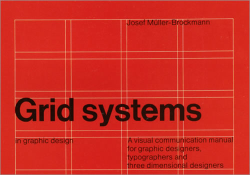
Grid Systems in Graphic Design, by Josef Müller-Brockman
WP7’s graphic style is typographic and follows in the footsteps of pioneering graphic designer Josef Müller-Brockman: pure typography on a basic canvas, plain color and squared angles. Icons are only for actions with content and don’t play a main role as they do on traditional devices. They are more an aid to orientate the user while navigating the content.
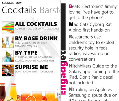
Clean design and typography, as exemplified by Cocktail Flow and Fuse.
All of these things together give the user an experience reminiscent of cartography. The need to give a direction is expressed in the look and feel of a map, where the text is clear because the user has to follow labels and names in order to find places, and there is no space for visual elements.
A New Content Grid
Metro design requires a more rigid organization. Think of subway maps. In the context of mobile apps, this requires that the information architecture be stronger. With the main graphical layout elements removed, the content grid is built using just the content itself. So, as the user scans the layout, they are already reading the content. The absence of a physical grid leaves room for negative space. Elements seem lighter, so the designer has to choose a few strong elements on which to build the content path. Choosing the wrong elements means that the user will not understand how to reach the content they need.

Milano subway map (Image: Wikipedia)
Content has to be structured in a hierarchy according to importance and be based on what you want to push to users. For this reason, you have to identify the application’s target user very carefully, because building an application that fits all users is not possible.
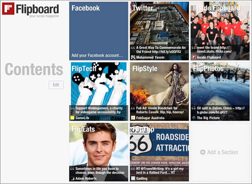
Flipboard emphasizes content as the interface.
The goal of the Metro UI is to emphasize important content in a way that helps the user determine whether to dive into it or keep doing what they’re doing. To make all of this possible, Microsoft has introduced the concept of the hub, whose role is to concentrate all of the information onto one screen, like a dashboard. A better analogy might be the cover of a digital magazine, such as Flipboard.
UI Elements For Organizing Content
The hub is the central point of access to content, and it includes specific UI elements with new paradigms of navigation and content organization. The concept of the hub is manifested as two new paradigms of navigation, each with its own meaning and function: “panorama” and “pivot.” The difference between the two is subtle at first glance.
Choosing one or the other depends on the application’s purpose and on how you want to introduce the user to the contents. The live tile is another powerful hub element that gives a view of the application’s content directly on the home screen. And while not strictly a new UI control, accent color is another important element; it helps to pinpoint the important bits of information on the screen.
Panorama
When the user enters the application, they land in the panorama, which pulls information from different areas of the application onto the same screen. It gives the user a bird’s-eye view of all available information.
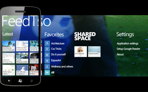
FeedTso, an example of panorama.
Panorama uses text and images to create a path through blocks of content. This visual communication gives the user an immediate sensory link to information.
Pivot
Pivot orders the elements logically, splitting the information into categories and listing the elements available in each category. It is an analytical list used to show different aspects of the same content.
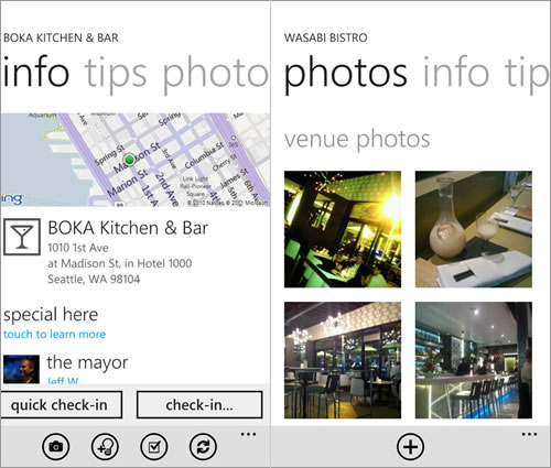
4th & Mayor, an example of pivot as tabs.
For example, you can use it to show multiple views of a single concept (like tabs), as in the screenshot of 4th & Mayor, a popular Foursquare client. You can also use it to show folders such as those in an email client (“Read,” “Sent,” “Important,” “Drafts” and so on).
Live Tiles
The strong hierarchical content structure, which starts from the content brief and goes deeper in detail level after level, is brought to the extreme with live tiles, the new feature introduced with Mango. In the first release of WP7, the tile was at best an application icon with a static overlay, like the badges in iOS and Android. Now a new communication model has been introduced. The home screen shows a brief notification, with the most important information in the application, similar to abstracts in a magazine. Think of this space as a way to provide meaningful content that is immediately usable.
In the example below, live tiles are used to show current weather conditions. The user doesn’t even need to open the application if they just want to check the weather, because all of the basic information is already there. But if they want to see a five-day forecast or other details, they can open the application.
The live tile can also be designed to rotate information, so you can creatively use multiple tiles in the space of one tile.
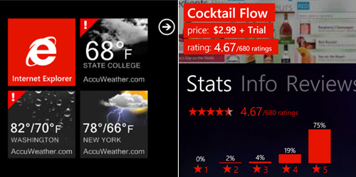
AccuWeather and AppFlow, examples of live tiles and accent color.
Accent Color
Of course, there is more to content than hierarchically organizing it in the application. You will also want to make content stand out on a page. The WP7 guidelines suggest a special way to emphasize content: by using the accent color. This is a system-wide color that the user can customize and that you can use to better highlight header information, such as titles and headings, as well as other important content. It’s a standard element of the UI, but it is extremely important because it is set by users themselves at the system level, so all applications on the phone will adopt it.
Design Tips
The clean interface, without the usual icons, means that users interact differently with the content. So, when building a WP7 application (or a Metro app in general), you will also have to think differently about how they use standard UI elements.
Clickable Text
The first difference in the interactive model is that text is an active element in WP7, meaning that it is tappable. This changes the concept of the tap-safe area for buttons and other elements: here it applies to text as well. The margin space gets a new role, then, as does the text size.
Animation
Animation is one of the most important features of WP7. I’ve been a designer for more than 10 years, and I used to think that using animation after an action was strictly to give subtle feedback to the user and that animation could be used “creatively” only in specific circumstances.
With WP7, this is changing. Animation and transitions are fundamental elements that are deeply rooted in the original UI concept. You can use them not only to give feedback on what is going on (as with a “toast” notification), but to keep the user’s attention on what is happening and to prepare them for a different experience (for example, when switching from a panorama screen to a textual news screen).
Flickr for Windows 7 and WP7, an example of how animation can enhance the UX without being overwhelming.
Icons
WP7 has very specific guidelines about icons, and I suggest reading them carefully before designing an application. The only place to put icons is in the application bar, which hosts the icons for all of the main actions for interacting with the content.
The application bar for Pictures Lab, with four icons and the “more” button.
Text Wrapping
Another difference from the usual way of designing is how header text wraps. In WP7, headers wider than the screen don’t wrap onto the next line but instead are clipped on the right margin. This of course doesn’t apply to main content (such as the body of an email), but if the text is not of vital importance (for example, the name of the sender), then this text clipping is common.
The Color Theme
WP7 is different from other mobile OS’ in that the user can choose a system-wide color theme that is dark or light. This changes not only the background color, but also the foreground.
You will have to adapt to the changing colors (remember also that the accent color can change) by using an adaptive palette and respecting the decision of the user. You can also use a background image, but in this case you would need one for the dark theme and another for the light theme.
Only if the branding in your application is so strong that you don’t want to change the colors could you fix the palette. But make sure not to mix the two approaches, because that might lead to unreadable combinations. This is one of the most common causes of an application failing the Marketplace certification process.
The Design Tools
To design a WP7 application, you can use your usual tools, such as Balsamiq, Adobe Illustrator, Fireworks, Photoshop and so on. Keep in mind that the application needs to be developed using Expression Blend. Depending on the project’s structure and the designer’s role on the team, you should know how Expression Blend works in order to design effective interaction models. The better you understand the application, the more nuanced your designs will be. Obviously, understanding Expression Blend will also add value to your work and make it easier to talk with developers.
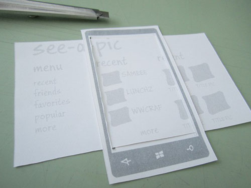
Example of paper prototyping for WP7.
Conclusion
With Metro, Windows Phone 7 is an exciting new addition to devices and operating systems for designers. It represents a completely new direction from Apple and Google in its interface for devices. For the first time in Microsoft’s history, the interface is strictly linked to the hardware, so carriers and manufacturers have very little room for customization. This gives us standards on which to base our work and to expand on in future applications.
This article is just a starting point in designing for this platform. Below are some additional resources to continue learning.
Resources
- “User Experience Design Guidelines for Windows Phone,” MSDN This extensive section is dedicated to Metro concepts and design guidelines.
- “UX Guidelines for Metro-Style App Development,” Blend Insider This provides insights from the Microsoft’s Expression Blend team.
- “Jeff Wilcox’s ‘Metro’ Design Guide for Developers, v1.00,” Jeff Wilcox This article presents the main Metro concepts and shows how to use them in designing an application.
- “20 Free Prototyping, Mockup and Wireframing Resources for Windows Phone 7,” MicrosoftFeed This article presents some useful resources for prototyping and designing for WP7.
- “Develop for Windows Phone 7.5 and Xbox LIVE Indie Games,” MSDN App Hub
(al) (fi)


