Breaking The Rules: A UX Case Study
I read a lot of design articles about best practices for improving the flow of sign-up forms. Most of these articles offer great advice, such as minimizing the number of steps, asking for as little information up front as possible, and providing clear feedback on the status of the user’s data.
If you’re creating a sign-up form, you could do worse than to follow all of these guidelines. On the other hand, you could do a lot better. Design guidelines aren’t one size fits all. Sometimes you can improve a process by breaking a few rules. The trick is knowing which rules to break for a particular project.
Recently, I did a project for Outright, a product aimed at simplifying accounting and tax preparation for small businesses. The product automates accounting tasks for sole proprietors and online product sellers so that they don’t have to do things like categorize receipts and generate profit and loss reports.

To get the most value out of the product, new users have to hook up one or more of their own accounts, so that their business finances can be automated.
The Original Design Rules
When first designing its user set-up process, Outright followed some very reasonable design rules:
- It kept the process to one page in order to reduce the number of steps users had to go through.
- It allowed new users to easily quit the set-up process, so that they could explore the interface before committing.
- It provided constant feedback about the status of each account as it was being updated.
Then we did a redesign, broke every single one of those rules and decreased the cancellation rate by 20%.
Why did breaking those rules help in this particular case? Let’s look at them one at a time.
Rule #1: Reduce The Number Of Screens In The Set-Up Process
This rule is normally great, because requiring a lot of unnecessary clicks just slows the user down as they try to sign up for your product. But in some cases, combining too many different concepts onto one screen can complicate things.
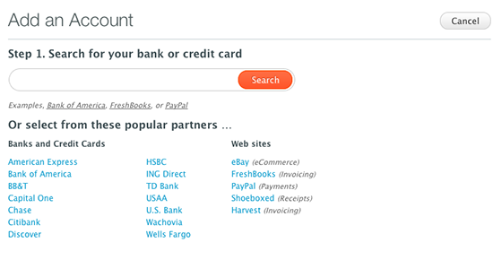
In the old version of the application, the user saw only one search box, in which they could enter the name of a bank, a credit card or one of several e-commerce partners, such as eBay.

During the preliminary user research, we found that this was a little overwhelming for new users. It made them wonder which piece of information they should add first. There was occasionally a rather dramatic pause as they tried to process what was being asked of them.
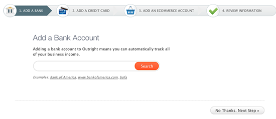
By breaking the process down into three explicit steps, we freed users from having to decide which information to input at any point. This made the whole process seem much simpler, because users always knew what was expected of them.

Of course, we have not required users to input something at every step. They can skip ahead if, for example, they don’t have a business credit card. But still, the only decision they ever have to make is whether to enter the requested information.
When to break rule #1: Adding steps can simplify the experience, if it makes each individual step very clear.
Rule #2: Allow Users To Test Drive Before Making Them Submit Data
For many products, allowing users to play around before entering any information is a great tactic.
Think of Yelp. I must have read hundreds of reviews before getting around to reviewing anything myself. The same goes for online shopping; I’ll often visit a website several times before making a purchase.
But other products don’t make much sense without personalized content. Social networks, for example, are significantly more useful once you connect with friends on them.
This is certainly true with Outright. The experience for users who plug into a financial data source is so much better than for users who don’t. Letting people test drive the product before importing their account information simply doesn’t make sense. Users won’t understand the value of the product until they see and manipulate their own data.
When to break rule #2: While letting people explore before committing can be useful for some types of products, assess whether your product can be fully understood without personalized content.
Rule #3: Always Provide Feedback On Status
Don’t you hate it when you’re trying to import or export data and you don’t get any feedback on how long it will take or whether any errors have occurred? Everyone does. That’s why Outright kept users informed as their data was being imported.

The problem was, when users imported data from more than one account, the status messages started cluttering up the screen. This distracted them from adding more accounts.
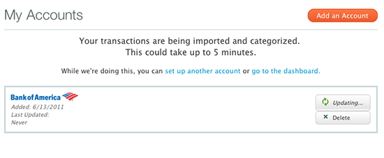
Now, instead of showing constant feedback about the status of each data import, we simply let users know that they have successfully connected to their data source and then move them on. If there are errors, we provide a place at the end of the process for the user to recover.

When to break rule #3: Feedback is often good, but too much can overwhelm users, especially if it distracts them from moving on to the next task. If the user can’t do anything with the feedback or if moving on is more important, consider not giving constant status updates.
Rules That We Did Follow
Of course, we didn’t break every rule. Rules exist for a reason. We followed a lot of best practices, with great results. For example:
- We made sure to have a single, clear, primary call to action for each screen, so that users always know what they’re supposed to do.
- We kept each screen focused on a single task.
- We made sure that users always know which step of the process they’re on and how many more they have left to go.
I’d love to be able to say that breaking certain rules and following certain others will improve the sign-up flow of your product, but design isn’t like that. You need to figure out which rules apply to your product and users. And once you’ve figured that out, don’t be afraid to break a few of the ones that don’t apply, just to see if that makes things better.
Further Reading
- 10 Useful Usability Findings and Guidelines
- 30 Usability Issues To Be Aware Of
- 10 Useful Usability Findings and Guidelines
- 10 Principles Of Effective Web Design


 Flexible CMS. Headless & API 1st
 Register!


