Fundamental Guidelines Of E-Commerce Checkout Design

Email Newsletter
Weekly tips on front-end & UX.
Trusted by 200,000+ folks.


 Flexible CMS. Headless & API 1st

Here is the harsh reality of e-commerce websites: according to recent e-commerce studies, at least 59.8% of potential customers abandon their shopping cart (MarketingSherpa puts it at 59.8%, SeeWhy at 83% and MarketLive at 62.14%). The main question is why do customers abandon their shopping cart so often? Is there some fundamental mistake that designers of e-commerce websites do very often? Are there any common guidelines or rules of thumbs that make it more difficult for our users to purchase products? And is there some meaningful way to improve the conversion rates for our products?
Well, that’s exactly what we wanted to find out. In 2010, we recruited a batch of Web users and conducted a usability study, focusing only on the checkout user experience, from “Cart” to “Completed order.” The study was conducted using the “think aloud” protocol and was documented by recording everything that happened on the computer screen. The behavior of the test subjects was then analyzed by scrutinizing these recordings at a later date.
The 15 e-commerce websites that we tested were: 1-800-Flowers, AllPosters, American Apparel, Amnesty, Apple, HobbyTron, Levi’s, Newegg, Nordstrom, Oakley, Perfume.com, PetSmart, Thomann, Walmart and Zappos.
In total, the test subjects were given more than 500 usability issues, ranging from being distracted by animated graphics to being thrown off course by an illogical checkout flow. These issues were then analyzed and distilled into 63 checkout usability guidelines in a report titled “E-Commerce Checkout Usability.” In this article, we’ll share 11 fundamental guidelines from that report with you.
1. Your Checkout Process Should Be Completely Linear
Issue: Having steps within steps confuses and intimidates customers as it breaks with their mental model of a linear checkout.
One of the worst usability violations that we discovered in our testing was non-linear checkout processes. Websites with a non-linear checkout process left several of our test subjects confused and intimidated. At the time of testing, both Walmart and Zappos had a non-linear checkout process.
The typical way to “accidentally” end up with a non-linear checkout process is to create steps within steps. This happens, for example, when the customer has to set a “Preferred shipping address” (Walmart’s violation) or “Create an account” (Zappos’ violation) on a separate page, and is then redirected to a previous checkout step upon completion.
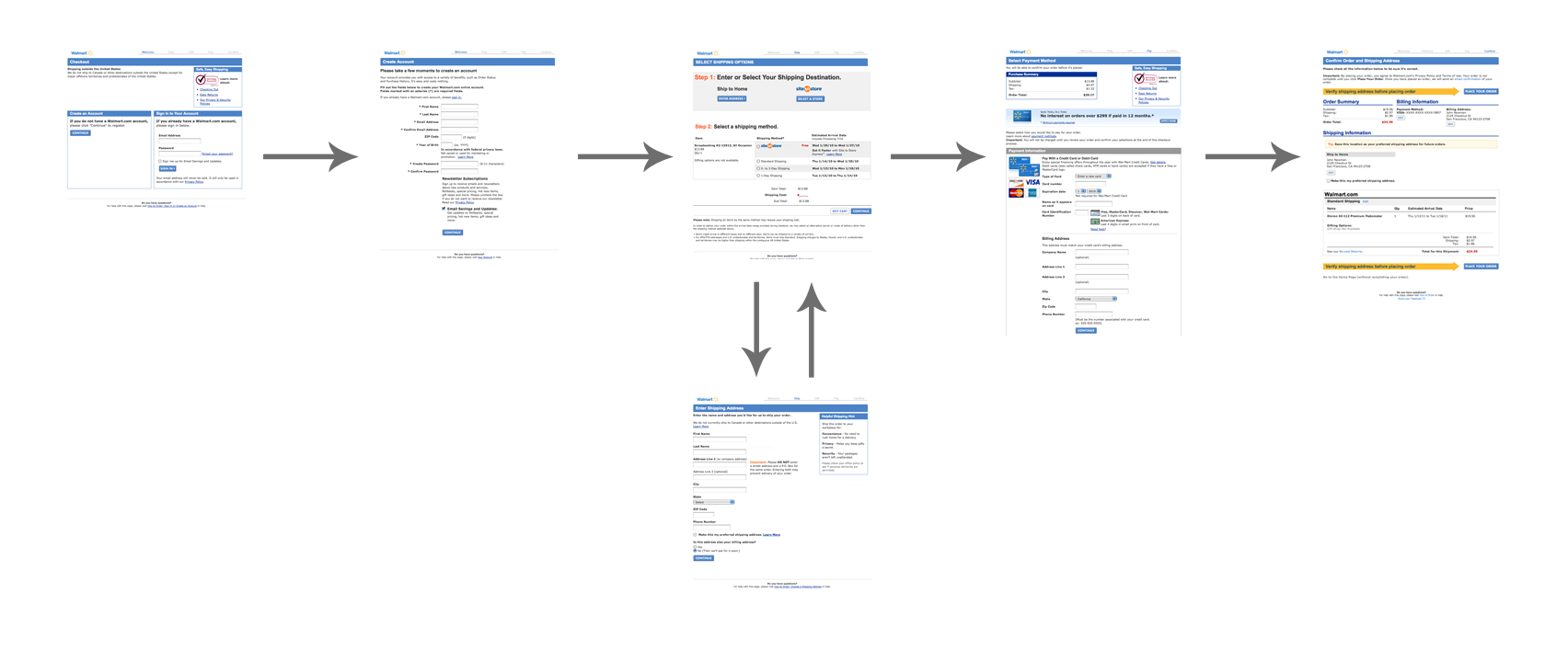
Below, you can see Walmart’s checkout flow in thumbnails (click image for larger view). Notice that it’s non-linear because the “Preferred shipping address” sub-step directs the user to a previous step:
Luckily, making the process completely linear is easy. In this case, a sub-step such as “Account creation” should never redirect to a previous step in the checkout process, but instead direct the customer to the next step in the checkout process.
This is critical because the mental model of most customers dictates that a checkout process should be linear. Upon seeing the same page twice, most customers would conclude that the website has an error, because this is what happens with validation errors.
As one test subject said, “This looks suspiciously like the page I was on before. Is there something I didn’t do correctly?”
2. Add Descriptions To Form Field Labels
Issue: Without descriptions, many form field labels can be ambiguous.
“What does this ‘Address line 2’ mean?” a test subject mumbled. Other test subjects were confused by “Billing address.”
The vast majority of test subjects had problems understanding certain labels. They varied in which labels they had trouble with. The problem was critical in a few cases, and one subject gave up a purchase because she couldn’t understand the label for a required field, making it impossible for her to complete the checkout process. Therefore, always provide clear instructions for each field.
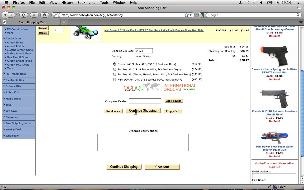
One form that caused confusion belongs to HobbyTron, where test subjects had to guess what “First” refers to:
On Apple’s website, the majority of test subjects started typing their zip code in the field labeled “Area code”:
When you have form field labels without any explanation, some of your customers will likely be confused about what information is being asked of them. Alleviate this by adding short descriptions and examples next to labels. Because not all customers need the extra help, you may want to hide these instructions behind a “What’s this?” link, or perhaps slightly fade its color or reduce the font size.
Below are examples of how descriptions below form field labels can help customers understands what inputs are required of them:
Even unambiguous fields, such as “Email address,” are great opportunities to explain what you’ll use the data for. “Email address” may be a sufficient description, but most people would want to know how you’ll use their email address. Why do you need it?
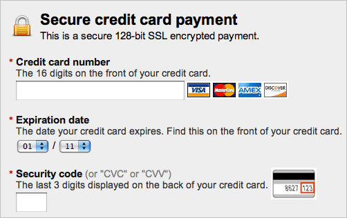
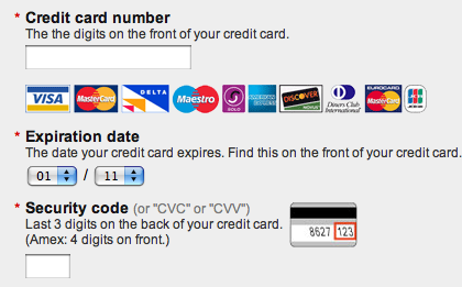
Finally, for fields that users have to fill in by referring to a paper or card, illustrations can enhance the descriptions a lot (for example, an image of an expiration date from a credit card).
3. Avoid Contextual Words Like “Continue”
Issue: Contextual words such as “Continue” are ambiguous and tend to confuse customers.
Depending on the customer’s state of mind, a button labelled “Continue” in a shopping cart could mean one of two things:
- Continue shopping Say, if the customer is also looking for a shirt to go with those jeans.
- Continue to checkout If the customer has all the products they need and just wants to pay.
Another example is “Back.” Back to the last page? Back to the search results? Where? And how about “Proceed”? These are all contextual words that change in meaning depending on the context (i.e. the page) and the customer’s state of mind.
HobbyTron was one of the websites on which multiple test subjects clicked on the “Continue” button thinking they would continue to the checkout section:
After clicking a wrong button, one test subject said:
It was confusing because I thought, “I want to continue.” I didn’t think about continuing shopping, but rather I was continuing to checkout.
This is a good example of how contextual words, being open to interpretation, can confuse customers. Roughly half of the test subjects at least once clicked a wrong button because of contextual words.
Instead, use words that aren’t open to interpretation, such as “Check out now” and “Shop more.”
4. Visually Reinforce All Sensitive Fields On The Payment Page
Issue: Customers might hesitate if credit card fields don’t appear secure (regardless of actual security).
Many test subjects didn’t think about security until they had to enter their credit card details. In fact, several test subjects talked about certain parts of the checkout page in terms of being “secure” and “insecure” (typically related to credit card details).
Parts of the page with security icons, badges or text and a general “robustness” were perceived as being more secure, while parts without these visual cues inspired less confidence, despite the fact that these fields were all part of the same form on the same page. Technically, there was no difference in security. However, most customers don’t understand the technical workings of forms. All they know about your website is what their gut feeling tells them.
There is a clear divergence between the customer’s mental model of form-field security and the actual security.
As one test subject who had just abandoned their purchase said, “It didn’t look safe enough.” Her reaction wasn’t based on the technical security of the website, but rather on the perceived security of the fields.
Below is a quick mock-up I made to illustrate how you can visually secure your credit card form fields (version B). Notice the background color, padlock image and placement of the GeoTrust seal:
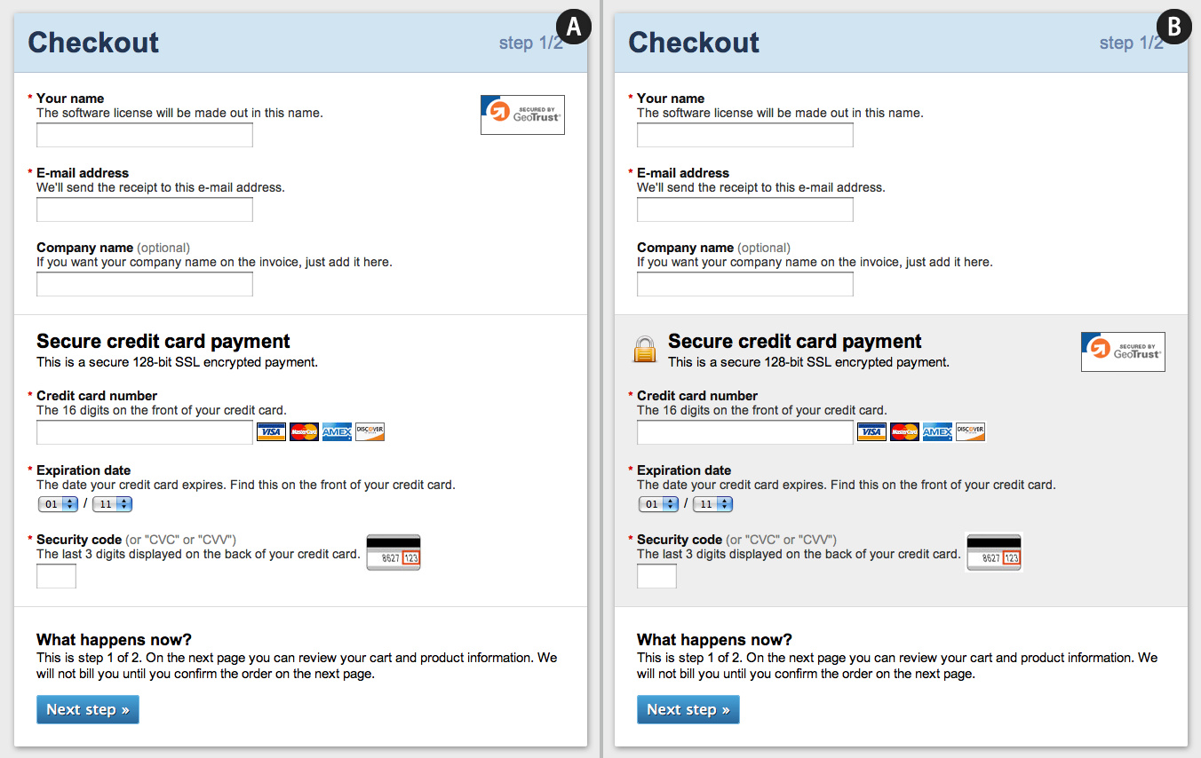
By adding visual cues (such as borders, background color, and security icons and badges) around the form fields for credit cards, you can increase their perceived security for non-technical customers.
5. Don’t Use An “Apply” Button In Your Form
Issue: Customers don’t understand “Apply” buttons for distinct sections of a form.
More than half of test subjects were confused by websites with an “Apply” button somewhere in the form; for example, to apply a shipping method to an order.
In almost every case, these buttons were either:
- Not clicked, even if the relevant input field was filled out;
- Mistaken for the main form submission button.
Test subjects simply didn’t understand the purpose of having a separate “Apply” button in a form.
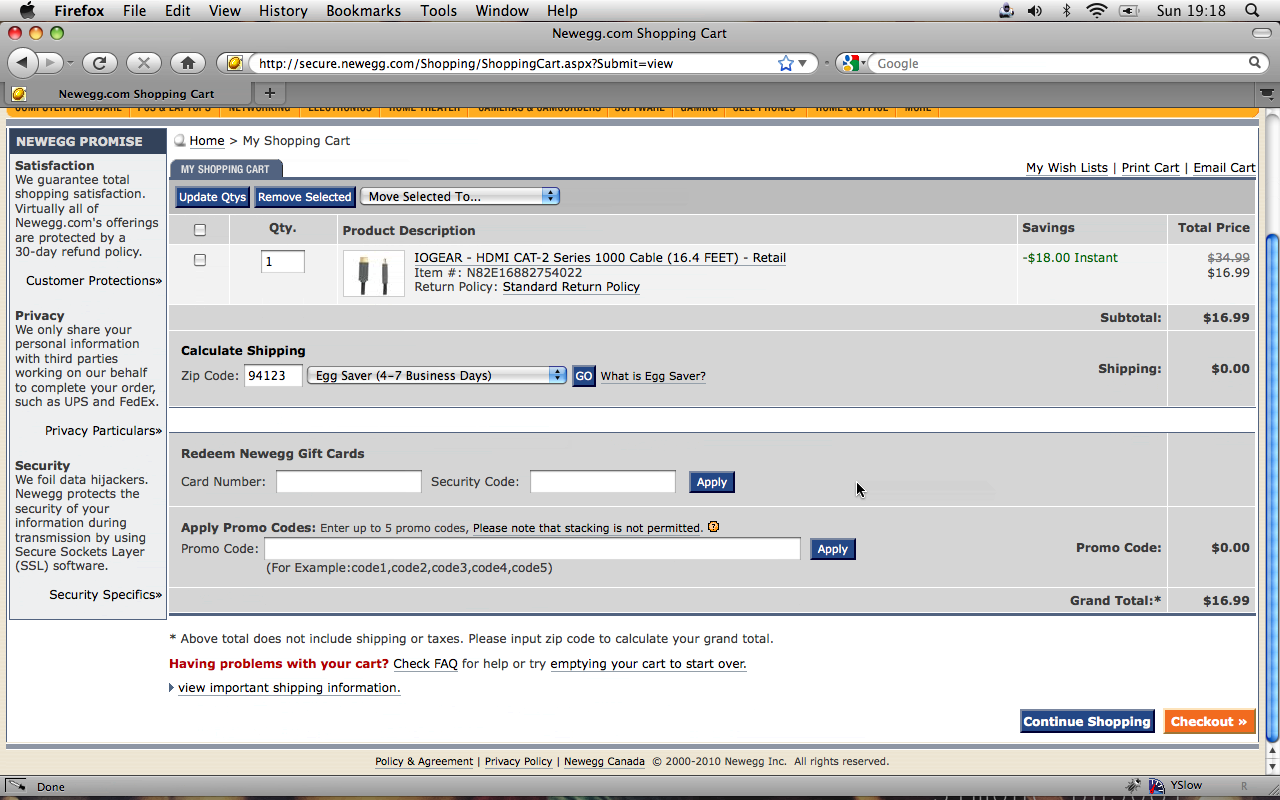
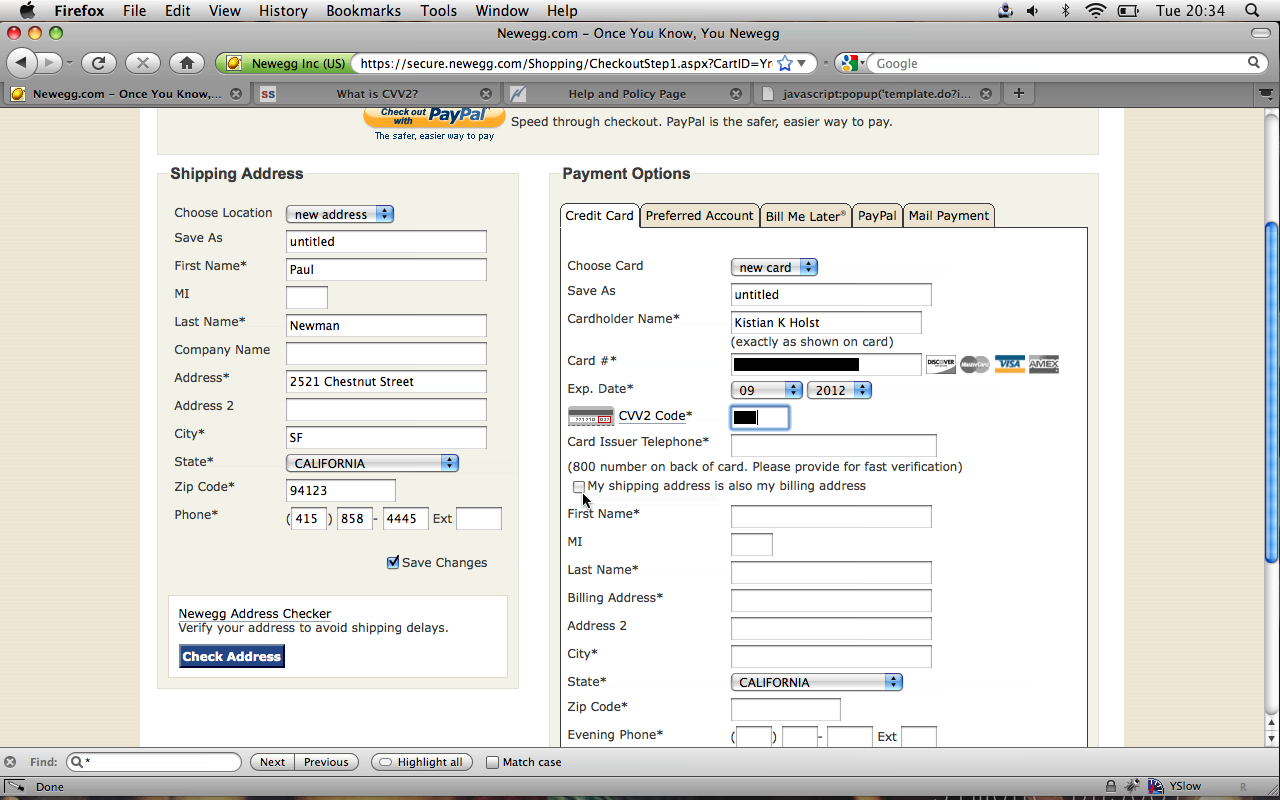
Below is Newegg’s checkout, where only half of test subjects who filled in their zip code also clicked the “Go” button (problem 1 from above):
The consequence of mistaking “Apply” for the main form submission button is that customers will be redirected back to the same page in order to apply the change, thwarting their expectation of moving to the next step and likely leading them to think that there’s an error on the page (as we saw in guideline #1). This happened to two test subjects, who were left to guess what the error was because no error message was displayed (since a technical error never actually occurred on the page).
Below is a form for American Apparel, where test subjects mistook the “Apply” button for the main form submission button (problem 2) and consequently couldn’t proceed with the purchase.
If you really need to update a value before moving on to the next step, then auto-update the value using AJAX or the like, without showing an “Apply” button.
6. Format Field For Expiration Date Exactly As It Appears On Credit Card
Issue: Fields for credit card expiration dates can be tricky to decipher if they aren’t written exactly as they are on the credit card.
Some websites use month names, while other websites use a combination of month names and numbers, while still others just use numbers. Which is best? The correct way to format a field for an expiration date is to match what the customer sees on their credit card (i.e. numbers only). This minimizes confusion and misreading because the user can easily verify the field against their credit card.
Below are four examples of how not to format the fields for expiration date. Example D, with the month written as text and the year in four digits, is the worst.
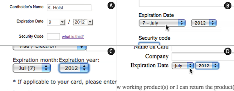
The correct way to format the month field is to use numbers and to prefix all single-digit numbers (i.e. 1 to 9) with a 0, so that they appear exactly as they do on credit cards (for example, 03 for March).
The correct way to format the year field is to use just two digits, to match the number on the credit card (for example, 14 for 2014).
Our test subjects didn’t have any difficulties when month names were included, as long as they came after the digits. So, “03 - March” is okay, but “March - 03” is not. Whatever is on the credit card should appear at the beginning of each option.
You could put a forward slash (/) between the month and year fields to further match credit cards (so, 03 / 14 for March 2014).
7. Use Only One Column For Form Fields
Issue: Customers have an amazingly difficult time understanding the relationships between form fields in two columns.
Half of the test subjects had problems when form fields were in two columns. There were two typical scenarios:
- One of the two columns of form fields was missed. It was either dismissed as unrelated or simply overlooked by test subjects.
- Unrelated form fields were filled in and/or submitted, often causing validation errors.
Below is Perfume’s form for signing into and creating an account:
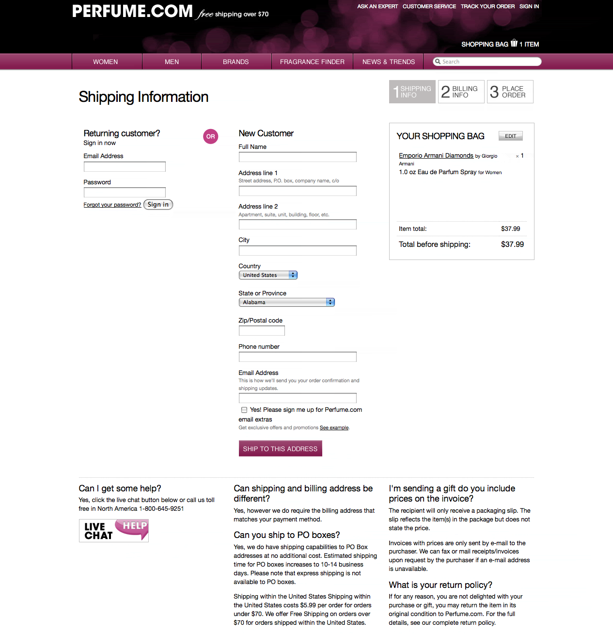
This form was interpreted in three ways:
- All form fields should be completed in order to create an account.
- The “Email address” field and the fields in the right column should be completed to use “Guest checkout.”
- Either the left or right column should be filled out.
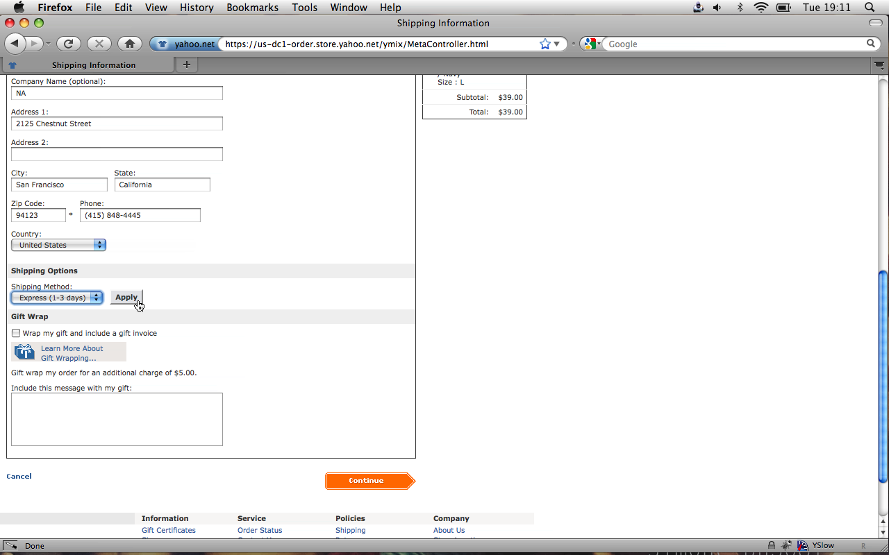
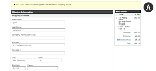
Another example is PetSmart. There, the most common behavior was to overlook the second column, with the “Credit card identification number,” resulting in an error message:
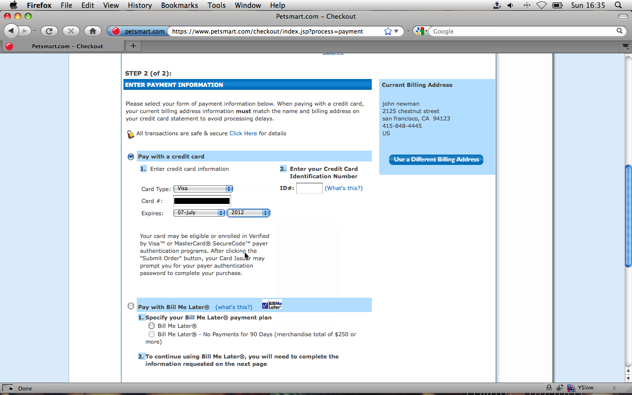
On two occasions, test subjects abandoned their purchase because they kept submitting the wrong data in the wrong column.
Our suggestion is to use a single column. None of our test subjects showed any difficulty with this.
8. Use Shipping Address As Billing Address By Default
Issue: Most customers order products to their home, so requiring both a billing and shipping address doesn’t make sense.
Customers typically order products to their home address. So, by default, you should use the same address for shipping and billing, unless you happen to record data differently for your store.
By defaulting the billing address to the shipping address, your checkout process will have many fewer fields, making it less intimidating for customers. Users also reduce the risk of misspelling their address if they have to enter it only once; they won’t rush through the form as quickly, and if there are errors, the customer will have to fix them only once.
Moreover, you should hide the billing address fields entirely. Disabling the fields isn’t good enough. On the one website that did this, most test subjects were confused by why the fields were grayed out, with some users clicking on them. Instead, show only the fields for the billing address, unless the customer explicitly asks to use separate shipping and billing addresses.
Some websites have a “Copy shipping address” button. The problem with this is that it also copies any errors, so the customer has to correct the same information twice. While the customer could just click the “Copy shipping address” button once they’ve corrected the error, all of the test subjects in this situation forgot to do so.
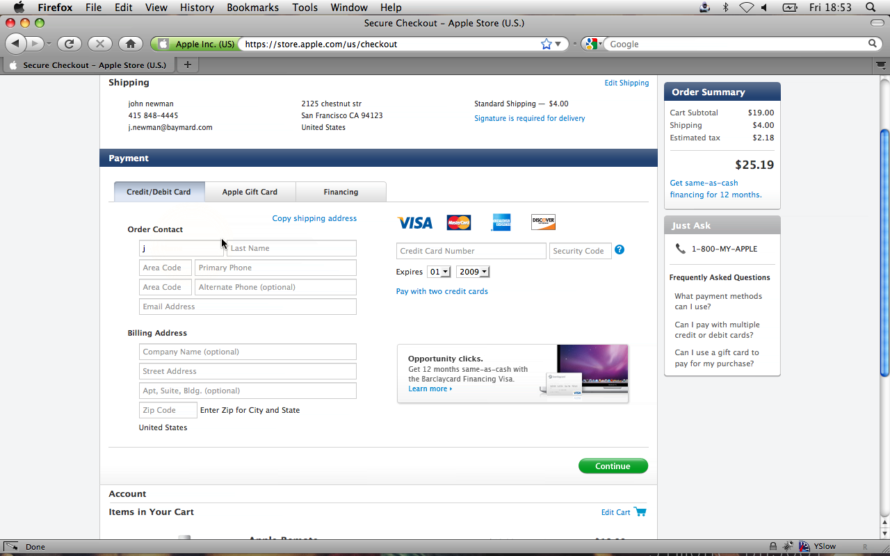
Also, depending on the website’s layout, such a feature could be easily overlooked. On Apple’s website, half of test subjects overlooked the “Copy shipping address” link and ended up typing in the same address again.
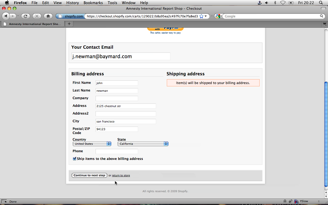
A check box (or something similar) is better for this purpose because errors will have to be corrected only once. Amnesty International’s checkout page is a good example of how to do this right:
9. Use Clear Error Indications
Issue: Customers overlook error messages, making them less likely to resolve the errors.
More than half our test subjects had serious problems finding or understanding error messages on the websites we tested.
When a customer has problems with a form, the likelihood that they abandon the purchase increases significantly. When a customer fails more than once, they will be inclined to leave the website altogether (whether because they assume they were blocked or the website has a bug or something else).
Below are four examples of a lack of a clear indication of error.
On American Apparel’s website, the yellow bar at the top is actually an error message, saying that the data in the phone field at the bottom isn’t valid:
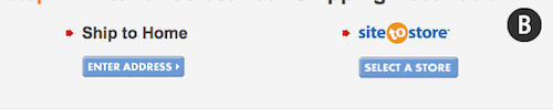
On Walmart’s website, the two red arrows (next to “Ship to home” and “Site-to-store”) are actually error indicators:
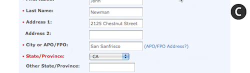
On PetSmart’s website, the red of “State/Province” is not an error indicator, but rather just the style chosen for this particular label:
On Perfume.com’s website, the red does indicate an error in the “Phone” field:

Unless placed in close proximity to the relevant fields, error messages were likely to be overlooked by our test subjects. Many websites present error messages only at the top of the page, not next to the form fields.
Without this proximity, error messages can be difficult to understand. Some test subjects, seeing nothing wrong with the fields, tried to submit the form again, assuming the page didn’t load properly the first time. This, of course, resulted in the same page being shown again with the same error message.
If a customer doesn’t notice or understand your error message, they will not be able to resolve the error or proceed through the checkout process. In such cases, abandonment is inevitable. So, put time and effort into designing and wording your error messages.
Make sure your error messages:
- Are contextualized (that is, not at the top of the page but in close proximity to the relevant fields);
- Are clear and concise;
- Stand out so people notice them (provide high contrast and maybe even use arrows or other visual indicators).
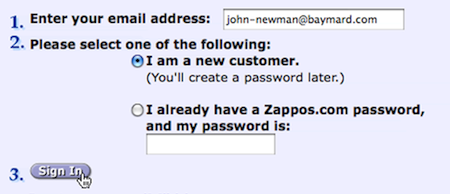
10. Registration Should Be Optional
Issue: Customers strongly resent having to sign up for an account.
Customers dislike having to register for yet another account. This quickly became evident during our testing as every single subject showed great frustration when forced to do it. 30% of them ended up abandoning one of their purchases as a result.
There are many reasons for this resentment.
For one, customers already have a myriad of user names and passwords to remember and don’t want to create an entirely new account just to buy one or two products from an online store.
Another reason is that 40% of test subjects expected to be spammed with marketing material, even if they explicitly declined to sign up for a newsletter during the checkout process. These customers have a mental model in which Account = Newsletter. Or, as one subject described it: “If I create an account, they can send me spam from now on and forever.” Their prior experience on websites that check the newsletter box by default and obscure it likely led them to this conclusion.
Also, customers likely realize that you’re storing their information indefinitely. While most companies keep a customer’s information in their database regardless of whether they registered an account, most customers don’t think of this. It’s about perception, and some customers just don’t like the idea of a website storing their personal information.
Signing up for an account also takes time. It adds more steps and fields to the process—and complexity. Yet another reason to dislike it.
Finally, many customers just don’t understand why they need an account to buy a product. As one subject clearly put it, “I don’t need to sign up for anything when I’m buying a perfume in a regular [brick and mortar] store.”
Most test subjects didn’t mind having the option to create an account, but they found it illogical and annoying to be required to do so. Some said they would voluntarily create an account if they regularly bought from the website.
If you’re looking for an unobtrusive way to get customers to sign up for an account, then consider simply asking them after they have completed their purchase. “Would you like an account? Just enter a password in the field below.” You can set their email address as their user name and fill in the account information with their order details. This way, the customer isn’t forced to create an account but has an easy way to do so after completing their purchase. (Remember to explain the benefits of having an account.)
11. Don’t Require Seemingly Unnecessary Information
Issue: Customers feel that their privacy is being invaded when they are required to submit seemingly unnecessary personal information.
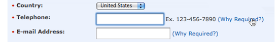
Refusing to give up their phone number, one test subject anxiously clamored, “Look, why do they need my phone number? What do they need that for? They don’t need it!” Every test subject at one point or another complained about a website that asked for too much personal information.
Being asked for a phone number when the website already had an email address was especially irritating when subjects were trying to make a purchase. The logic goes, if the store already has one way to contact them, why does it need another?
If the information is necessary, at least explain why. What is obvious to you may not be obvious to the customer. They have learned to expect the worst when shopping online (usually spam email and phone calls).
Our test subjects were surprisingly forgiving, as long as the website explained why the information was needed. Here’s a tip: don’t hide it behind a link; state it directly in the field’s description. In fact, the test subject we quoted above provided their phone number to another website without any complaints because the store clearly explained that the phone number was needed so that it could contact the customer in case of delivery problems.
The more expensive the order, the more accommodating the customer will be. When buying a laptop, customers want you to be able to contact them. But this holds true only if you require the information in order to complete the purchase. On websites where the field was optional, our subjects weren’t comfortable giving their phone number and simply left the field blank. However, this means that required and optional fields must be clearly distinguished.
Designing A Better Checkout Experience
While there are many more subtleties to designing a good checkout experience, these 11 guidelines go a long way. If you adhere to them, your checkout process will perform well above average.
In a study that he conducted 10 years ago, usability guru Jakob Nielsen concluded that large e-commerce websites violated many basic checkout usability guidelines. It seems little has changed when you look at websites like AllPosters and Walmart.
While a lot of the big websites boast impressive features such as geo-targeting, address validation and state look-up, they don’t manage to get basic usability principles right, and they suffer greatly as a consequence.
With the latest improvements in Web technology and browsers, the potential to create an amazing user experience has increased dramatically. Yet, advanced features shouldn’t be the focus until basic usability guidelines are met. If we add the latest technology just because it’s new and exciting, then today’s abandonment rate of 59.8% is unlikely to decrease.
Things like meaningful flow (see guideline 1), good copywriting (2, 3), simple form design (4, 5, 6, 7, 8, 9), and privacy considerations (10 and 11) go a long way to creating a great checkout experience.
Do yourself and your customers a favor by following these 11 guidelines. Once you’ve covered the basics, you can venture into more advanced territory.
You can find further checkout usability guidelines in our report titled E-Commerce Checkout Usability (not free).
Further Resources
You may be interested in the following related resources:
- MarketingSherpa, SeeWhy, MarketLive The three different sources that document the 59.8% cart abandonment rate.
- 10 E-Commerce Checkout Strategies Key strategies for making the checkout process easy for even inexperienced shoppers.
- E-Commerce Checkout Page Design: Learn From Amazon.com A walkthrough of an effective e-commerce checkout page.
- Happy Customers Through an Improved Checkout A collection of details to keep in mind when working on checkout forms.
- One-Page Checkouts for E-Commerce Sites Advantages of a one-page checkout, and how it boosts conversion rates.
Further Reading
- The State Of E-Commerce Checkout Design 2012
- 12 Tips For Designing an Excellent Checkout Process
- Designing A Better Mobile Checkout Process
- 7 More Useful Tips To Help Your Site Convert


