10 Useful Usability Findings and Guidelines

Email Newsletter
Weekly tips on front-end & UX.
Trusted by 200,000+ folks.
 Flexible CMS. Headless & API 1st


Here are 10 useful usability findings and guidelines that may help you improve the user experience on your websites.
1. Form Labels Work Best Above The Field
A study by UX Matters found that the ideal position for labels in forms is above the fields. On many forms, labels are put to the left of the fields, creating a two-column layout; while this looks good, it’s not the easiest layout to use. Why is that? Because forms are generally vertically oriented; i.e. users fill the form from top to bottom. Users scan the form downwards as they go along. And following the label to the field below is easier than finding the field to the right of the label.
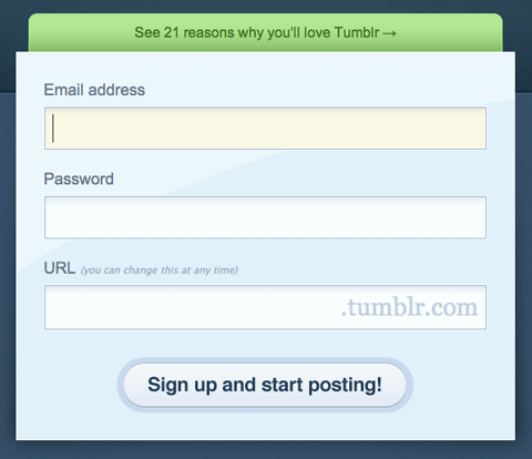
Tumblr features a simple and elegant sign-up form that adheres to UX Matter’s recommendation.
Positioning labels on the left also poses another problem: do you left-align or right-align the labels? Left-aligning makes the form scannable but disconnects the labels from the fields, making it difficult to see which label applies to which field. Right-aligning does the reverses: it makes for a good-looking but less scannable form. Labels above fields work best in most circumstances. The study also found that labels should not be bold, although this recommendation is not conclusive.
2. Users Focus On Faces
People instinctively notice other people right away when they come into view. On Web pages, we tend to focus on people’s faces and eyes, which gives marketers a good technique for attracting attention. But our attraction to people’s faces and eyes is only the beginning; it turns out we actually glance in the direction the person in the image is looking in.
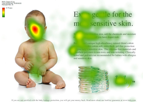
Eye-tracking heat map of a baby looking directly at us, from the UsableWorld study.
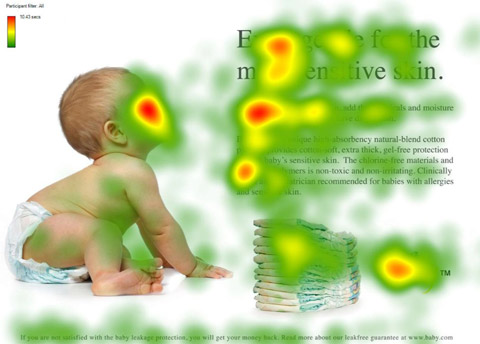
And now the baby is looking at the content. Notice the increase in people looking at the headline and text.
Here’s an eye-tracking study that demonstrates this. We’re instinctively drawn to faces, but if that face is looking somewhere other than at us, we’ll also look in that direction. Take advantage of this phenomenon by drawing your users’ attention to the most important parts of your page or ad.
3. Quality Of Design Is An Indicator Of Credibility
Various studies have been conducted to find out just what influences people’s perception of a website’s credibility:
- Stanford-Makovsy Web Credibility Study 2002: Investigating What Makes Web Sites Credible Today
- What Makes A Web Site Credible? A Report on a Large Quantitative Study
- The Elements of Computer Credibility
- Elements that Affect Web Credibility: Early Results from a Self-Report Study (Proceedings of ACM CHI 2000 Conference on Human Factors in Computing Systems, v.2, New York: ACM Press)
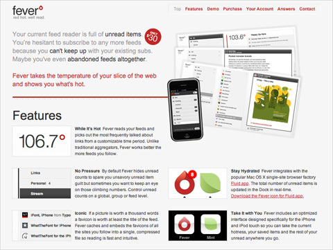
We don’t know if Fever app is any good, but the sleek user interface and website make a great first impression.
One interesting finding of these studies is that users really do judge a book by its cover… or rather, a website by its design. Elements such as layout, consistency, typography, color and style all affect how users perceive your website and what kind of image you project. Your website should project not only a good image but also the right one for your audience.
Other factors that influence credibility are: the quality of the website’s content, amount of errors, rate of updates, ease of use and trustworthiness of authors.
4. Most Users Do Not Scroll
Jakob Nielsen’s study on how much users scroll (in Prioritizing Web Usability) revealed that only 23% of visitors scroll on their first visit to a website. This means that 77% of visitors won’t scroll; they’ll just view the content above the fold (i.e. the area of the page that is visible on the screen without scrolling down). What’s more, the percentage of users who scroll decreases with subsequent visits, with only 16% scrolling on their second visit. This data highlights just how important it is to place your key content on a prominent position, especially on landing pages.
This doesn’t mean you should cram everything in the upper area of the page, just that you should make the best use of that area. Crowding it with content will just make the content inaccessible; when the user sees too much information, they don’t know where to begin looking.
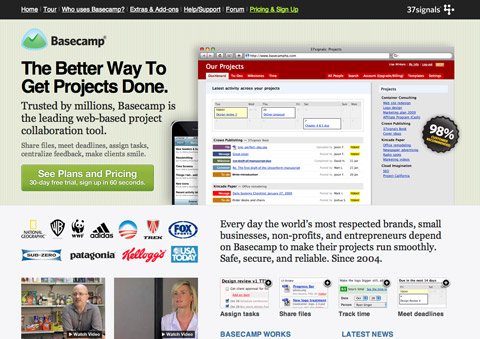
Basecamp makes great use of space. Above the fold (768 pixels high), it shows a large screenshot, tagline, value proposition, call to action, client list, videos and short feature list with images.
This is most important for the home page, where most new visitors will land. So provide the core essentials there:
- Name of the website,
- Value proposition of the website (i.e. what benefit users will get from using it),
- Navigation for the main sections of the website that are relevant to the user.
However, users’ habits have significantly changed since then. Recent studies prove that users are quite comfortable with scrolling and in some situations they are willing to scroll to the bottom of the page. Many users are more comfortable with scrolling than with a pagination, and for many users the most important information of the page isn’t necessarily placed “above the fold” (which is because of the variety of available display resolutions a quite outdated, deprecated term). So it is a good idea to divide your layout into sections for easy scanning, separating them with a lot of white space.
For further information please take a look at the articles Paging VS Scrolling (Wichita University – SURL), Blasting the Myth of the Fold (Boxes and Arrows). (thanks, Fred Leuck).
5. Blue Is The Best Color For Links
While giving your website a unique design is great, when it comes to usability, doing what everyone else is doing is best. Follow conventions, because when people visit a new website, the first place they look for things are in the places where they found them on most other websites; they tap into their experience to make sense of this new content. This is known as usage patterns. People expect certain things to be the same, such as link colors, the location of the website’s logo, the behavior of tabbed navigation and so on.
Google keeps all links on its websites blue for a reason: the color is familiar to most users, which makes it easy to locate.
What color should your links be? The first consideration is contrast: links have to be dark (or light) enough to contrast with the background color. Secondly, they should stand out from the color of the rest of the text; so, no black links with black text. And finally, research shows (Van Schaik and Ling) that if usability if your priority, sticking to blue for links is best. The browser’s default link color is blue, so people expect it. Choosing a different color is by no means a problem, but it may affect the speed with which users find it.
6. The Ideal Search Box Is 27-Characters Wide
What’s the ideal width of a search box? Is there such a thing? Jakob Nielsen performed a usability study on the length of search queries in website search boxes (Prioritizing Web Usability). It turns out that most of today’s search boxes are too short. The problem with short boxes is that even though you can type out a long query, only a portion of the text will be visible at a time, making it difficult to review or edit what you’ve typed.
The study found that the average search box is 18-characters wide. The data showed that 27% of queries were too long to fit into it. Extending the box to 27 characters would accommodate 90% of queries. Remember, you can set widths using ems, not just pixels and points. One em is the width and height of one “m” character (using whatever font size a website is set to). So, use this measure to scale the width of the text input field to 27-characters wide.
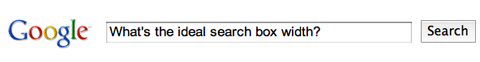
Google’s search box is wide enough to accommodate long sentences.
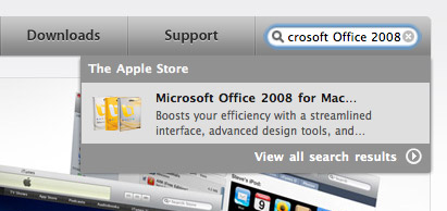
Apple’s search box is a little too short, cutting off the query, “Microsoft Office 2008.”
In general, search boxes are better too wide than too short, so that users can quickly review, verify and submit the query. This guideline is very simple but unfortunately too often dismissed or ignored. Some padding in the input field can also improve the design and user experience.
7. White Space Improves Comprehension
Most designers know the value of white space, which is the empty space between paragraphs, pictures, buttons and other items on the page. White space de-clutters a page by giving items room to breathe. We can also group items together by decreasing the space between them and increasing the space between them and other items on the page. This is important for showing relationships between items (e.g. showing that this button applies to this set of items) and building a hierarchy of elements on the page.
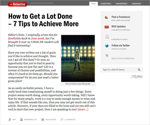
Notice the big content margin, padding and paragraph spacing on The Netsetter. All that space makes the content easy and comfortable to read.
White space also makes content more readable. A study (Lin, 2004) found that good use of white space between paragraphs and in the left and right margins increases comprehension by almost 20%. Readers find it easier to focus on and process generously spaced content.
In fact, according to Chaperro, Shaikh and Baker, the layout on a Web page (including white space, headers, indentation and figures) may not measurably influence performance but does influence user satisfaction and experience.
8. Effective User Testing Doesn’t Have To Be Extensive
Jakob Nielsen’s study on the ideal number of test subjects in usability tests found that tests with just five users would reveal about 85% of all problems with your website, whereas 15 users would find pretty much all problems.
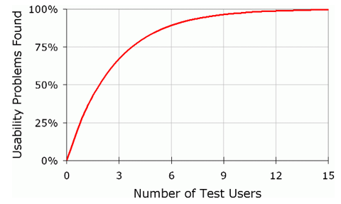
Source: Jakob Nielsen’s AlertBox
The biggest issues are usually discovered by the first one or two users, and the following testers confirm these issues and discover the remaining minor issues. Only two test users would likely find half the problems on your website. This means that testing doesn’t have to be extensive or expensive to yield good results. The biggest gains are achieved when going from 0 test users to 1, so don’t be afraid of doing too little: any testing is better than none.
9. Informative Product Pages Help You Stand Out
If your website has product pages, people shopping online will definitely look through them. But many product pages lack sufficient information, even for visitors doing a quick scan. This is a serious problem, because product information helps people make purchasing decision. Research shows that poor product information accounts for around 8% of usability problems and even 10% of user failure (i.e. the user gives up and leaves the website) (Prioritizing Web Usability).
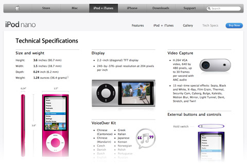
Apple provides separate “Tech Specs” pages for its products, which keeps complicated details away from the simpler marketing pages, yet provides easy access when they’re needed.
Provide detailed information about your products, but don’t fall into the trap of bombarding users with too much text. Make the information easy to digest. Make the page scannable by breaking up the text into smaller segments and using plenty of sub-headings. Add plenty of images for your products, and use the right language: don’t use jargon that your visitors might not understand.
10. Most Users Are Blind To Advertising
Jakob Nielsen reports in his AlertBox entry that most users are essentially blind to ad banners. If they’re looking for a snippet of information on a page or are engrossed in content, they won’t be distracted by the ads on the side.
The implication of this is not only that users will avoid ads but that they’ll avoid anything that looks like an ad, even if it’s not an ad. Some heavily styled navigation items may look like banners, so be careful with these elements.
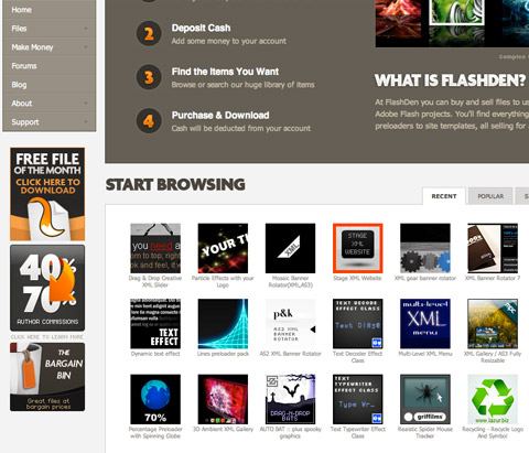
The square banners on the left sidebar of FlashDen are actually not ads: they’re content links. They do look uncomfortably close to ad banners and so may be overlooked by some users.
That said, ads that look like content will get people looking and clicking. This may generate more ad revenue but comes at the cost of your users’ trust, as they click on things they thought were genuine content. Before you go down that path, consider the trade-off: short-term revenue versus long-term trust.
Bonus: Findings From Our Case-Studies
In recent years, Smashing Magazine’s editorial team has conducted a number of case studies in an attempt to identify common design solutions and practices. So far, we have analyzed Web forms, blogs, typography and portfolios; and more case studies will be published next month. We have found some interesting patterns that could serve as guidelines for your next design.
Here, we’ll review some of the practices and design patterns that we discovered in our case studies in this brief, compact overview, for your convenience.
According to our typography study:
- Line height (in pixels) ÷ body copy font size (in pixels) = 1.48. 1.5 is commonly recommended in classic typographic books, so our study backs up this rule of thumb. Very few websites use anything less than this. And the number of websites that go over 1.48 decreases as you get further from this value.
- Line length (pixels) ÷ line height (pixels) = 27.8. The average line length is 538.64 pixels (excluding margins and padding), which is pretty large considering that many websites still have body copy that is 12 to 13 pixels in font size.
- Space between paragraphs (pixels) ÷ line height (pixels) = 0.754. It turns out that paragraph spacing (i.e. the space between the last line of one paragraph and the first line of the next) rarely equals the leading (which would be the main characteristic of perfect vertical rhythm). More often, paragraph spacing is just 75% of paragraph leading. The reason may be that leading usually includes the space taken up by descenders; and because most characters do not have descenders, additional white space is created under the line.
- Optimal number of characters per line is 55 to 75. According to classic typographic books, the optimal number of characters per line is between 55 and 75, but between 75 and 85 characters per line is more popular in practice.
According to our blog design study (not online anymore):
- Layouts usually have a fixed width (pixel-based) (92%) and are usually centered (94%). The width of fixed layouts varies between 951 and 1000 pixels (56%).
- The home page shows excerpts of 10 to 20 posts (62%).
- 58% of a website’s overall layout is used to display the main content.
According to our Web form design study:
- The registration link is titled “sign up” (40%) and is placed in the upper-right corner.
- Sign-up forms have simple layouts, to avoid distracting users (61%).
- Titles of input fields are bolded (62%), and fields are vertically arranged more than they are horizontally arranged (86%).
- Designers tend to include few mandatory fields and few optional fields.
- Email confirmation is not given (82%), but password confirmation is (72%).
- The “Submit” button is either left-aligned (56%) or centered (26%).
According to our portfolio design study:
- 89% of layouts are horizontally centered, and most of them have a large horizontal navigation menu.
- 47.2% of portfolios have a client page, and 67.2% have some form of standalone services page.
- 63.6% have a detailed page for every project, including case studies, testimonials, slideshows with screenshots, drafts and sketches.
- Contact pages contain driving directions, phone number, email address, postal address, vCard and online form,
Other Resources
You may want to take a look at related articles:
- 30 Usability Issues To Be Aware Of
- 10 Useful Usability Findings and Guidelines
- 9 Common Usability Mistakes In Web Design
- 10 Principles Of Effective Web Design
Have any thoughts on what we’ve covered, or know of other useful usability findings? Please leave a comment below.
(al)


