User Interface Design - 12 Useful Techniques

Email Newsletter
Weekly tips on front-end & UX.
Trusted by 200,000+ folks.

 Flexible CMS. Headless & API 1st

Last week, we presented 10 Useful Web Application Interface Techniques, the first part of our review of useful design trends in modern Web applications. Among other things, we highlighted embedded video blocks, specialized controls and context-sensitive navigation. We also encouraged designers to disable pressed buttons, use shadows around modal windows and link to the sign-up page from the log-in page.
This post presents the second part of our review: 12 useful techniques for good user interface design in Web apps. We also discuss how to implement these techniques so that they are properly used. Please feel free to suggest further ideas, approaches and coding solutions in the comments below.
You may also want to take a look at the following related articles:
- 5 Useful Coding Solutions For Designers and Developers
- 10 Principles Of Effective Design
- Five More Principle Of Effective Design
1. Highlight important changes
One of the most significant elements of a good user interface is visibility of the system’s status. Users must notice immediately what’s going on behind the scenes and whether their actions have actually led to the expected results. To achieve a more sophisticated level of system visibility, Web applications these days use AJAX (of course), which allows users to update portions of a Web page at any time without having to refresh the whole page. AJAX brings the level of responsiveness and interactivity of Web apps much closer to desktop-grade applications.
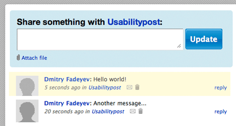
Yammer applies not one but three effects on all new messages in a feed: fade in, slide down and highlight.
However, this dynamic nature means that when you click on a button, the page doesn’t refresh but something does happen. The majority of websites still don’t use AJAX extensively, so some users may not be sure whether anything has happened at all or whether the button was properly clicked. To fix this, you need to provide some visual feedback for each of the user’s interactions.
Backpack applies a highlight effect to all new items in a task list, which lasts for a second before fading out.
One great way to do this is with animation. The human eye can notice movement fairly well, especially if the rest of the page is static. Playing a highlight animation when users add items to their shopping carts, for instance, will attract their eyes to those items. They’ll see that their action has worked. Animations can be implemented with JavaScript and are a nice way to provide visual feedback. Just be sure to not overdo it; adding too many animations could cause interface friction because the speed with which the user performs each action will be slowed down by the duration of the animation.
2. Enable keyboard shortcuts in your web application
As the advanced features of modern Web applications (such as dragging and dropping, modal windows, etc.) steadily gain on those of desktop apps, developers of these applications are trying to offer users more responsive and interactive user interfaces. One of the techniques used to achieve this is the integration of keyboard shortcuts or navigation. Just as with classic applications, this little feature can significantly improve the workflow of your users and make it easier for them to get their tasks done.
In fact, various Web applications already use shortcuts (for example, Google Spreadsheets, MobileMe, etc.), and even regular websites, such as Ffffound or Boston.com, allow visitors to use them for basic navigation. Ffffound enables users to use shortcuts to switch from the thumbnail view to list view and vice versa (using “v”), go back to the top (“h”) and navigate to the previous (“k”) and next (“j”) image. Boston.com also uses “k” and “j” for the same functions.
It’s worth mentioning that your shortcuts should be intuitive and self-explanatory. For instance, it wouldn’t make sense to make the shortcut letters for “Previous” and “Next” navigation too far apart from each other on the keyboard; rather, pick ones that are close together. The reason is, if a user makes a mistake and jumps to a page she doesn’t want to visit, she can immediately return to her page without looking at the keyboard. The “j/k” configuration is one option. It would actually make perfect sense to have some common conventions for keyboard shortcuts used throughout various websites, but we haven’t been able to detect such conventions thus far.
How do you implement this? Essentially, you just have to use the onKeyPress-DOM event and manipulate the appearance of the document using the window.scrollTo function in JavaScript.
Ffffound.com uses an onMouseDown effect in its markup, which is not a good solution because it doesn’t adhere to the main guideline of unobtrusive JavaScript coding: Thou shalt separate JavaScript functionality from CSS style sheet and (X)HTML markup.
<a id="float-navi-prev" href="javascript:void(0);"
    onmousedown="try { move_asset_auto(-1) ;} catch (e) { }"
    onclick="return false;">prev(<span class="shortcut">k</span>)
</a>
Here it would make more sense to use a JavaScript library instead (like jQuery) and call the element via its identifier or class. That's (almost) what Boston.com does. All of the images in its gallery are labelled with the class bpImage in the markup, with the JavaScript pointers to them added to the array. The onKeyPress event triggers the scrolling window in the background, and the window's browser is manipulated using the window.scrollTo() function.
Here is the (X)HTML:
   ...

    <img src="[url]" class="bpImage" />
    <div class="bpCaption">...</div>

    <img src="[url]" class="bpImage" />
    <div class="bpCaption">...</div>

    <img src="[url]" class="bpImage" />
    <div class="bpCaption">...</div>

    ...
And the JavaScript:
function bpload(){

        // put pointers to all images with the class "bpImage" in an array
        imgArr = getElementsByClassName(document.body,"bpImage")
        isLoaded = 1;
    }

    document.onkeypress = function(e) {
        if (!e) e = window.event;

        // Pick up what key was pressed
        key = e.keyCode ? e.keyCode : e.which;

        // 107 is the ASCII code for 'k'
        if(( key == 107 ) && ( isLoaded ) ) {

            // if there are images...
            if ( currImg > 0 ) {

                // decrease the counter for the current image
                currImg--;

                // offsetTop returns the vertical coordinate of the
                // upper-left corner of the image
                // (we are not sure why the script adds 174px. Any idea?)
                window.scrollTo(0,imgArr[currImg].offsetTop+174)

            }
            else {
                if (currImg==0) {
                    currImg--;
                    window.scrollTo(0,325)
                }
                else
                {
                    if (currImg<0) {
                        window.scrollTo(0,325)
                        }
                    }
                }
        }

        if ( ( key == 106 ) && ( isLoaded )) {
            // a similar code snippet for 'j'
            ...
        }
    }

}
But you need to make sure that you clearly communicate that 1) keyboard shortcuts are available, and 2) they can be used to perform certain tasks more efficiently. If a user can easily manage his tasks with your application, he is less likely to switch to another application, if the feature set is more or less similar.
3. Upgrade options from the account page
If your application features several subscription plans, make sure to remove any interface friction for customers deciding to upgrade. Most users like to try the basic version of an application first to get a better sense of what it offers and how it works. If they are convinced the application meets their expectations, they will consider upgrading to a more advanced plan. It’s the designer’s task to make sure this transition is as simple and intuitive as possible.
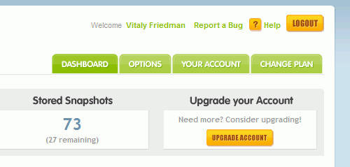
CrazyEgg integrates the option “Change plan” in its main navigation.
In fact, a lot of Web applications put upgrade options right on the user’s account page, making them easily accessible. This design choice has the simple advantage of providing users with an overview of available options and supported functionalities right away.
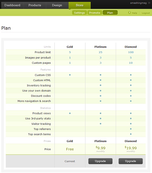
Bigcartel’s upgrade plans are available in the app itself.
Note, though, the importance not only of featuring the available upgrade plans, but also of identifying the plan that the user is currently using and the features that are currently available to her. It is vital to provide users with precise information about what advantages they gain by upgrading their account. Take a look at our article Pricing Tables: Examples and Best Practices as well.
4. Advertise features of the application
Even though you’ve created a detailed marketing page, outlining your application’s every feature, and crafted a thorough help section on your website, your users are unlikely to have read it all. They’re probably not familiar with all the features of your product and would benefit from little tips inside the application itself.
Advertise new features in your application. These would usually go in the sidebar, out of the way of the main functions. If a user is nearing the maximum capacity of a certain feature for her chosen subscription plan, you should point this out and give her an option to quickly upgrade.
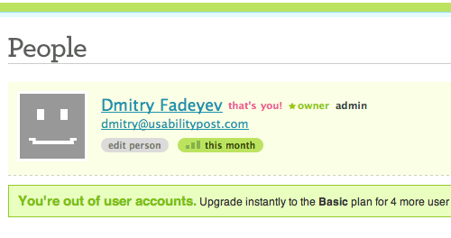
The Freckle time-tracking app tells you when you’ve run out of people on your current plan. The message also links to actions you can take if you need to upgrade.
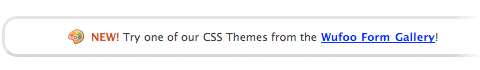
Wufoo highlights its new form gallery feature at the bottom of the form creation page, making sure customers get the most value out of the app.
5. Use color-coded lists
Some applications feature feeds that aggregate various types of content. For example, you may have a project management application that shows you all the latest messages, tasks and files on the home page. If these items all appear together in one list, it may be difficult to tell what’s what. Many applications use color coding to help visually distinguish between different types of entries. A simple way to do this is to place a text label inside a colored box. This way, the list becomes easily scannable.
It’s important not to use various colors for the same task or similar colors for completely different tasks. The color scheme should not be random but should implicitly indicate the function each item serves.
The Lighthouse issue-tracking app has color-coded labels on the right-hand side of each item on the overview page, which helps you quickly scan the list.
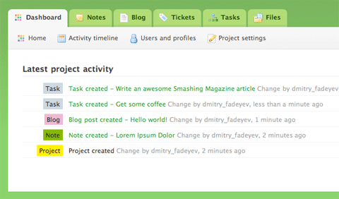
The Goplan dashboard uses similar color-coded labels to differentiate various items, like tasks, notes and files, so you can quickly find what you need.
6. Offer personalization options
Many applications provide custom workspaces for people and businesses. Personalization can help make your users feel more at home. This can be done by giving users options to customize the look and feel of the application interface. Let them select the color theme, the link colors, the background and so on. Even a small amount of customization will allow your users to make their pages their own.
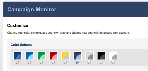
Campaign Monitor lets you choose a color theme for your account and upload your business logo. This helps businesses infuse the colors of their brands into the Web apps they use.
Personalization is certainly one of the simplest and most effective methods of binding your customers to your service, but it’s important to understand that the various personalization options should never come at the expense of the core application’s functionality. The system should always be capable of performing its functions and thus meet users’ expectations, despite how exactly users have personalized the application.
One useful approach to finding a compromise between a website’s core functionality and the user interface is to introduce various levels of personalization, depending on whether the user is a novice or an advanced user. It is also a good idea to allow the user to revert his account to the default settings or restore the settings that he had saved in his previous session.
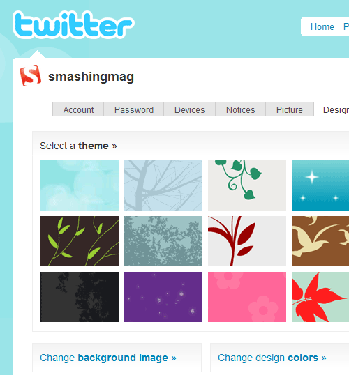
Twitter lets the user customize his profile page background and colors, allowing him to craft a unique spot on the popular micro-blogging network.
7. Display help messages that attract the eye
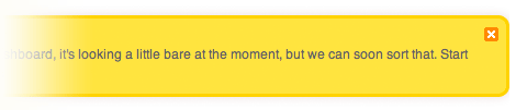
Every Web application is different and has its own way of doing things. If the function of a particular element isn’t immediately apparent, you can provide short help messages to get people started. One important thing to note is that if you want to help people who aren’t sure what they’re doing yet, you need to attract their attention to this message. One way to attract attention is with color – putting a yellow “sticky” message in the sidebar, for example, is sure to stand out.
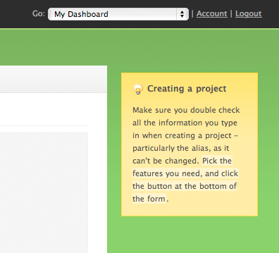
Goplan puts help messages in bright yellow boxes resembling paper stickies. The bright color ensures that users don’t miss them.
Alternatively, if you are looking for a subtler solution that doesn’t require much space to display and isn’t obtrusive for regular users of your application, you can consider displaying vibrant visual graphics (for example, small icons) next to the design element needing explanation. For instance, pointing users to new, updated or useful features of an application’s search engine, as Wishlistr.com does, makes sense.
Classic: Wishlistr uses a light bulb to focus the user’s attention on the available search functionality of its system.
8. Design feedback messages carefully
Pretty much every application has some form of feedback messages. These are little messages that pop out when there is an error or warning or perhaps when an action is completed successfully. Designing these messages correctly is important because you don’t want to confuse or startle your users when there’s nothing to worry about.
A good practice here is to do a couple of things. First, color code the different types of messages. Messages that notify users of successful actions are usually colored green. These employ the traffic-light analogy of green meaning “Go.” Warning and error messages are colored yellow. Same traffic-light analogy here: yellow means slow down and wait. You can also distinguish between warning messages and error messages by coloring errors red and warnings yellow.
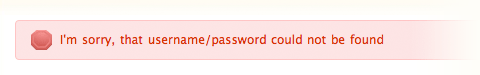
The second thing to do is add a unique icon for each message type. Icons can convey meaning instantly, without the user having to read the message. For example, a tick icon can symbolize completion of a successful action. An exclamation mark in a triangle is a warning sign. People will instantly recognize that this message warns them about something and will pay attention.
GetSignOff allows you to close notifications by using the little button in the top-right corner of the message box.
Lastly, you should provide a way for users to close the notification if they are likely to remain on the page for a while.
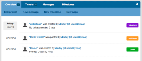
9. Use tabbed navigation
Many Web applications have adopted the tabbed navigation approach for their main navigation menu. Tabbed navigation is a menu that looks like each item is a tab on a file folder, with the active tab connected to the body of the page. Tabbed navigation isn’t just eye candy; it provides a usability benefit.
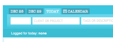
Freckle uses tabbed navigation in a sub-menu relating to the time input menu.
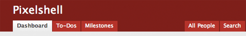
Basecamp features the standard tabbed menu for the main navigation of its app.
If you make the menu look like tabs on folders, almost everyone will be able to figure out what it is and how it works. This is because the visual metaphor is strong and clear. The current page or section also becomes easy to see. Knowing where they are puts users at ease because they gain a greater sense of control.
10. Darken background under modal windows
In some applications, you may want to display a bit of information or quick input form that doesn’t really deserve a full page of its own. Some developers put that message or form in a modal window. Modal windows are little windows that pop up on top of the current page and that users need to interact with to proceed.
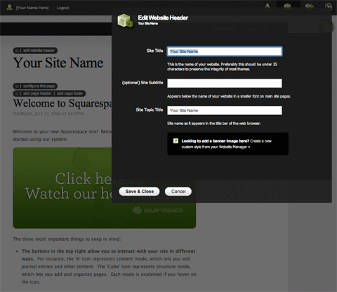
When editing things in the Squarespace website creation app, the background darkens to shift focus to the edit window.
To make this window stand out better, you can darken the content below it. The darker background will block out all the noise of the content behind the box and make the modal window the center of attention. This is very similar to using shadows around the window but is even more powerful in directing focus. The darker background also indicates that interaction with the content beneath is disabled and that the user should instead interact with the modal window.
11. Lightboxes and Slideshows
Some applications include a lot of images that users may want to browse. Displaying every image on its own page may not be the most efficient way to do it — both for your visitors and your server. Your visitors will need to navigate back and forth, and your server will incur extra hits that can be avoided.
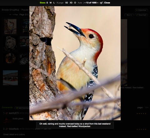
SmugMug uses lightboxes to enlarge photos. (Photo by Kurt Preston.)
Enter lightboxes and slideshows. Lightboxes and slideshows are used to display photos without having to load a new page. For example, the lightbox method will enlarge an image and place it as a modal window above the rest of the page, allowing the user to focus on the image itself while the background is darkened. This means less noise interfering with the viewing experience.
12. Short sign-up forms
The sign-up form is potentially one of the biggest barriers between you and potential customers. The longer the form, the more effort your visitors will have to make before becoming members of your website or, perhaps, paying customers. To minimize the barrier, we’ve got to speed up the process. This means removing all optional elements from the form and leaving only the core essentials. The optional stuff can be filled in later.
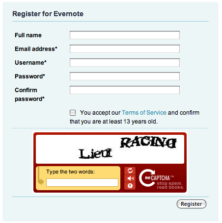
Opening an Evernote account is easy, with only a handful of fields to fill in, all of which are grouped together in a compact box.
User Interface Design Conclusion
Making your application beautiful may lead to a satisfying user experience, but it will not guarantee a usable product. For example, an ugly website like Craigslist performs its function fairly well. Its poor aesthetic did not stop it from becoming hugely successful. Similarly, the minimalist interface of the Google search engine manages to fully accomplish its objectives without getting in your way. The interface disappears, letting you focus on getting things done.
Steve Jobs once said, “design is not just what it looks like and feels like. Design is how it works.” In fact, the usability and overall usefulness of a Web app is governed by how well it performs its functions and how easily those functions are accessed. Design with a goal in mind – a goal that the interface helps your users achieve. Not every technique will work in every situation or for every application. Only implement interface elements if they make sense in your particular context.
 (al)
(al)

